Navigation
Install the app
How to install the app on iOS
Follow along with the video below to see how to install our site as a web app on your home screen.

Note: This feature currently requires accessing the site using the built-in Safari browser.
More options
You are using an out of date browser. It may not display this or other websites correctly.
You should upgrade or use an alternative browser.
You should upgrade or use an alternative browser.
A few Recents
- Thread starter score04w
- Start date
Austin Greene
Been spending a lot of time on here!
- Joined
- Jan 6, 2012
- Messages
- 1,472
- Reaction score
- 855
- Location
- Mountain View, California
- Website
- www.austingreenephotography.com
- Can others edit my Photos
- Photos NOT OK to edit
All of them except #4 seem somewhat underexposed, with #3 being the least so. #4 is my favorite, though I think its a tad over-processed.
Snakeguy101
TPF Noob!
- Joined
- Dec 5, 2010
- Messages
- 717
- Reaction score
- 63
- Location
- Gainesville
- Can others edit my Photos
- Photos OK to edit
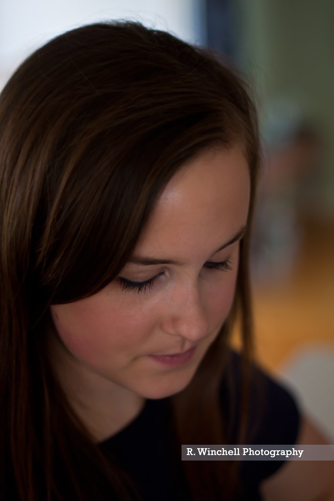
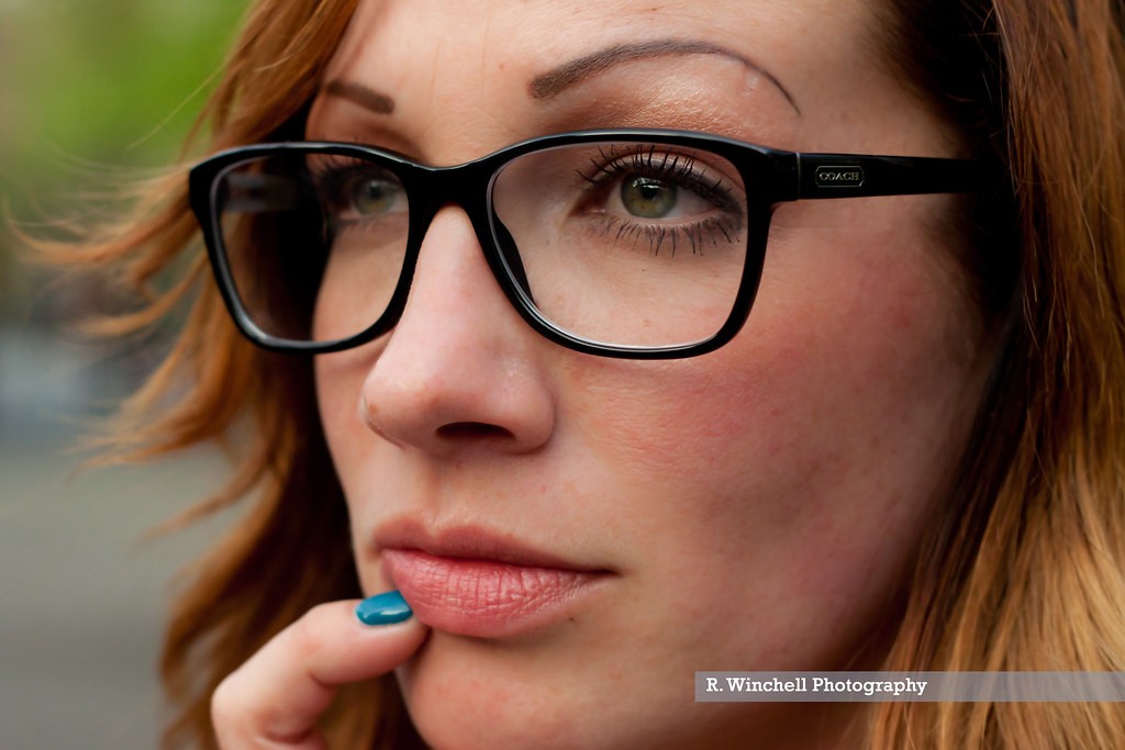
1) what is this a picture of? Why did you decide to take it? She is looking down and I follow her line of sight directly out of the frame. I want to see what she is looking at- without that story, it is a pointless image.
2) typical "mommy goggle" type of image. The background is very distracting and it is pretty unoriginal although there is not much wrong technically.
3) I like this one the most. The eyes don't flow out of the frame like they did in the first one and the is interest generated by the blue tipped finger. This images gives a bit of emotion.
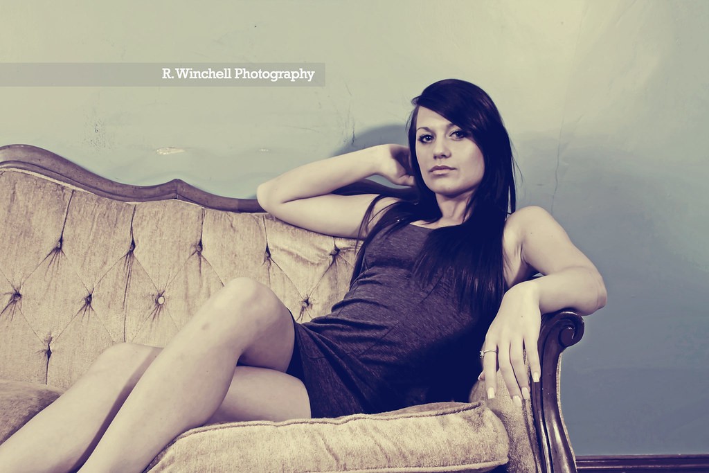
4) I have always loathed this type of processing but I like the concept of the shot. I will let someone else critique it for you because I don't care for any shots in this style and thus never reallly pay attention to them. I will say that having the girls feet out of the frame was a mistake by my book. Either do a tighter crop or include them.
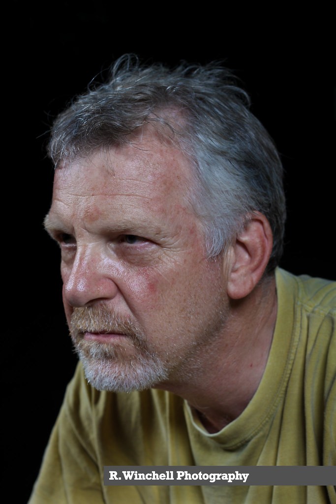
5)under exposed and again, my eyes do not stay on the image, they are immediately pushed off the frame by the direction of the gaze. This is also a very strange and unflattering pose for your subject.
Overall, I would say that you are getting somewhere. Get rid of that annoying logo on all of your images though, there is no need for it and it is pretty distracting in some of the shots.
2) typical "mommy goggle" type of image. The background is very distracting and it is pretty unoriginal although there is not much wrong technically.
3) I like this one the most. The eyes don't flow out of the frame like they did in the first one and the is interest generated by the blue tipped finger. This images gives a bit of emotion.
4) I have always loathed this type of processing but I like the concept of the shot. I will let someone else critique it for you because I don't care for any shots in this style and thus never reallly pay attention to them. I will say that having the girls feet out of the frame was a mistake by my book. Either do a tighter crop or include them.
5)under exposed and again, my eyes do not stay on the image, they are immediately pushed off the frame by the direction of the gaze. This is also a very strange and unflattering pose for your subject.
Overall, I would say that you are getting somewhere. Get rid of that annoying logo on all of your images though, there is no need for it and it is pretty distracting in some of the shots.
o hey tyler
Been spending a lot of time on here!
- Joined
- Aug 3, 2009
- Messages
- 9,784
- Reaction score
- 2,727
- Location
- Maine
- Can others edit my Photos
- Photos NOT OK to edit
The watermark makes everything better.
I have a watermark too... Does that add to the quality of all photos, or just the OP's?
")
Snakeguy101
TPF Noob!
- Joined
- Dec 5, 2010
- Messages
- 717
- Reaction score
- 63
- Location
- Gainesville
- Can others edit my Photos
- Photos OK to edit
I think he was being sarcastic.
o hey tyler
Been spending a lot of time on here!
- Joined
- Aug 3, 2009
- Messages
- 9,784
- Reaction score
- 2,727
- Location
- Maine
- Can others edit my Photos
- Photos NOT OK to edit
I think he was being sarcastic.
I think I was too.
Snakeguy101
TPF Noob!
- Joined
- Dec 5, 2010
- Messages
- 717
- Reaction score
- 63
- Location
- Gainesville
- Can others edit my Photos
- Photos OK to edit
They really need a font for that...
Brinr
No longer a newbie, moving up!
- Joined
- May 16, 2011
- Messages
- 320
- Reaction score
- 63
- Location
- Reno
- Website
- www.brinrphoto.com
- Can others edit my Photos
- Photos OK to edit
Two is money... needs a tighter crop and a less busy background though.
yerlem
TPF Noob!
- Joined
- Apr 12, 2012
- Messages
- 328
- Reaction score
- 95
- Location
- Argentina
- Can others edit my Photos
- Photos OK to edit
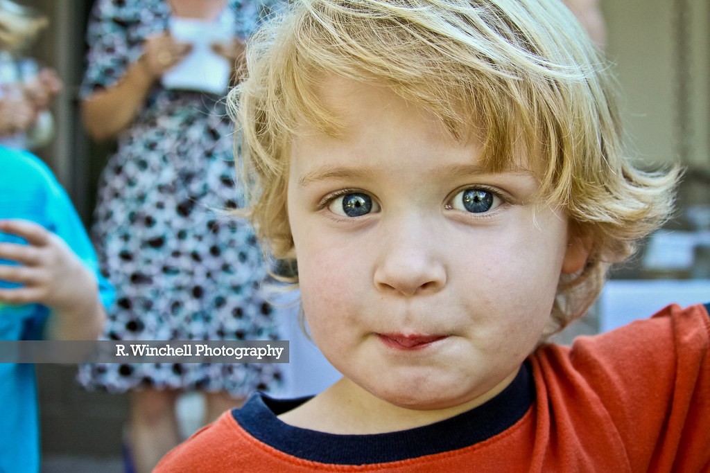
I really like #2, person in the dress behind him doesn't bother me, I think it adds context to the picture...I wish she was talking to someone else though-. the person in the blue shirt ruins it with that akward hand
But what do I know, I'm a noob!
But what do I know, I'm a noob!
OP
OP
score04w
TPF Noob!
- Joined
- Aug 10, 2010
- Messages
- 83
- Reaction score
- 0
- Location
- CT
- Can others edit my Photos
- Photos NOT OK to edit
1) what is this a picture of? Why did you decide to take it? She is looking down and I follow her line of sight directly out of the frame. I want to see what she is looking at- without that story, it is a pointless image.
It is a picture of my sister. I took it because I did. Do you plan every single shot perfectly before you click? It was a holiday and I was snapping pictures the whole day, and I happen to like it plain and simple. Not every picture has to be "original" either, as you pointed out in #2. Sometimes people want that normal picture.
Other than that thanks for the critique.
groan
TPF Noob!
- Joined
- Mar 30, 2012
- Messages
- 237
- Reaction score
- 22
- Location
- Ottawa, Canada
- Website
- marcphoto.ca
- Can others edit my Photos
- Photos OK to edit
Sometimes the 'noobs' have a better natural eye than the seasoned technically leaning pro's out there! I never discount a critique from anyone!I really like #2, person in the dress behind him doesn't bother me, I think it adds context to the picture...I wish she was talking to someone else though-. the person in the blue shirt ruins it with that akward hand
But what do I know, I'm a noob!
#'s 2 and 4 really work for me.
2 because I love that it's so automatic, and natural. That's a kid that loves being a kid!
$ because it's casual, sensual without being sexual. I love your choice in PP.
jcskeeter
TPF Noob!
- Joined
- Nov 7, 2010
- Messages
- 83
- Reaction score
- 6
- Location
- Minnapolis, MN
- Website
- www.jamescordell.com
- Can others edit my Photos
- Photos OK to edit
#1 Just a pic, like you said. A bit underexposed like others have said. Doesn't really tell me anything, but it doesn't have to either. I think if it was a bit brighter it might speak a little more. IDK?
#2 I like it all around! Seeing it next to the others, the processing seems heavy, but alone it would stand up nicely. The background elements make me think "Back yard BBQ" with kids running all over and the "moms" watching over them. Looks like he might have a whole mouth full of Hawiian Punch that he's going to spray at his little brother. haha
#3 I like this one as well. Be a good photo for Coach. (Maybe that's what you were going for?) To be a little picky, there are some spots I probably would have cloned out and maybe smoothed a little. The speck just under her lip kinda bugs me and the spot on her nose. As well as the two creases in between her eyes. Those details aren't prevalent enough for me to keep them there as "character" for the subject. I think I would just touch up the eyes a little too. Whiten the whites and pop the pupils a little. Since the eyes are basically the center of attention for the whole photo I think it would help it pop. (just do what you did to the kid's eyes in #2)
#4 I agree on the crop as someone else mentioned. It doesn't ruin it for me but I would like to see the whole leg if I could. I imagine she had some type of sexy heel on that would have helped sell the emotion in the photo. The processing doesn't bother me although it does seem a little flat. But maybe that's what you were going for. The bruise on her leg is kinda distracting me. I like how the model connected to the camera.
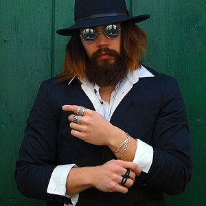
#5 Meh... I'm assuming this might be you. (the OP) The lighting idea is headed in the right direction. But like other's said, the framing and pose isn't working for me. Maybe if the photo was edited into some other context it might work? I wish the eyes had some catch light in them and overall bump the photo exposure up.
#2 I like it all around! Seeing it next to the others, the processing seems heavy, but alone it would stand up nicely. The background elements make me think "Back yard BBQ" with kids running all over and the "moms" watching over them. Looks like he might have a whole mouth full of Hawiian Punch that he's going to spray at his little brother. haha
#3 I like this one as well. Be a good photo for Coach. (Maybe that's what you were going for?) To be a little picky, there are some spots I probably would have cloned out and maybe smoothed a little. The speck just under her lip kinda bugs me and the spot on her nose. As well as the two creases in between her eyes. Those details aren't prevalent enough for me to keep them there as "character" for the subject. I think I would just touch up the eyes a little too. Whiten the whites and pop the pupils a little. Since the eyes are basically the center of attention for the whole photo I think it would help it pop. (just do what you did to the kid's eyes in #2)
#4 I agree on the crop as someone else mentioned. It doesn't ruin it for me but I would like to see the whole leg if I could. I imagine she had some type of sexy heel on that would have helped sell the emotion in the photo. The processing doesn't bother me although it does seem a little flat. But maybe that's what you were going for. The bruise on her leg is kinda distracting me. I like how the model connected to the camera.
#5 Meh... I'm assuming this might be you. (the OP) The lighting idea is headed in the right direction. But like other's said, the framing and pose isn't working for me. Maybe if the photo was edited into some other context it might work? I wish the eyes had some catch light in them and overall bump the photo exposure up.
Snakeguy101
TPF Noob!
- Joined
- Dec 5, 2010
- Messages
- 717
- Reaction score
- 63
- Location
- Gainesville
- Can others edit my Photos
- Photos OK to edit
1) what is this a picture of? Why did you decide to take it? She is looking down and I follow her line of sight directly out of the frame. I want to see what she is looking at- without that story, it is a pointless image.
It is a picture of my sister. I took it because I did. Do you plan every single shot perfectly before you click? It was a holiday and I was snapping pictures the whole day, and I happen to like it plain and simple. Not every picture has to be "original" either, as you pointed out in #2. Sometimes people want that normal picture.
Other than that thanks for the critique.
That is fine but it makes the shot nothing more than a snap shot. I do take snap shots too but I put a lot of work and forethought into all of my photographs.
I just was saying what I thought of the images, not what YOU should think of them. Take it for what it is worth.
OP
OP
score04w
TPF Noob!
- Joined
- Aug 10, 2010
- Messages
- 83
- Reaction score
- 0
- Location
- CT
- Can others edit my Photos
- Photos NOT OK to edit
Thanks for all the comments. Trying to learn and keep progressing. #5 is not me however. It's my father and doesn't take direction very well so I worked with what I had. I do agree that some are under exposed. #4 is a bit over processed but that's what she was going for, so I gave her what she wanted.
Most reactions
-
 440
440 -
 326
326 -
 316
316 -
 284
284 -
 257
257 -
 247
247 -
 190
190 -
 186
186 -
 178
178 -
 146
146 -
 145
145 -
 140
140 -
 139
139 -
 136
136 -
 103
103
Similar threads
- Replies
- 4
- Views
- 425
![[No title]](/data/xfmg/thumbnail/31/31757-4f5257d19be4e34c6bdcbd2519380d53.jpg?1619734994)

![[No title]](/data/xfmg/thumbnail/40/40296-1e3931509698e96fed6a0e43f5cb4adc.jpg?1619739411)
![[No title]](/data/xfmg/thumbnail/32/32004-4455324f0b4b5cc318dd35877147ac47.jpg?1619735148)