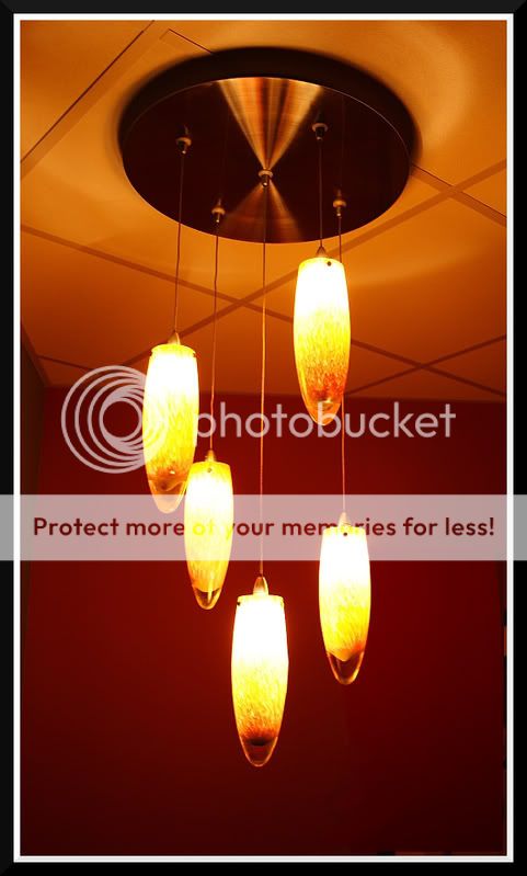
I took a few pics last night at the cafe at work. I really wish I could clone out the table in the right corner of number 1 and the painting in number 2.
I got rid of the reflections in the painting and the window of the light the best I knew how to. I think it looks better without the distracting reflections.
Also there is a lot of noise because of imageshack. The originals dont have the noise.
Leave the painting in #2. But skew the top left out further to the left and get rid of the corner shadow. The picture frame adds an element to the shot.
Regardless of what you do, the down lights in #1 are blown out.
The play of diminishing perspective lines, color and reflections on the wall are soothing in the last. Patrons may have improved the image by giving some life to an otherwise static moment.
There is a really neat way of toning down blown high lights, which I've put as an action on my web site, if that would help you with #1 - looks a cool sort of place. Well done


![[No title]](/data/xfmg/thumbnail/37/37930-501fdf314a05686acde53d9899f68091.jpg?1619738402)