What's new

A Few Streets

Gary A.

Been spending a lot of time on here!
Joined
Sep 17, 2014
Messages
22,357
Reaction score
7,541
Location
Southern California
Los Angeles:

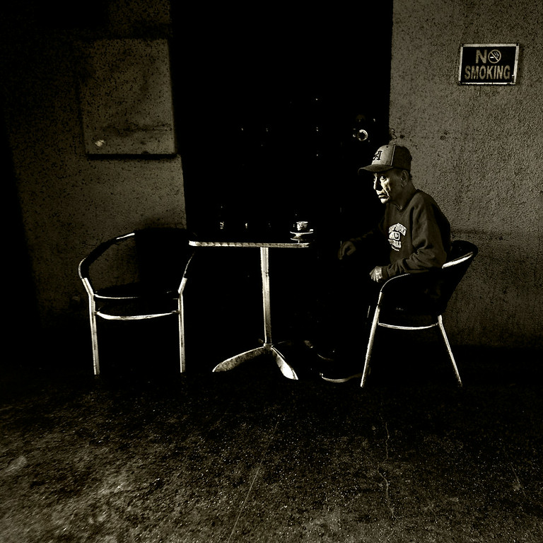
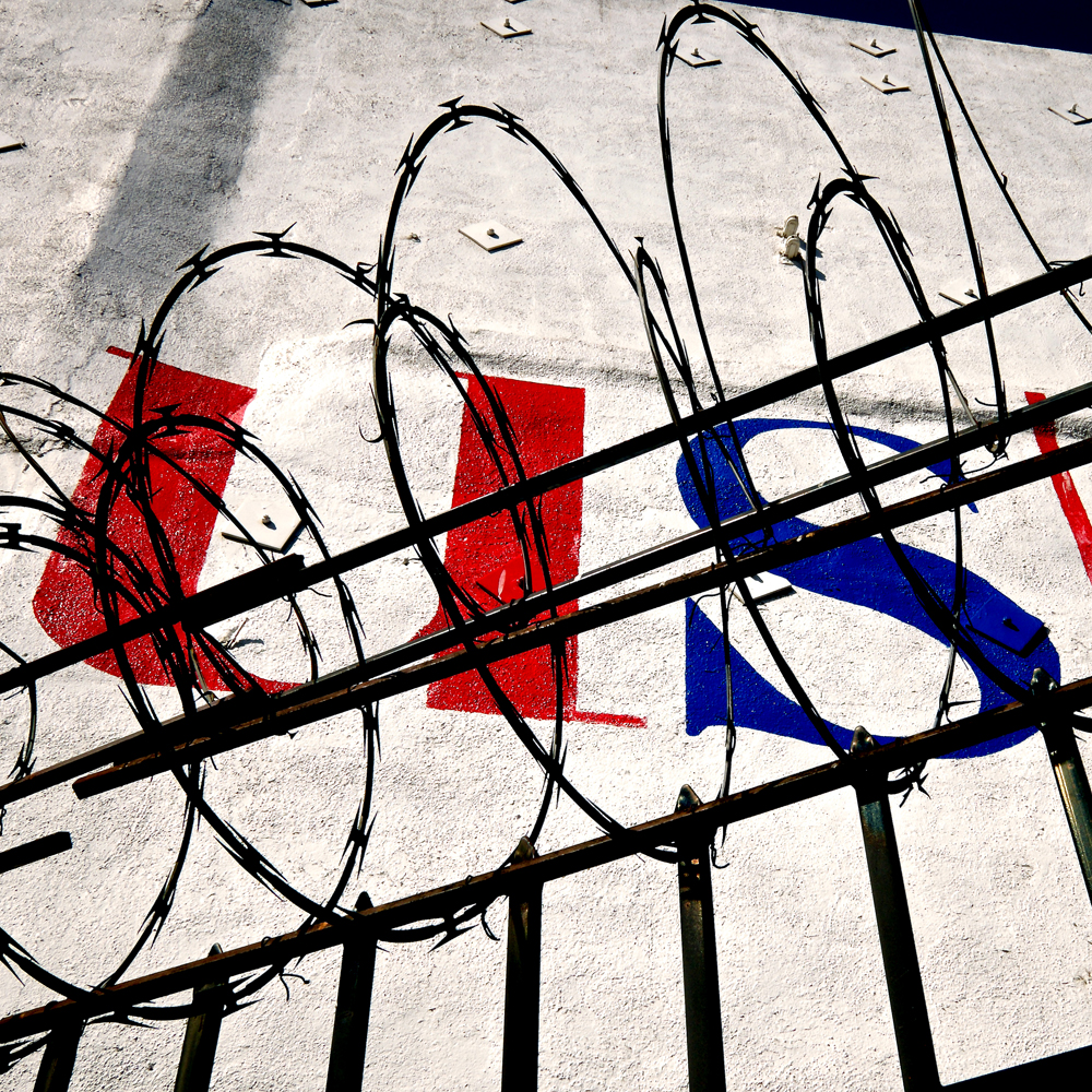
#1 - No Smoking
DSCF5886-XL.jpg

XT1 w/ 10-24 @ 10mm

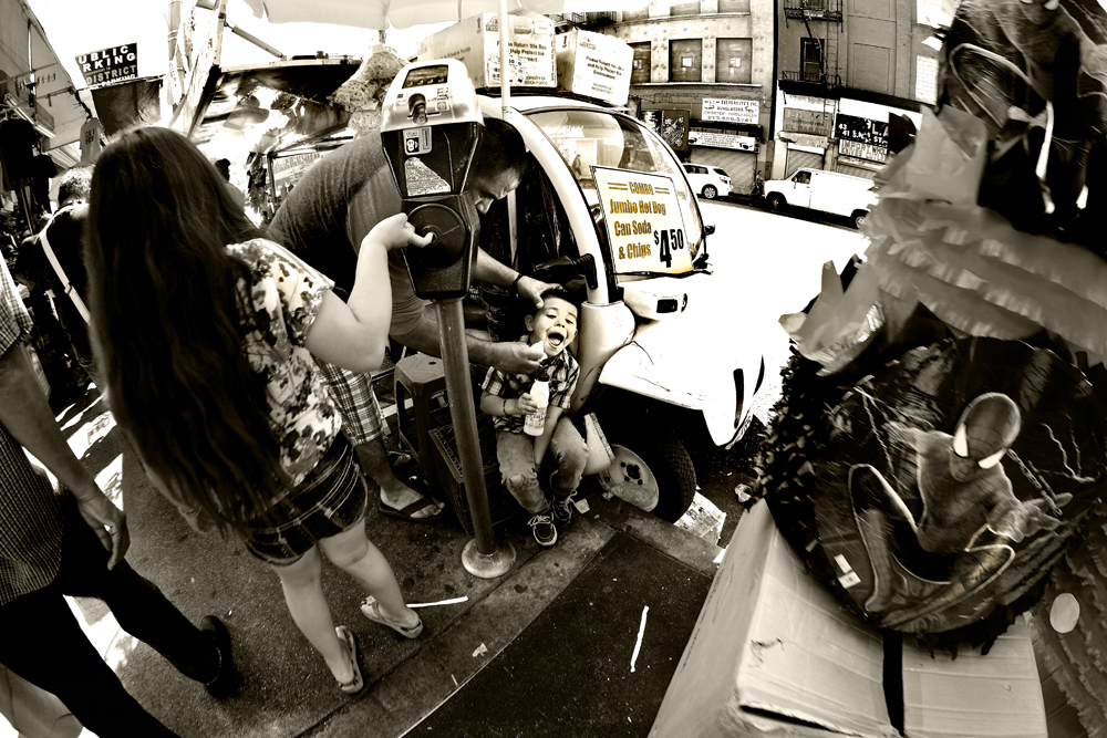
#2 - & Chips
DSCF5823.jpg

XT1 w/ 8mm (fish)

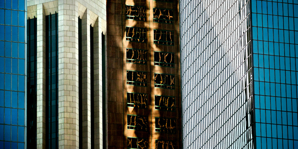
#3 - No Name
_GA12681.jpg

XT1 w/ 55-200 @ 200mm

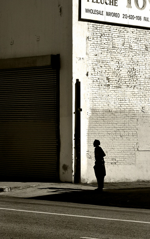
#4 - Wholesale Matoreo
_GA12682-XL.jpg

XT1 w/ 55-200 @ 77.9mm

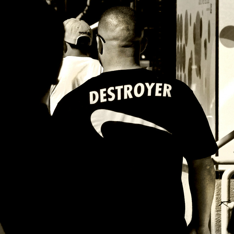
#5 - Destroyer
_GA12684-XL.jpg


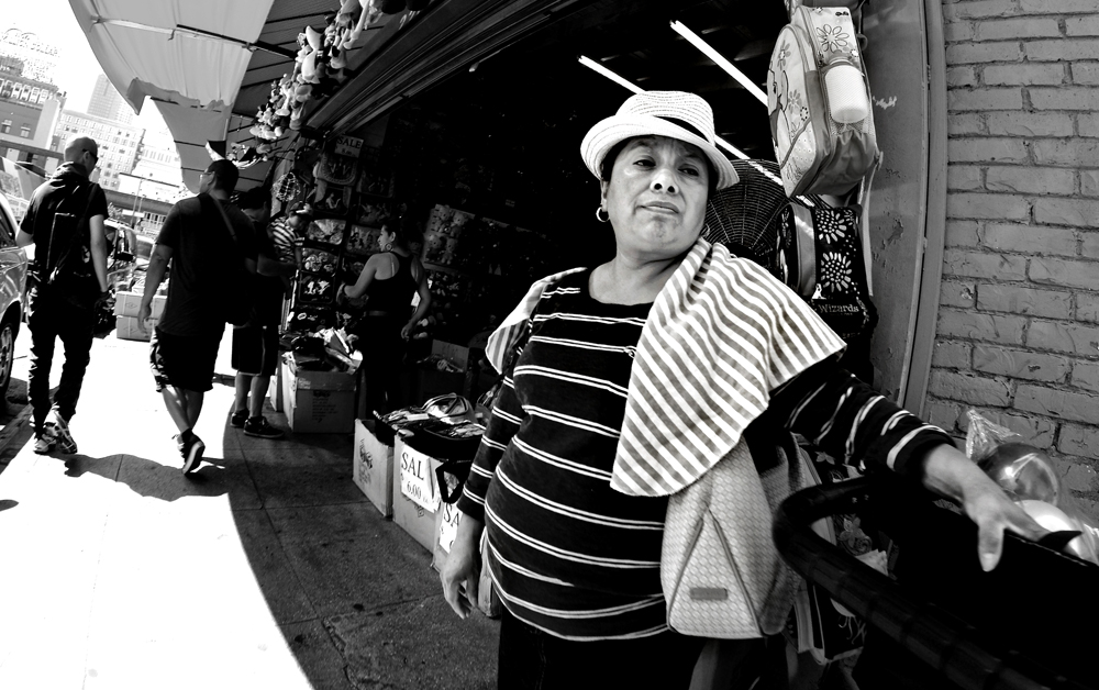
#6 - Sal
DSCF5817.jpg

XT1 w/ 8mm (fish)

Thanks for viewing,
Gary
 
#1 and #2 for me


hope you'll stick around :)
 
#1, #2 and #4 work for me for different reasons.

#1 has a sense of mystery to it, with the empty chair and the guy staring off into space. I might darken the lower left a bit and get rid of the light spot over the left-hand chair, but those are minor fidgets. Well done and good call on the square crop.
#2 is interesting to look at. I'd probably partially adjust the perspective on the left and right, but that's really a matter of taste.
#4 to me would be much more interesting without the sign. I don't see how it adds anything compositionally, and it is distracting because it leads the eye to the upper corner, unlike the sign in #1. If you crop the entire sign or perhaps leave just the lower part with no letters visible you would have a much more interesting image, imo.
 
#1, #2 and #4 work for me for different reasons.

#1 has a sense of mystery to it, with the empty chair and the guy staring off into space. I might darken the lower left a bit and get rid of the light spot over the left-hand chair, but those are minor fidgets. Well done and good call on the square crop.
#2 is interesting to look at. I'd probably partially adjust the perspective on the left and right, but that's really a matter of taste.
#4 to me would be much more interesting without the sign. I don't see how it adds anything compositionally, and it is distracting because it leads the eye to the upper corner, unlike the sign in #1. If you crop the entire sign or perhaps leave just the lower part with no letters visible you would have a much more interesting image, imo.

Thanks for the critique. I'll take another and harder look at #4. I appreciate the time you took and constructive criticism.

Gary

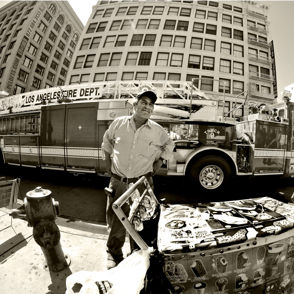
#8 - Truck 9
DSCF5848.jpg
 

Create an account or login to comment

You must be a member in order to leave a comment

Create account

Create an account on our community. It's easy!

Log in

Already have an account? Log in here.

Back
Top Bottom