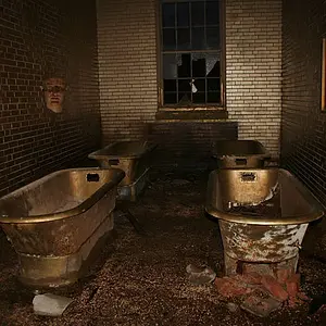
Sharpness etc good, does seem a bit over-saturated.
What is bothersome is the excess of space at the top and the too-close (imo) margin at the bottom.
Thus it looks like a framing mistake
I agree with Lew; I think if you crop a little off the top of the toque, it will work better. Also consider a monochrome conversion; lots of character in that face!
The focus seems to be on his hat, I would have preferred sharper eyes. It looks a bit over saturated to me too and I would desaturate the red thing above his right shoulder.
Otherwise You have here a really interesting subject and it's not a bad shot at all.



![[No title]](/data/xfmg/thumbnail/40/40300-583eaa43665714005823e12314084a4d.jpg?1734174710)
![[No title]](/data/xfmg/thumbnail/41/41796-690c109012575e084970902dbd3894ba.jpg?1734176108)
![[No title]](/data/xfmg/thumbnail/40/40298-08fb67b2f2c98625b8ff8dcb00ed42a8.jpg?1734174708)
![[No title]](/data/xfmg/thumbnail/40/40309-c759bfd4ae7c079632e7402d21d332f1.jpg?1734174717)
![[No title]](/data/xfmg/thumbnail/37/37280-a7e70a01ccd331918e71645cd4c1f16e.jpg?1734170137)