AlanE
TPF Noob!
- Joined
- Apr 5, 2012
- Messages
- 366
- Reaction score
- 23
- Location
- Atlanta, GA
- Website
- www.flickr.com
- Can others edit my Photos
- Photos OK to edit
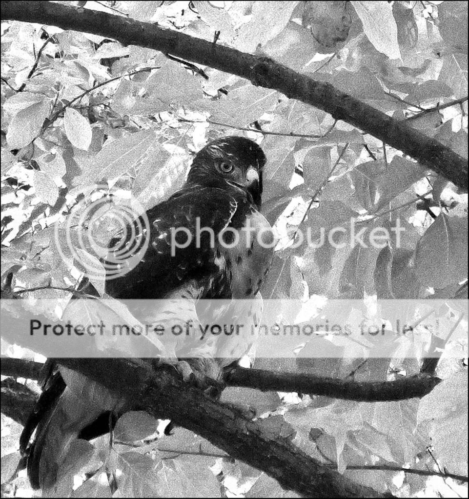
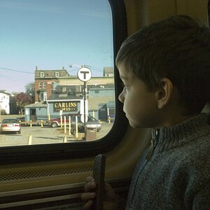
1

P1050945 by Nokinrocks, on Flickr
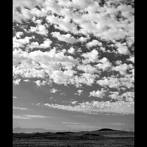
2

P1050943 by Nokinrocks, on Flickr
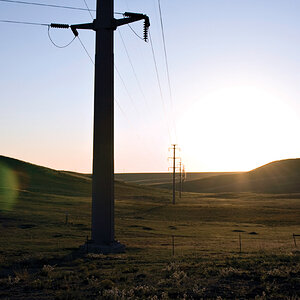
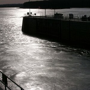
3

P1050939 by Nokinrocks, on Flickr
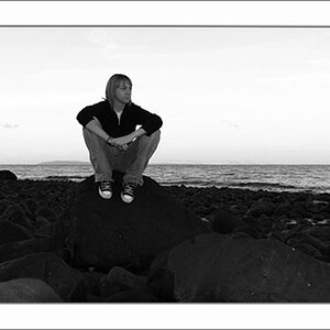
4

P1050925 by Nokinrocks, on Flickr
P1050945 by Nokinrocks, on Flickr
2
P1050943 by Nokinrocks, on Flickr
3
P1050939 by Nokinrocks, on Flickr
4
P1050925 by Nokinrocks, on Flickr