A little CC on these flower photos, Please

Scott Whaley

Been spending a lot of time on here!
Joined
Aug 4, 2018
Messages
1,280
Reaction score
1,270
Can others edit my Photos
Photos NOT OK to edit
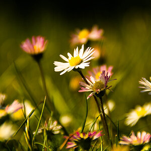
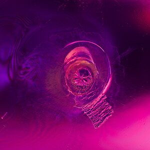
I think most everyone on this forum knows I am a birder and wildlife photographer. I have been trying to branch out and try different things. Here are a few photos of some flowers around our pond. I am using my Canon 7D mkii with the stock lens. I am shooting at around 1/200 sec., the F-stop is a 11, and the ISO is at 800. I set the camera to under expose a few stops. In post processing I raised the contrast in order to darken the background on the yellow flowers and raised the shadows a bit. I really didn't do much post processing on the orange flowers. What type of suggestions do you have in making these photos better?

1
Flower 3 (1 of 1).jpg


2

Flower 2 (1 of 1).jpg


3
Flower 4 (1 of 1).jpg


4
Flower 8 (1 of 1).jpg
 
I think compositionally they are all pretty good, with 3 being the strongest. The water droplets look good and add a bit of complexity to the shots.

1 and 2 still look underexposed to me. I'd have liked to see the top of the stamen of the background flower in 1 as it would provide a break between the top of the image helping to keep the eye in the frame. Ideally in 1 and 2 you wouldn't want any yellow touching the sides of the frame, it's not always possible to do, and if it can't be avoided then localised burning and/or desaturation can help de-ephasise those areas.

3 and 4 look a bit oversaturated in the green and orange, possibly a bit too much contrast as well. In 4 I'd consider just slightly burning the orange in the background flowers, just to help subtly bring the eye back to the centre.

Overall these are pretty solid shots, interesting and a nice use of colour.
 
I would agree, all seem a tad under exposed :( maybe consider using an off camera flash

Les :)
 
I would agree, all seem a tad under exposed :( maybe consider using an off camera flash

Les :)

I think compositionally they are all pretty good, with 3 being the strongest. The water droplets look good and add a bit of complexity to the shots.

1 and 2 still look underexposed to me. I'd have liked to see the top of the stamen of the background flower in 1 as it would provide a break between the top of the image helping to keep the eye in the frame. Ideally in 1 and 2 you wouldn't want any yellow touching the sides of the frame, it's not always possible to do, and if it can't be avoided then localised burning and/or desaturation can help de-ephasise those areas.

3 and 4 look a bit oversaturated in the green and orange, possibly a bit too much contrast as well. In 4 I'd consider just slightly burning the orange in the background flowers, just to help subtly bring the eye back to the centre.

Overall these are pretty solid shots, interesting and a nice use of colour.
 
Agree tad underexposed, maybe a little bit to much saturation. Some early morning light is easier to capture. Have fun and keep shooting.
 
Agree with the others about these being underexposed. The first two would be better if you had shifted position or cropped in to isolate the subject flower, in my opinion. I think f11 is the issue. Your stock lens may not have great bokeh? but a shallower dof could also have been used to isolate the flower as well. And this would have brightened these considerably.

Personal preference for me I’m not a fan of flower photos on a dark or black background, especially the warmer colored flowers. If that’s what your wanting to achieve I second the recommendation to talk to old hippy. Or take the photos indoors where you can control the light and background.

similar suggestion on photo 3 - try to isolate a single flower as your subject for more impact. Many flower photographs carry clothespins or smalll clips to clip the other buds out of the way without damaging them. Or you can use a small handheld reflector to both increase your light and hold back a few stray buds just out of frame. It’s rare to find the perfect flower composition just waiting for you. But it’s easy to make it happen with a few small steps.

4 is my favorite of these but again I think a shallower dof would have made for a softer background and a less busy photo.

If you’re interested in getting into flower photography I highly recommend looking at some of Kathleen Clemens’ work. She is amazing! She also has some tutorials on the creative live site. If you catch it on the right date they stream for free.but if not we’ll worth the price. She also has a blog and Facebook page where she posts free tips occasionally.
 
Thanks for the CC and suggestions. I never have considered myself to be a flower photographer or product photographer. I went back an played with 2 of the photos using some of the suggestions you made.

Photo 1 I actually had the tone curve set to strong contrast. You were correct in your assessment for that. Thanks. I raised the exposure a bit and lowered the saturation. Here is the results of those changes.


Flower #1 - Re-PP.jpg


Photo 4 had the Tone curve set to strong contrast. I took it back to linear. I raised the exposure slightly and also lowered the saturation a bit. I wasn't sure what you meant by "Burning " so I actually used the graduated filter on the left, right, & top and under exposed the edges and then used a slight vignette. Here is the result.

Flower #4 - Re-PP.jpg


Thanks to everyone who gave suggestions. I'm really not sure this is the type of photography I will continue with, but I want to broaden my skills.
 
I would agree, all seem a tad under exposed :( maybe consider using an off camera flash

Les :)

No flash was actually used. Thanks for the CC.
 
No flash was actually used. Thanks for the CC.


Yes I can see that :( I was suggesting USING an OFF CAMERA flash gun will make these shots 100%

Les
 
Sorry, I thought you thought I used the built-in flash. I never use that flash. Thanks for the suggestion.
 
I like the photos except the postprocess could be done better .. I'd go up with exposure, I'd tighten histogram and add a S curve for contrast and also some subtle (or strong :D, depends on your tastes) vignette effect .. composition and focus is cool but the colours seem a bit dull to me ..
 

Most reactions

New Topics

Back
Top