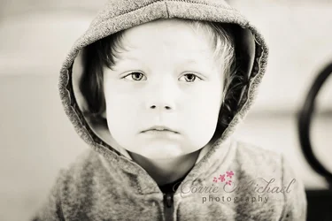
The child looks bored out of his mind. The horizontal composition, which directly causes his head to be lopped off, and which also directly leads to the the inclusion of dead space on the left, and that odd background element on the right, is just killing this as a good photo. I do not mind the child's expression at all...it looks very real, very genuine, very true-to-life. But the camera handling looks very unstudied, shall we say. And the logo, with the frilly script and the pink flowers...ugh...the logo and its tenor and color and girly-ness all combined,together, well all of that annoyance just "blows up" the reality of the shot...the pink flowers and the white script overlayed on a somber monotone rendering...ouch...it makes it almost ALL about "you", and not about the subject of the photo.