A Long walk down a Village.

Jasii

No longer a newbie, moving up!
Joined
Jun 17, 2015
Messages
470
Reaction score
171
Location
Dharamsala, Himachal Pradesh, India.
Can others edit my Photos
Photos OK to edit
My long drives have always been rejuvenating, this one followed by a trek down a hill to this village was not any different and even more rewarding, sharing the moments with all you lovely folks here. As always oodles of critique would be graciously and well received. All these were made with the Canon 600D and with the 18-55 kit lens.
Thank you folks for your time,
Cheers,
Jasii

1. This was the first view as I plodded downhill.
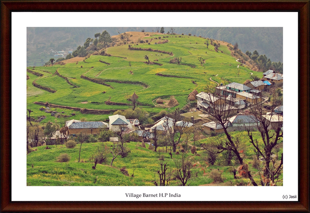
Village Barnet by jasiiboss, on Flickr

2. The sky was overcast and the cloud cover thick over the majestic lower Himalayas, waited for the cover to lift and this was the best it got. The mustard fields in the FG were just the right condiments for this shot.
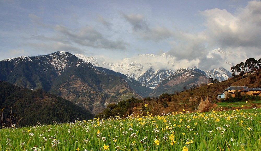
IMG_8754 by jasiiboss, on Flickr

3. There was this paved pathway that I thought would provide some leading lines.......
In the front is the village headman spinning yarn from sheep wool that go into making some incredibly warm Jackets.
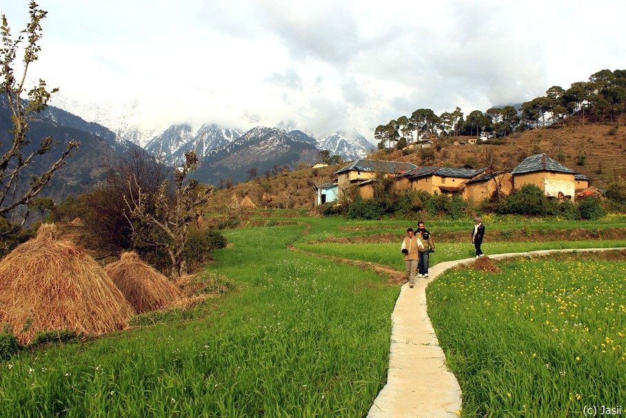
the path by jasiiboss, on Flickr

4. Adios my friend , do visit again is what this buxom lady appeared to say :)
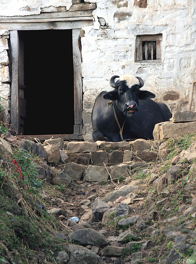
Hello there by jasiiboss, on Flickr
 
Last edited:
For me I like #2 the best, 2 and 3 are taken only a few metres apart but look totally different, I think the path in #3
is the problem as it leads you straight out of the image. #4 is good, reminds me of all the images you see of people sitting outside their homes watching the world go by, I would have cropped it to square format to just below the row of stones as there is nothing interesting in the foreground.
Thanks a ton Carl. Yep! you are right about the line leading the eyes out of the pic and will give the square crop treatment to No 4.
Jasii
 
C&C:
1. I really like this, but then I'm a sucker for this sort of scene. I like the composition and overall feel of the image; I can't help wondering if prehaps the greens couldn't be punch up just a tiny bit though.
2. Very "A sound of music"; I'm not sure I think I'd like it even better if the buildings image right went away. Again a very nice composition with the angles of the background hills complementing the foreground angle.
3. Hmmmm.... the paths do work as leading lines, but to be honest, it's just not holding my interest.
4. Nice hatrack she's got! I think some careful work with highlights and the dodge & burn tools to bring more detail into the whites of the wall would make this image even stronger; a pity we can't get just a little sniff of detail inside the door way. This would be a great candidate for HDR.
 
The first shot is my favorite. The landscape is interesting, as is the distant village shown upper left corner. These do not look sharp and clear on TPF; perhaps the original images are too large, and they are suffering from down-rezzing algorithms from Flickr? The second and third images seem to have this soft look more so than 1 and 4. On #4, the cow, I think there is too much OOF foreground and too much bottom space allotted; I would re-crop that image somewhat. #2, with the mustard flowering, is not holding my attention, and the sky is somewhat light, which is I think the reason the eye wanders a bit. I agree with Tirediron about shot 3; lines are fine, but eye movement research shows that so-called leading lines really don't do much, and that the eye actually goes to strong points of interest, over and over and over, and I think that';s the issue here in this image: the points of interest are not nearly as strong, and as numerous, as in the first photo. Shot #1 is FILLED, just FILLED with interesting things, and they are pretty large in size! Compare the interesting things in shot #1 with the other images, 2 and 3, and it's clear why #1 is so strong. The cow is interesting, and shown BIG in the frame...but I think there are just too many rocks competing in the bottom area.
 
Thank you John, A BIG Thank you Derrel for aceeding to my request and giving me the detailed.
Would like to dwell on the points made in detail and revert. The prob is with 2 drinks, concentration is kinda difficult ;) hence, will do it tomorrow. :)
Cheers!
 
C&C:
1. I really like this, but then I'm a sucker for this sort of scene. I like the composition and overall feel of the image; I can't help wondering if prehaps the greens couldn't be punch up just a tiny bit though.
2. Very "A sound of music"; I'm not sure I think I'd like it even better if the buildings image right went away. Again a very nice composition with the angles of the background hills complementing the foreground angle.
3. Hmmmm.... the paths do work as leading lines, but to be honest, it's just not holding my interest.
4. Nice hatrack she's got! I think some careful work with highlights and the dodge & burn tools to bring more detail into the whites of the wall would make this image even stronger; a pity we can't get just a little sniff of detail inside the door way. This would be a great candidate for HDR.
Yes! I can think better and logically today :)
Most of these are mostly straight out of the cam as I am a moron as can be when we talk of editing.
The only edit tool on my pc is Photoscape. Will try to get the basics of PS/LR and maybe add the oomph factor.
Am throwing the pics open especially the last one to folks with nimble PP hands to give it a shot if they want.

Talking of PS the huge amt of help that is available out there looks kinda intimidating, Would appreciate if you could point me towards a learning resource that would help an abso rookie like me.
Rgds,
Jasii
 
its really worth learning to edit though in my opinion.
I really like 3
 
I'm not great at editing, but here's my version of #4.

I'm
cow1.jpg
 
Thanks a ton Shiela. Appreciate it for sure.
I see that you did a great job of removing that piece of red cloth. Like the way you added zing to the bg wall and the doorway too. I think the Lady could do with some more powdering up. :)

You decided to let the stony pathway as is and not crop it as others suggested?

Jasii
 
I like these, but then I'm quite fond of the Himalayas.

Images are not just composed with shapes, think about brightness and colour as well. You can use these to bring composition and contrast into your images. These are just my humble attempts to try to illustrate some ideas you may wish to explore.
I like the first image, but as others have said it needs a boost on the green. But don't be reaching for the saturation slider just yet. One way of giving more colour to an image is to give it a slight lift in brightness and a little shift in colour balance because adding colour contrast is as simple as adding other colours for the green to contrast against. So you can make it look more green just by adding more blue and yellow (and with this image removing a bit of the red).

mod-1.jpg


I like the second image, but think about brightness. I see a blue sky and wonder why the flowers are dull. You can use brightness here to add variation and contrast to the image. Brightness makes people happy and it draws the eye. By making the foreground bright you can add depth because it stands out and your eye is drawn to it before being led into the rest of the picture. By keeping the levels of brightness more uniform across an image they tend to appear flatter.

mod-2.jpg


I like the cow, but here think of ways that you can separate it from the background and make it more visible. One way of doing this is to give the cow a slight boost in contrast while keeping the wall relatively flatter in contrast. If you boost the contrast on the wall then it's shapes textures and patterns compete for you attention and the cow becomes less visible.
Most important though is making both eyes more visible. Eyes are very magnetic in images and two are a lot better than one.

mod-3.jpg


Hope the above is of some help.
 
Last edited:
Thank you Derrel for your views. Gracias bro........... :)

The first shot is my favorite. The landscape is interesting, as is the distant village shown upper left corner. These do not look sharp and clear on TPF; perhaps the original images are too large, and they are suffering from down-rezzing algorithms from Flickr?
Ummmm...... Let me go back and see if I did shoot in raw and try and post a link.

The second and third images seem to have this soft look more so than 1 and 4.
OK I get the point.

On #4, the cow, I think there is too much OOF foreground and too much bottom space allotted; I would re-crop that image somewhat.
I kept the FG as that was the path leading to the subject. Tim has done a crop with his edit, tell me if that looks better.

#2, with the mustard flowering, is not holding my attention, and the sky is somewhat light, which is I think the reason the eye wanders a bit.
Yep! The conditions were heavy and overcast, but I still hold the view that the mustard fields look kinda nice ;)

I agree with Tirediron about shot 3; lines are fine, but eye movement research shows that so-called leading lines really don't do much, and that the eye actually goes to strong points of interest, over and over and over, and I think that';s the issue here in this image: the points of interest are not nearly as strong, and as numerous, as in the first photo.
Agree in toto.

Shot #1 is FILLED, just FILLED with interesting things, and they are pretty large in size! Compare the interesting things in shot #1 with the other images, 2 and 3, and it's clear why #1 is so strong. The cow is interesting, and shown BIG in the frame...but I think there are just too many rocks competing in the bottom area.
 
I like these, but then I'm quite fond of the Himalayas.

Images are not just composed with shapes, think about brightness and colour as well. You can use these to bring composition and contrast into your images. These are just my humble attempts to try to illustrate some ideas you may wish to explore.
I like the first image, but as others have said it needs a boost on the green. But don't be reaching for the saturation slider just yet. One way of giving more colour to an image is to give it a slight lift in brightness and a little shift in colour balance because adding colour contrast is as simple as adding other colours for the green to contrast against. So you can make it look more green just by adding more blue and yellow (and with this image removing a bit of the red).

View attachment 106425

I like the second image, but think about brightness. I see a blue sky and wonder why the flowers are dull. You can use brightness here to add variation and contrast to the image. Brightness makes people happy and it draws the eye. By making the foreground bright you can add depth because it stands out and your eye is drawn to it before being led into the rest of the picture. By keeping the levels of brightness more uniform across an image they tend to appear flatter.

View attachment 106426

I like the cow, but here think of ways that you can separate it from the background and make it more visible. One way of doing this is to give the cow a slight boost in contrast while keeping the wall relatively flatter in contrast. If you boost the contrast on the wall then it's shapes textures and patterns compete for you attention and the cow becomes less visible.
Most important though is making both eyes more visible. Eyes are very magnetic in images and two are a lot better than one.

View attachment 106427

Hope the above is of some help.

Thanks a Ton Tim. Loved the way you put across your mindset in such lovely non-intrusive manner. :icon_salut:
Would love to keep hearing from you.
Rgds,
Jasii.
 

Most reactions

Back
Top