What's new

A portrait of Honest Abe

crimbfighter

Been spending a lot of time on here!
Joined
Jun 4, 2010
Messages
2,219
Reaction score
1,784
Location
Wisconsin, United States
Can others edit my Photos
Photos OK to edit
I couldn't decide if this belonged in the B&W forum, or the macro. But then I thought there weren't enough bugs in it to be in the macro forum... :er:

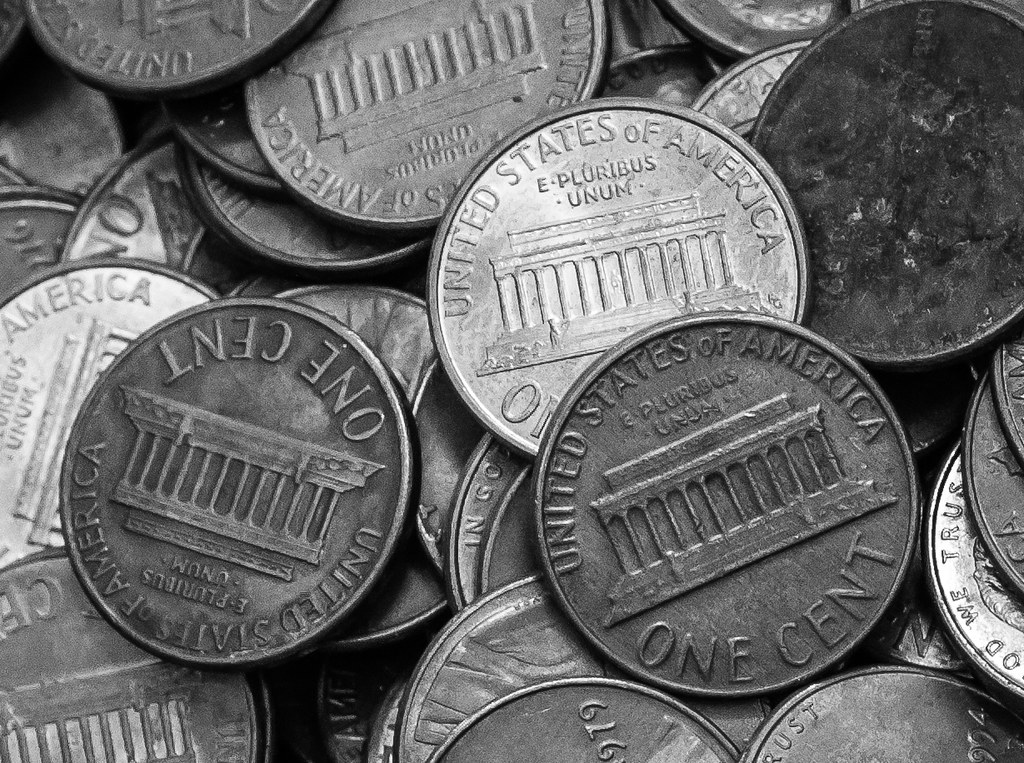
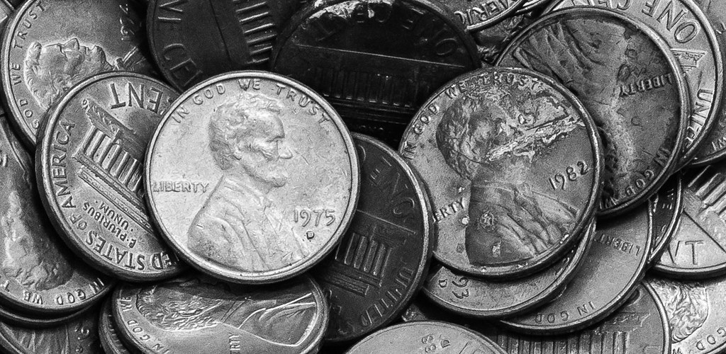
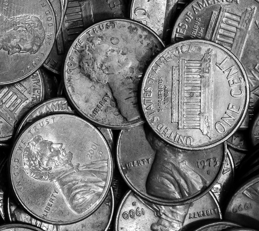
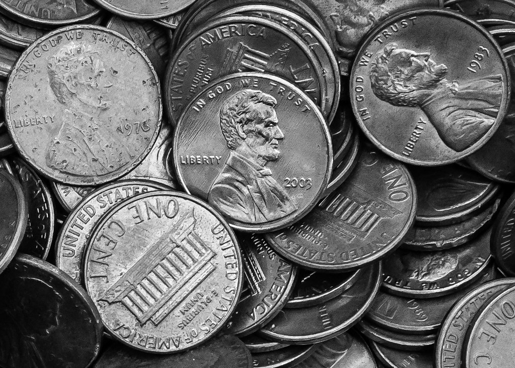
Anywho, I was counting out my giant change jar (trying to squeeze out the few extra bucks to pick up a new lens), and when I had all the coins separated into piles, I thought it might be a good opportunity to challenge myself and see what I could come up with.. I tried to focus on finding compositions that highlighted the textures, as well as one coin, for one reason or another, amongst the many. Here were my best efforts. All shot with my 50mm f/1.4 @ f/10. These were also all about 100% crops from the originals.

In order of what I thought were the strongest to the weakest. Thoughts and C&C appreciated!

1.
10413326694_df42c61736_b.jpg


2.
10413346915_15a81f3107_b.jpg


3.
10413328384_5987404ff8_b.jpg


4.
10413345276_3ed1119ebe_b.jpg
 
I like all of them. Great tones. I think you succeeded, your pictures look nice. Good "stock" photography in any case.
 
Would you mind if I use #1 for my wallpaper ?
 
Would you mind if I use #1 for my wallpaper ?

Thanks for the comment! By all means, use it away. If you PM me your email address I can send you a slightly higher resolution copy.
 
I like concept a lot, I really like the idea and the execution of the first one which is the best in my opinion. My only gripe is that I wish only the one in the center was facing up, I wish all the others were tails up.
 
I like concept a lot, I really like the idea and the execution of the first one which is the best in my opinion. My only gripe is that I wish only the one in the center was facing up, I wish all the others were tails up.

Thanks, Shipman! Appreciate the comment. I agree, I think it would have helped isolate the upright Abe. I tried a couple times to stage the pennies, but it somehow always detracted from the visual appeal. Each time I was able tell they were staged, and somehow only the random organization created by dumping the pennies in a pile created the visual interest..
 
That makes complete sense. I could see how when you put it together like that it seems so obviously set up that it ruins the photo. If only you could have dumped them out and had them fall perfectly lol.
 
Really neat stuff, crimbfighter! It's a refreshing set.
 
Cool set. IMO, the first one is far and away the best, as that center penny really draws the eye in a way that doesn't happen with the others. How did you light these?
 
Really neat stuff, crimbfighter! It's a refreshing set.

Cool set. IMO, the first one is far and away the best, as that center penny really draws the eye in a way that doesn't happen with the others. How did you light these?

Thanks for the compliments! cynicaster, I couldn't agree more. I got lucky on that one, because the penny had just the right shine to the finish, and was at just the right angle to the camera to reflect light straight at the sensor, making it stand out. Lighting was just natural light, coming in through a glass patio door. The camera was pointed straight at the floor, and the patio door was about 10 feet away, so I guess you could say the main light source was at 90 deg, directly above the subject. I also got lucky because it was overcast outside, so the light coming in was already diffused, plus my apartment has high vaulted ceilings with white walls, diffusing the light even more. I was using exposure times between 1.5 and 2 seconds.
 
P.S. I cashed in all the change at the bank today, got $327 for it! 85mm f/1.8, here I come! :thumbup: :bounce:
 
I'm not really interested by this kind of photography, but as it seems there is more money in the first one, I select it :mrgreen:
 
Maybe because I am a bit cranky this morning, but for me the glare was too great in the first image. Perhaps this is a bit too "darkened." I did sharpen a bit more as well.

$10456897585_7914c97514_o.webp
 
I'm not really interested by this kind of photography, but as it seems there is more money in the first one, I select it :mrgreen:

Can't argue with that logic! :lol:

Maybe because I am a bit cranky this morning, but for me the glare was too great in the first image. Perhaps this is a bit too "darkened." I did sharpen a bit more as well.

View attachment 58791

One should never let one's morning crankiness drive one's photo editing! Though I agree it could use a touch more sharpening, I think the darker edit changes what I was going for. I liked the sheen on the penny in the middle specifically because it made that one stand out, giving the frame a focal point. But, as with anything, that's only through my eyes. Thanks for the feedback, and giving it a different edit to think about!
 

Create an account or login to comment

You must be a member in order to leave a comment

Create account

Create an account on our community. It's easy!

Log in

Already have an account? Log in here.

New Topics

Back
Top Bottom