What's new

A Potpourri

Every single one is luscious. Each photo has wonderful textures, colors, balance, and composition.
 
First post on this forum, but here goes.

1) I don't like the picture all that much. I DO like the way the water looks - very green and viscous with the miniature bubbles formed from the undulating waves. Aesthetically, I really like the look of it. But the sewage crate, ehh.

2) Really great, more than just an "at a glance" photo. Pulls you in to notice more details each second more you look at it.

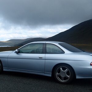
3) Doesn't do much for me. Only points of interest were the chrome features, which clash (IMO) with the sort of matte paint finish on the car.

 
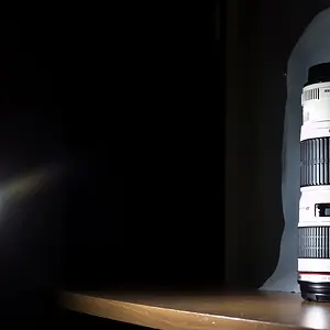
Good stuff. Was it your intention to split #1 into a 2/3rds sharp 1/3rds blurry composition, because I think that is really neat. Took me a minute to 'get it'. The picture wouldn't be as good if it was all sharp.

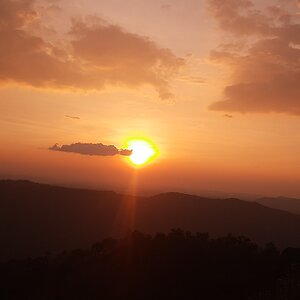
#2 is wonderful. It's pretty easy to make good compositions with lines and shapes, etc. It's all pretty straightforward. But balancing a picture with different elements is kind of a nebulous, gray area. The picture illustrates the concept pretty well. Honestly I would not be surprised to see it in a book as an example of asymmetrical balance.

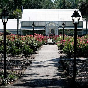
#3 would be better if there was more separation. So, yeah, less depth of field. :thumbup:
 

Create an account or login to comment

You must be a member in order to leave a comment

Create account

Create an account on our community. It's easy!

Log in

Already have an account? Log in here.

New Topics

Back
Top Bottom