What's new

Abstract...ish, Part 1 for C&C

Joined
Oct 4, 2011
Messages
10,726
Reaction score
5,468
Location
The Beautiful Hills of East Tennessee
Can others edit my Photos
Photos OK to edit
Normally, this first part is where I tell my little stories about what led me to take these photos and explanations of why they are the way they are or what I see that's wrong with them.
I have ALL of those things for these photos--but instead, I'm just gonna post 'em and let you have at it. No explanations, no apologies. Though I'm sure I'll add them later. :D

This is Part 1; I'll add a second thread for the remaining photos--a few others are also up on my Flickr page.

#1
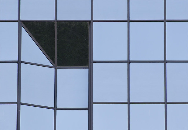
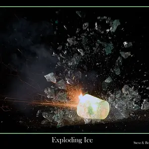
abstract_0016web by sm4him, on Flickr#2


#2
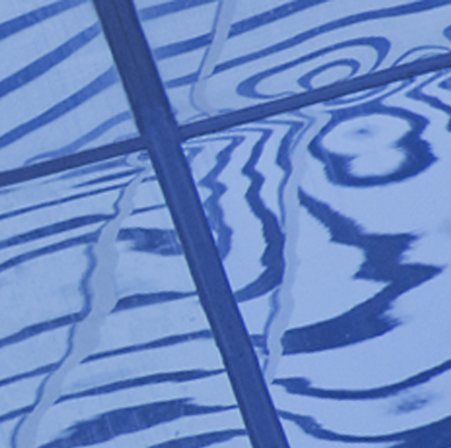
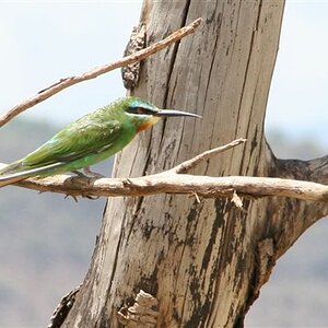
abstract_0008cropweb by sm4him, on Flickr


#3
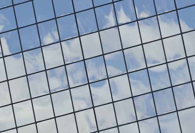
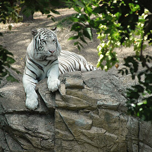
abstract_0024web by sm4him, on Flickr


#4
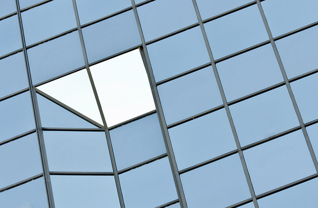
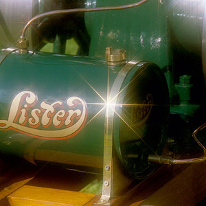
abstract_0025web by sm4him, on Flickr

Your comments will be greatly appreciated! (Except for the ones that aren't, but you'll never know which ones are which!) :D
 
#3 makes me pleasantly dizzy :) I know what it is, but my brain is still saying, "Yeah, but it could be..."
 
The first and last are interesting, and similar, and my objection to both is that the area that's relatively light in 4 and dark in 1 looks kind of like an arrow, but it's pointing out of the frame, which makes these seem unbalanced, at least to me. I like the look of the first better, so if you have one with a little more on the left, and you could "clean up" the dark area a little to remove some small spots, I think it would work really well.

The others don't do much for me. #2 is the more interesting of the two, but it seems to be missing something, I'm not sure what, perhaps the darker areas need to be darker and the lighter areas cleaned up a bit, I don't know.
 
  • Thread Starter 🔹
  • Moderator 🛠️
  • #4
#3 makes me pleasantly dizzy :) I know what it is, but my brain is still saying, "Yeah, but it could be..."

Thanks, jowens! Dizzy isn't precisely what I was going for, but at least it's a pleasant dizzy! :lol:

The first and last are interesting, and similar, and my objection to both is that the area that's relatively light in 4 and dark in 1 looks kind of like an arrow, but it's pointing out of the frame, which makes these seem unbalanced, at least to me. I like the look of the first better, so if you have one with a little more on the left, and you could "clean up" the dark area a little to remove some small spots, I think it would work really well.

The others don't do much for me. #2 is the more interesting of the two, but it seems to be missing something, I'm not sure what, perhaps the darker areas need to be darker and the lighter areas cleaned up a bit, I don't know.

Thanks, KenC, some good thoughts there. I have plenty of other shots with that "arrow" area--plus, the building's not going anywhere if I wanted to reshoot (and it's just about a block from where I work). Unfortunately though, that area is right at the edge of the building so there's no way (at least, no way I've figured out so far) to get the "arrow" pointed in instead of out.
 
Numbers 3 and 4 are the stronger images of the set, but both need much more contrast and saturation in my opinion. In addition, #4 would probably benefit from a horizontal flip for a better flow, which might or might not address the balance issue mentioned by Ken.
 

Create an account or login to comment

You must be a member in order to leave a comment

Create account

Create an account on our community. It's easy!

Log in

Already have an account? Log in here.

Back
Top Bottom