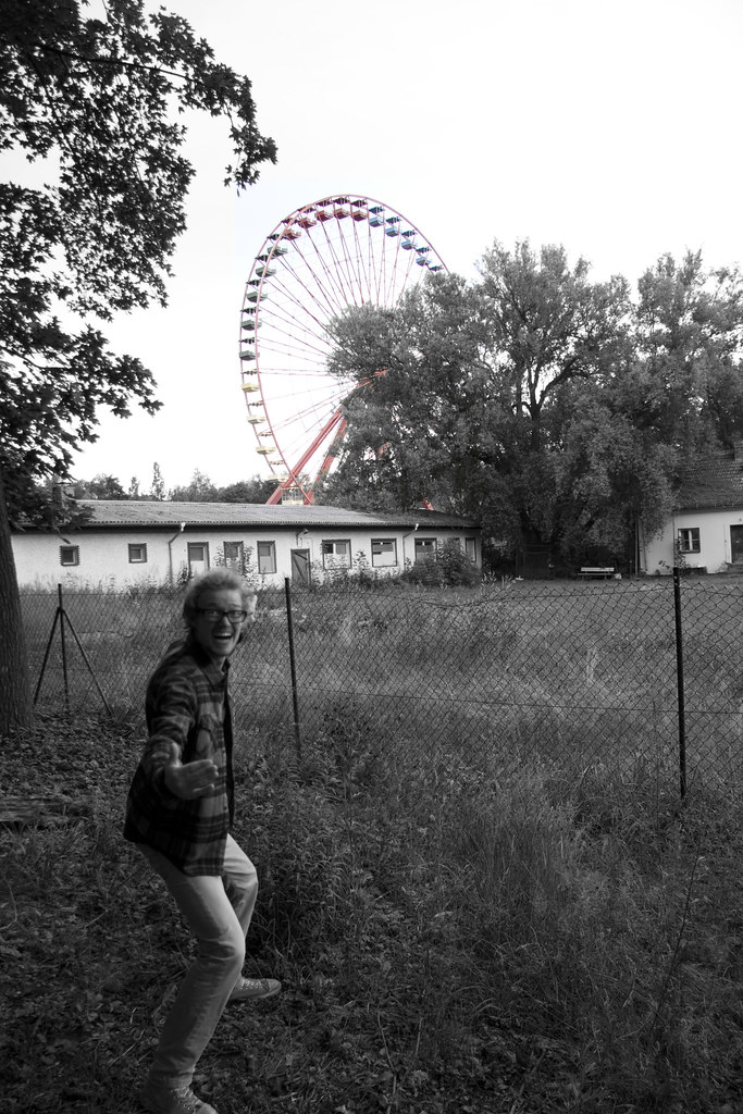
Most people here are probably not going to like the selective coloring. People mostly think it's tacky. I've only ever seen a couple instances where I've actually liked it, and I think in your photos, it'd look better without. Just go B&W.
#1 - The crazy dude (If it's you, sorry!) kinda puts me off on this one. I think it'd look better without him there. Also, the focal point of the photo (the ferris wheel) is smack dab in the middle of the frame. I would put it off to the right slightly.
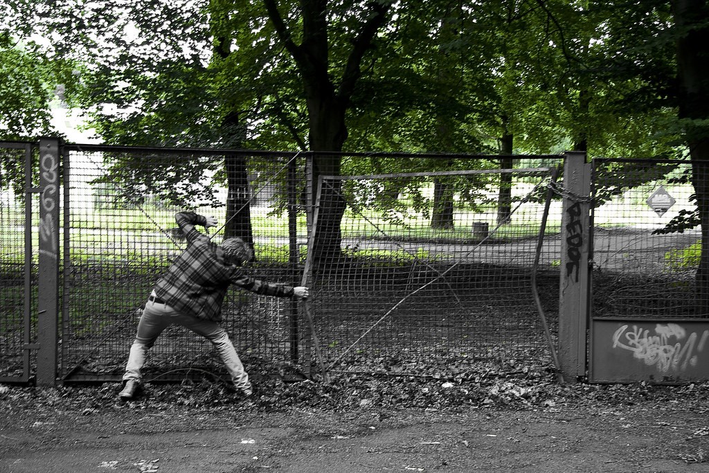
#2 - Again, this might be a better shot without the guy there. Also, because of that dark ceiling, or whatever it is in the middle of the frame, it almost looks like two seperate photos and it pretty distracting. Re-composed, and maybe re-evaluating the exposure, I think that would be an awesome subject to shoot though.
#3 - Probably my second favorite of the bunch. I like the humor in this one. The guy isn't as distracting, and it is kinda funny. Without the guy, this would be a boring shot. With him, it gives some interest and gives the feel of some action also.
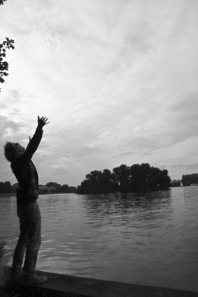
#4 - I think I like this one the best. But, make sure your horizons are level. I would have also moved the guy a little away from the edge of the frame. Some would say there's too much negative space , but I think that adds to the shot in this case.
In all of them, try removing the selective coloring and going just B&W. Good work!

")


