
mrca
No longer a newbie, moving up!
- Joined
- Mar 13, 2018
- Messages
- 872
- Reaction score
- 280
- Can others edit my Photos
- Photos NOT OK to edit
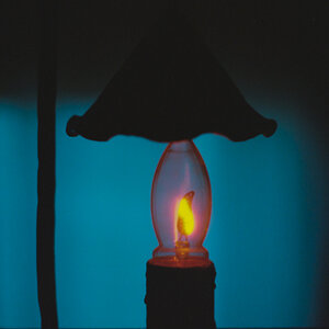
I thought would post an example of the sharpness and micro contrast you get when you couple a nikon d850 with a zeiss lens, here a 100 mm makro planar. I was getting ready to update a profile shot because I lost 51 lbs for a bodybuilding show 2 weeks ago and I don't look like what I did at 203 lbs now at 152. I realized my 25 yr old MF film Mamiya which has exceeded my d 700 in tonal transitions and resolution til I started shooting the d850 with Zeiss glass. It reminded me of the graveyard scene in Hamlet where he looks into the empty eye sockets of the skull of dead Yorick, a jester who gave him much enjoyment in his youth. It is Shakespeare's commentary on our morality and this shot is the same but refers also to the obsolescence of our cameras. Often in 3-5 years, digital camera's are obsolete. Here, I am looking into the one eye of the camera, remembering the joy it brought me but now, it has less usage than before, having been moved to obsolete. This is a 7 light source shot, 5 lights and 2 reflectors. The last was a bear lining up because I shot this alone and getting the rim light on the already lit profile and the top of the lens barrel to convey what the surface feels like with the specular highlight edge transition and and still getting the bead of light on the profile was difficult with me not being able to see what I was adjusting. Note the incredible detail on the texture of the sides of the camera created by skimming the main light across it as rendered by the camera lens combo. But for those who know the wonderful finish on those older lenses, not the plastic crap we get from china now, oh, and the zeiss lenses are metal bodied and have that same tactile experience, specular edge transfer tells you what a surface feels like, what it's surface efficiency is. Look at the reflection of a flashlight on a shiny car with black paint, immediate, hard edge between highlight and black. Shine it on suede, a wider highlight edge transfer. Oh, the image just took best in show
 in a local photo competition.
")
![[No title]](/data/xfmg/thumbnail/41/41759-f0f73c457ebcb6dabcbddc7a3c000487.jpg?1619739884)


![[No title]](/data/xfmg/thumbnail/42/42397-30faa170de7ed9be38adf00b9b26a220.jpg?1619740167)

![[No title]](/data/xfmg/thumbnail/42/42456-a5a32b76e115de404d99d09173cd71f2.jpg?1619740191)