Alexa MMA Shoot

DGMPhotography

Been spending a lot of time on here!
Joined
Mar 23, 2012
Messages
3,160
Reaction score
718
Can others edit my Photos
Photos OK to edit
Hello!

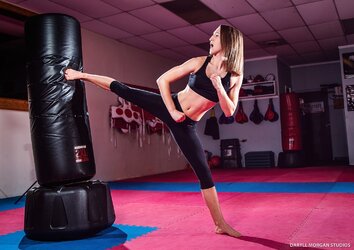
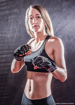
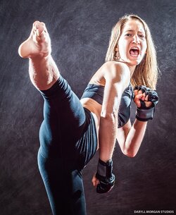
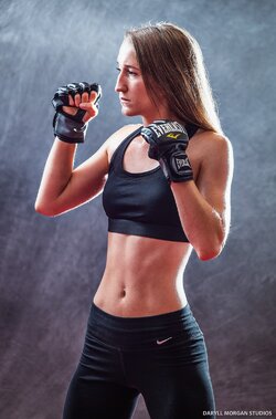
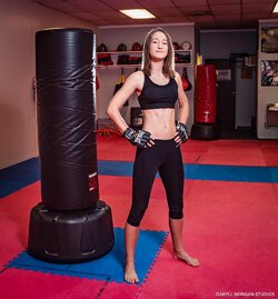
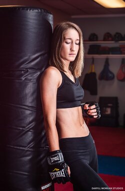
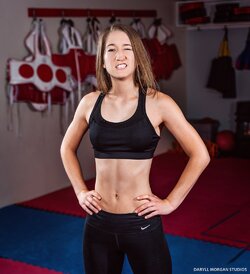
Here are shots from my recent MMA themed shoot with Alexa. Her background is specifically in Tae Kwon Do, but we experimented with different styles for this shoot. Thoughts and comments appreciated.

1 Alexa Oswald MMA Portraits - Daryll Morgan Studios-1.jpg test shot we ended up liking :)
2Alexa Oswald MMA Portraits - Daryll Morgan Studios-2.jpg
3Alexa Oswald MMA Portraits - Daryll Morgan Studios-3.jpg
4Alexa Oswald MMA Portraits - Daryll Morgan Studios-9.jpg
5Alexa Oswald MMA Portraits - Daryll Morgan Studios-13.jpg
6Alexa Oswald MMA Portraits - Daryll Morgan Studios-15.jpg
7Alexa Oswald MMA Portraits - Daryll Morgan Studios-17.jpg
8Alexa Oswald MMA Portraits - Daryll Morgan Studios-18.jpg
9Alexa Oswald MMA Portraits - Daryll Morgan Studios-21.jpg 10Alexa Oswald MMA Portraits - Daryll Morgan Studios-21b.jpg (removed the light in the top-right, thoughts?)
11Alexa Oswald MMA Portraits - Daryll Morgan Studios-25.jpg
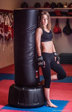
12Alexa Oswald MMA Portraits - Daryll Morgan Studios-27.jpg

Thanks!
 
**Caveat: What I know about MMA could be written on the head of a pin with lots of room left over for the Lord's Prayer!**

#1 needs to go; the expression is just plain odd. #s 2 & 3 are nice; the lighting in #3 especially is lovely. #s 4, 5, and 6 are more what I would expect in terms of MMA; something with a grittier, sharper feel. The remainder of the set are nice enough images, but they make her look like an attractive, fit and in the last couple even demure young lady. This does NOT seem to me to be the intent of an MMA shoot.

Some other, random thoughts: The background is too bright, and too distracting with all the various bits and pieces; I get the idea of using to set the scene, but I think a bit less of it. By way of example (and recognizing this is not a finished image, just a similar one I had handy for the sake of an exemplar):
_DSC1648_KRISTA_WEB.jpg


I also think you really need to get control of your lights; the highlights are really intense in some of these, and while a large shadow/highlight ratio is desirable here, blown highlights rarely are...

Thanks for the feedback! I don't like the blown highlights on #5, but I thought the rest turned out okay.

Not sure if "MMA shoot" is the right terminology here. Maybe more-so mma-inspired portraits.

I agree that #4 suits the theme very well, but for whatever reason, the model unfortunately does not like that one :( Oddly enough, her favorite is #1! :D

Thoughts on removing the light for 9/10?

As for the background, I too, was not sure about including the environment which is why I brought my backdrop for a couple. But I've been trying to move away from doing all my shoots on a backdrop.
 
Gotta see these On a computer to give mucho feedback. But she likes number one? Ha
 
Gotta see these On a computer to give mucho feedback. But she likes number one? Ha

Yep haha. I realize it's a silly one. I certainly wouldn't include it in any sort of portfolio, but I suppose she likes the character of it :)
 
I think #1 is a case where you need to put on your big-boy pants and tell her "No!" (Honestly, IMO, she should never have even seen it...). It's fine if she likes it, but it makes her look like she's got dentures stuck together with toffee! As far as the background, I think it's great to use the gym, but just really tone down the lighting; just make it a suggestion. I think too, that the ring, or weights or something a little more distinctly "MMA-like" would have helped.
 
RE-the removed the light shot...I actually prefer the light included in the shot, since it give the impression of being a light source that might have done some highlighting.

AN observation about your background, which I have seen now in two different sets; compare shots 4,5, and 6 and compare the texture that the background shows against shot #3, the one with the gel added to the background. The difference is that in shot #3 the backdrop is smooth and is just a color wash, whereas in 4,5,and 6 the background is very obviously "there",and in my opinion, a bit in-competition with the person for visual attention. Carrying this a bit farther, shots 4 and 5 show, to my eye, a distracting level of detail of the fabric, while shot #6 has less detail, and looks better. Just an observation, but I've seen this backdrop in two sets within the past week, and I think that might be the biggest issue I see.

As far as this MMA-type stuff...I love MMA...have you seen the Lightroom presets called Ultimate Fighter, in strengths 1,2, and 3? I really LIKE Ultimate Fighter, and often use it as the basis for a multistep B&W conversion...it's very interesting on hard-edged light and shadow portraiture, and as I said, I use it fairly often, typically with one or two other things also done to an image. I think Ultimate Fighter would look good on shots 4,5,and 6, or some other type of bold, dramatic processing "look".
 
I agree with both you and John on all your feedback! Definitely some things to keep in mind for future shoots.

As for the background, #3 is actually photoshopped, not sure if you could tell, but probably a good thing if you couldn't :)

I'm not a huge fan of using presets, but I can look into them.
 
I think #1 is a case where you need to put on your big-boy pants and tell her "No!" (Honestly, IMO, she should never have even seen it...). It's fine if she likes it, but it makes her look like she's got dentures stuck together with toffee!

I, respectfully, but quite strongly, disagree with this.

From a traditional sense it’s an unappealing expression. But a portrait is supposed to show more than just what someone looks like. A good portrait allows you to see someone’s personality and learn something about them.

This facial expression gives me a very good idea of what her personality type is, and makes the entire set much more appealing to me than it would be without this photo.

Personally, it’s one of my favorites from the set because of the reasons I stated above.

I agree with the other comments on background and lighting, however.
 
I, respectfully, but quite strongly, disagree with this...
Fair enough! My reasoning is based on the stated intent of the shoot being "an MMA shoot" and the assumption from that, that the client would be using these to promote herself within that sport. From that standpoint, I stand by my statement as I do not believe that the expression is one which would benefit her; now, if all she wants to do is put it on a personal facebook page? Sure, no issue with that.

And that I agree with wholeheartedly.
 
Look into presets. They can be modified easily and saved and re-used. They are a huge efficiency booster.
 

Most reactions

New Topics

Back
Top