- Joined
- Jul 8, 2005
- Messages
- 45,747
- Reaction score
- 14,806
- Location
- Victoria, BC
- Website
- www.johnsphotography.ca
- Can others edit my Photos
- Photos OK to edit
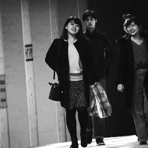
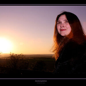
Had this young lady in the studio this afternoon; thoughts? Suggestions..

Follow along with the video below to see how to install our site as a web app on your home screen.

Note: This feature currently requires accessing the site using the built-in Safari browser.
Had this young lady in the studio this afternoon; thoughts? Suggestions..
Beautiful portrait! The lighting and color are just wonderful.
Thank you!Beautiful portrait! The lighting and color are just wonderful.
")
Thanks Alex!Great photo.
Thanks Rick; I liked that too; she was not a 'smiler', but I think this works well.Very nice John, I like her expression. Shows a bit of pride...
Thanks JC!Amazing quality
Thanks Mike! Poiint well taken on the hands; my feeling was that because of the light tan of the breeches, they weren't a big issue, but I think I'll do as Jason suggests and burn them in a bit. I do have other crops, but there's something about this one that makes it a keeper for me; we'll see if sales bear that out!Many good things, but in the name of constructive criticism, I don't like her hand that is holding the helmet. It's in a somewhat awkward position and we're seeing it at a bad angle. The worst part is that it's a very bright spot in a dark (low key) field, so it stands out quite a bit.
Hands are often one of the hardest things to pose well. What I try to do (when I remember to be cognoscente of the hands) is position them so that only the slim side of the hand is facing the camera.
As a test, I looked at this image with the bottom cropped off so that the hands and pants weren't visible...and it instantly became (IMO) a better portrait because he face stood out, without the distraction of the bright areas that were in the lower area.
I get that this is 'the outfit' and for her use, it's probably better to include the helmet and pants etc...but strictly as a portrait of her, I think it works better with keeping the whole thing low key.

Mehhh... it's all good! I always appreciate points from others.I get it but man, tough crowd.
Thanks Wade!Very nice! I agree about the hand, but still nice!
I did, but to be honest, I didn't like them as much. For whatever reason, it seemed to work best with less 'turn' than I would normally use.Very nice capture. The Dressage clothing benefits from the helmet as it's part of the outfit. Including the feet in the tall boots may have been good also. Did you try a pose with her at more of an angle to the camera?
Thanks Jason!very well done!
the hands dont bother me except that i might have preferred the fingers on her right hand laying flat against the helmet instead of curved. Any crop above the waist and the entire point of the outfit (and the shot) goes right out the window.
I think if you darkened up her right hand just a tad to match the left it would help a bit.
Fair enough; you're not the first person who's suggested I lean toward the 'too dark' in my studio work.for me is too dark, or i would see in more painted form - Rembrand's style
--------
no signature