What's new

Alum Sunrise - C&C Welcome

colnago1331

No longer a newbie, moving up!
Joined
Jan 2, 2013
Messages
214
Reaction score
72
Location
Columbus, Ohio
Can others edit my Photos
Photos NOT OK to edit
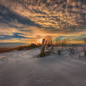
Don't know how I feel about this one, except I know I don't like the name. :D But then, I'm not much for naming my photos.....

Alum+Fog.jpg
 
Pretty misty sunrise on the water. My eye is drawn to the right, toward the sun.
 
I think I like this second version better.....

Alum+Fog+2.jpg
 
I like the first one a lot more. The second comes off as a bit oversaturated. The first one seems more realistic to me.
 
I like the first one. The edited one looks like there's a chemical spill and the orange gas is leaking everywhere. First one is calming.

I also wonder what this would look like in black and white?
 
I like the first one a lot more. The second comes off as a bit oversaturated. The first one seems more realistic to me.

I like the first one. The edited one looks like there's a chemical spill and the orange gas is leaking everywhere. First one is calming.

Ha! It does look a bit like that. The only thing I'd say in response is that that is, honestly, what the scene looked like. Perhaps slightly less orange, but it was a very bright yellow/orange scene, and I'm thinking that's why I may prefer the second version. I'll work on toning it down later and see where that takes me.

Thanks, everyone, for the input!
 
I like the first one better as well; for the colors but also the composition. It's more 1/3 than the second one. About the saturation, you could try something in between ? :wink:
 
What the poster above said.

The 1st one's a bit faded for me, 2nd one a bit too saturated.

Something in between would be nice to see!

cheers!
 
I do like the first one a little more too.
Great shot BTW

Sent from my DROID RAZR HD using Tapatalk
 
I don't know about this 3rd version... It seems the orange is less staurated than on the first one.
 
What the poster above said.

The 1st one's a bit faded for me, 2nd one a bit too saturated.

Something in between would be nice to see!

cheers!

Agreed, somewhere in the middle with a warm tone, but still able to see some of the orange/yellow.
 
Okay, fourth try. More orange than 3; less orange than 2. :D

Alum+Fog+4.jpg
 

Create an account or login to comment

You must be a member in order to leave a comment

Create account

Create an account on our community. It's easy!

Log in

Already have an account? Log in here.

Back
Top Bottom