What's new

Amateur Photoshoot 12/13/12

xxWesxx

TPF Noob!
Joined
May 19, 2012
Messages
101
Reaction score
2
Location
Tennessee
Can others edit my Photos
Photos OK to edit
$_MG_5275.webp$_MG_5183.webp$_MG_5199.webp$IMG_5171.webp$IMG_5330.webp

Any suggestions on where to improve? :) Thanks guys! :)

-Wes
 

Attachments

  • $_MG_5068.webp
    $_MG_5068.webp
    202.7 KB · Views: 152
I would start with a better location...a MUCH better location.
not sure what you are doing for processing, but your colors and white balance change from picture to picture. did you desaturate some, and/or boost the contrast on others?

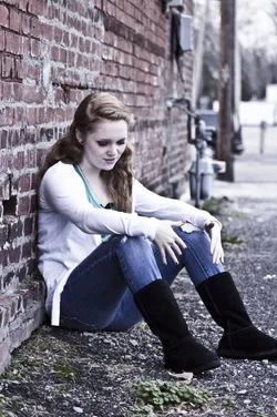
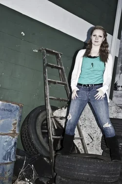
toss the one where she is standing on garbage. shadows are bad, colors washed out, and...well, shes standing on garbage.
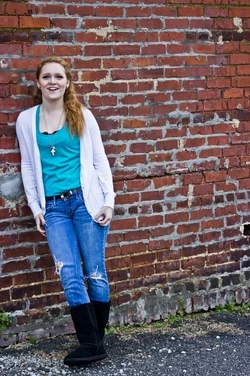
the brick wall shot could be decent with some better posing, and some fill light. and a nicer brick wall.
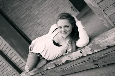
the shot where she is laying on the old wood deck(?) might be better in color. the B&W isnt very tonally good.
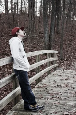
the shots all have horrible backgrounds that could have benefited from some larger aperture bokeh to drown out some of their awfulness. the guy on the bridge might have been an OK shot if he wasn't staring at some UFO's.
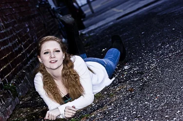
I like the pose where she is laying on the ground...but again, the location is a deal breaker for me.

on a positive note...you have a very pretty model, so make use of her.

 
Thanks for some Criticism. :D And the background I agree on. I was just looking for a more...i don't know i guess a grundgy shot? If that makes any since. I had alot of issues with it being pretty cloudy and dark outside so most of the time i had to use flash. I don't have a speed gun, And i try to lay off the ISO due to image nose. And the posing I usuaslly let them do on there own, im not very good at giving instructions on posing. But i can work on that! :D thanks guys
 
And contrast wise, i usually will raise the contrast on most of my images. Seems to give more of a sharpend, darker look to me.
 
1st image is my fav but I do wish the bg was less in focus, more bokeh, and I don't like the angle it was taken... same strange angle in the 3rd image.
 
Practice poseing your clients and giving them directions. Your the boss you control your shoot. Your client has no idea what your seeing in the viewfinder so they have no idea what looks good or not on your end. Poses 1-3 are ok by me but 4 bugges me not sure why. 5-6 just look awkward. Models dont know that since they can't see from your angle. Dont be afraid to ask them to adjust the angle of pose or plain change it if it looks off. I highly suggest investing in a speed light or two for days such as this and ptactice with it. The shadows with the pop up are way harsh in #5 I think it is. Biggest nit pick is the processing. The color shots don't look cohesive. Your model is in the same outfit in them all but the colors are all different values. Lost here as to direction to give there. As for your grunge shot get the concept you wanted but not seeing it. Location is too ummm bussy and messy makes it look like trash. Maybe try it again in a less bussy location with a similar feel to it. See what you get.
 
I hate silly angles personally. Some might like them I guess. But to me, any that are tilted are an insta-delete. It's not "cool" or "trendy" to hold your camera at funky angles...that's what people who have no idea how to shoot typically do and try to pass it off as "art".

Just my thoughts.
 
I can see what you are doing with the Dutch tilt, and it almost works int he first, but not the rest.

You mentioned "grunge." Part of composing a convincing photo is achieving synergy between the model and background. She doesn't "go" with the trash.
 
View attachment 28630

Any suggestions on where to improve? :) Thanks guys! :)

-Wes

More like this! B&W, SIMPLE composition, a fairly classic type of reclining pose, cute girl, direct eye contact. ON the third,fourth,and fifth photos, you have the girl wayyyyy too much off-center in the frame...that is not a really balanced or appealing "look"...in this photo, I think your shot has a little bit too much empty space to the right hand side of the frame, and also that the shot would have been better if you would have moved about two BIG steps to the left, and also used a bit less of the so-called "Dutch tilt". Still, even with some flaws, this shot is kind of what I think a person ought to strive for when photographing a young woman...a SIMPLE composition, with good eye contact, decent expression, and good post-processing of the image. This is a shot to be happy with!

It might not be a "great picture" in the grand scheme of things, but I personally think that based on the other shots I have seen, that this is a great picture of HER.
 
Thank you guys soo much for the help! Alot of your criticism is helping out alot. Im trying to become a professional photographer, But 1 photo at a time :)
 

Create an account or login to comment

You must be a member in order to leave a comment

Create account

Create an account on our community. It's easy!

Log in

Already have an account? Log in here.

Back
Top Bottom