American - Selective Color

SwissJ

TPF Noob!
Joined
Mar 29, 2010
Messages
243
Reaction score
1
Location
Brooklyn, NY
Can others edit my Photos
Photos OK to edit
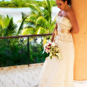
Opinions wanted... selective color... :thumbup: or :thumbdown:? C&C welcomed.

Edit
: Also see the b&w version below in post #8 and the color version in post #15 for comparison.


#1
4812805948_d340459874_b.jpg
 
Last edited:
Like most selective color shots (in my opinion) this just doesn't work. The people are the subject in this shot since they are the most in focus.

Then you compete for main subject by putting the entire image in black and white while keeping the flag in the background in color.

Just not a fan personally :-|
 
Well, I dunno...it's not too bad I suppose...the people are VERY interestingly arrayed. I really like the two gals who are taking the photo together on the left, and the woman and boy interaction with the hand-to-hand contact is nice, as is the woman primping her hair a bit. Fascinating people watching goin' on there. My main concern is the yellow and red flag colors, which look kind of weird. I think full color or complete monochrome would also work quite well. Not seeing those options, I'm reluctant to proclaim this selective color version a winner, cause it doesn't fully resonate with me, but it doesn't turn me off either, because the people are so good.
 
Thanks for all the comments so far.

The people are the subject in this shot since they are the most in focus.

Then you compete for main subject by putting the entire image in black and white while keeping the flag in the background in color.
I'd been staring at the image so long that I didn't consciously realize I was adding color to an out of focus element. Changes my perception a bit, though I'm not sure how much.

I feel like I don't know where to look, if that makes sense.
It does make sense. There's alot going on. I'd be curious to know where your eye spends most of it's time looking.

Well, I dunno...it's not too bad I suppose...the people are VERY interestingly arrayed. I really like the two gals who are taking the photo together on the left, and the woman and boy interaction with the hand-to-hand contact is nice, as is the woman primping her hair a bit. Fascinating people watching goin' on there. My main concern is the yellow and red flag colors, which look kind of weird. I think full color or complete monochrome would also work quite well. Not seeing those options, I'm reluctant to proclaim this selective color version a winner, cause it doesn't fully resonate with me, but it doesn't turn me off either, because the people are so good.
Thanks. I lucked out with the people, especially that high-five! I really don't like the full color version, but I'll post a monochrome version to compare.
 
Would be much better if the people in the forground were slightly OOF. So the scene still made some sense, but the subject and focus was much more apparent.
 
Here's a b&w version for comparison.

Sorry for adding another variable to the mix, but I re-cropped the image slightly... I thought there was too much space on the left. It bothered me that the woman's bag on the right was cut off, so to balance it, I cut off the woman's bag on the left as well... also, bringing the corner of the flag closer to the corner of the frame, and not chopping off the head of the guy on the billboard.

I like it better this way, but let me know what you all think.

#2
4815846200_e0ee8b989c_b.jpg
 
Honestly I was thinking more of:
4812805948d340459874b.jpg


Its just the rest is so much extra head space that I just keep finding myself wandering all over the image. Then again being in the city so often I find myself bored by the buildings to some degree and much prefer seeing the crazy people that live there.

I figured it wouldn't hurt to show you what I see in this shot :)

**Edit**
I just noticed I cropped far to close on the left, I cropped the original posted not the recropped one. There is supposed to be a bit more to the left.
 
selective color.......:p

IMHO selective color can be a very powerful technique but there has to be a reason for it's use. In your picture I'm not exactly sure what the purpose was. Like it was said above, the people are interesting but adding the American Flag doesn't really add to the story. Just curious what your reason behind bringing the flag to life was? What was the message that I was supposed to get? :hug::
 
Maybe if the flag were in focus and the people weren't... but since it's the other way around... I agree with amberl... I have to fight to keep my eyes focused on the flag because they want to go back down to the people... and then back to the flag because of the color...
Yeah, the focus is a problem. The eye does travel a lot, but I'm not sure how to avoid that in this kind of shot, cause there's just so much going on.

Would be much better if the people in the forground were slightly OOF. So the scene still made some sense, but the subject and focus was much more apparent.
I may try a shot like that to see how it looks, but unfortunately, I'll never get the same people again.
 
Honestly I was thinking more of:
4812805948d340459874b.jpg


Its just the rest is so much extra head space that I just keep finding myself wandering all over the image. Then again being in the city so often I find myself bored by the buildings to some degree and much prefer seeing the crazy people that live there.

I figured it wouldn't hurt to show you what I see in this shot :)
Thank you. I appreciate the crop. As much as I love the people, without the flag, it won't work with my intent. The flag is kinda important.

selective color.......:p

IMHO selective color can be a very powerful technique but there has to be a reason for it's use. In your picture I'm not exactly sure what the purpose was. Like it was said above, the people are interesting but adding the American Flag doesn't really add to the story. Just curious what your reason behind bringing the flag to life was? What was the message that I was supposed to get? :hug::
Thanks. The flag adds context... to who the people are and how they may or may not be related. That's about all I can really say about it.
 
I like your B&W much better than the selective color. I don't mind too much of the dead space it gives a feel to the location. Sorry Shmne I think your crop is too much.
 
I like your B&W much better than the selective color. I don't mind too much of the dead space it gives a feel to the location. Sorry Shmne I think your crop is too much.

I strongly disagree. I think shmne's crop captures the only interesting part of the picture. I would like to see the colour version.
 
Glad I posted this, cause although I knew nobody would like the selective color, I didn't think the overall image in general would get so much hate ;)

Anyway, for those who wanted to see, here's the full color version...

#3
4816648951_dc58070462_b.jpg
 

Most reactions

Back
Top