Hello, I'm new to photography
These are good: none of them really work well, which is good.* 1 and 2 are over-ambitious, which is good.* All of them attempt to impress the viewer, and be dynamic, and have impact, which is good. They all fall short in a good way*; a way that says "don't sweat the small stuff".
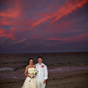
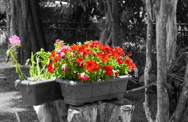
#1 In a world of monochrome, colour is wonderful. But the planter on the left is bedraggled, and the backdrop is ugly and chaotic. You could get much closer to the flowers and choose a better back drop.
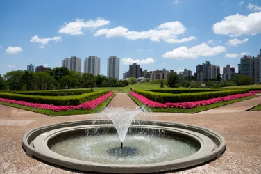
#2 as you know,
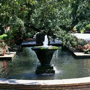
this one has a 'small' framing flaw, - or two, or three - and the horizon looks a little like it's running away from right to left. Exposures pretty good; maybe you could shoot several shots and one will have a more symmetrical water spout, (or
something), which looks more pleasing. You could zoom in, (or get closer), and frame the pond as a semi-circle. You could reframe and/or crop the image, omitting the 1 & 1/2 tower blocks to the right, and equalizing the amount of gravel/pavement either side of the pond.
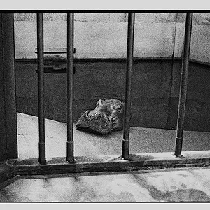
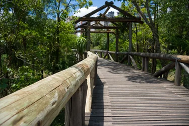
#3 Again, you see the bridge/gazebo thing is leaning ever slightly, and is too tightly cropped overhead by the top of the frame. With architecture and structures, if you are attempting leading angles and exact symmetry, it's best to set up the shot: use a tripod or some kind of level surface. Otherwise, you need to be experienced and/or use software to correct perspectives. Picture 3's big feature is wooden pole leading the eye out from the centre of the frame. Is it so deserving? Is it culturally significant? historic? immense? no, it's a pole! does it pass the "so what!" test? no. You can end up with tons of images like that clogging up your hard-drive that weren't worth the shutter actuation in the first place, other than as an exercise in leading-lines and being fun to shoot. Better to seek out a shot that informs the viewer: where does the bridge go to? where is the bridge situated? how big is the bridge compared to a person standing on it? - can that person be visually interesting and can they be photographed candidly or posed to be visually interesting. This is all the craft of what you want to be doing. At the very least, you are looking to photograph
light: shots 2 & 3, the light is fairly overhead and there are few or no shadows, (especially #2) that really add to the pictures. shoot earlier or later in the day and you'll have more interesting, directional light.
* - because you are an enthusiast, and it's important to remain enthusiastic.



![[No title]](/data/xfmg/thumbnail/35/35224-c14babe4157e05767660f47e7de82aef.jpg?1734166901)

![[No title]](/data/xfmg/thumbnail/39/39657-59afb9b38e439b33906e81e4952470ac.jpg?1734173973)