Anchorage Shoot CC please

RedWylder

TPF Noob!
Joined
Feb 14, 2011
Messages
255
Reaction score
24
Location
Alaska
Can others edit my Photos
Photos OK to edit
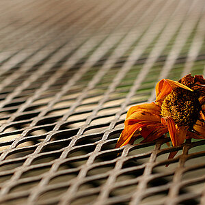
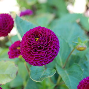
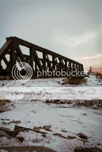
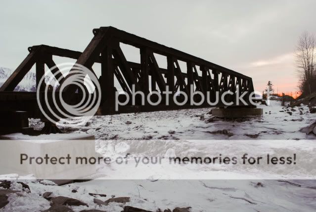
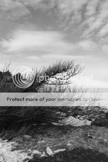
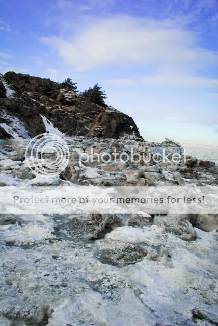
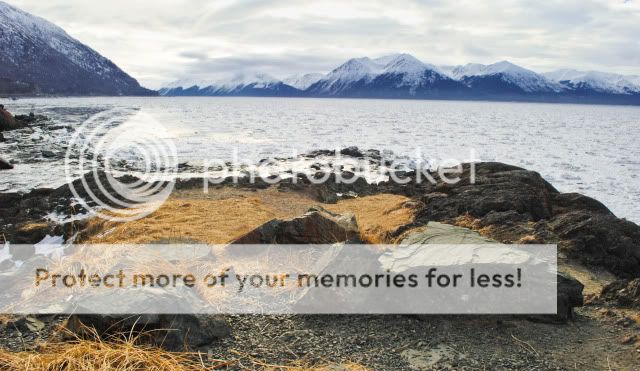
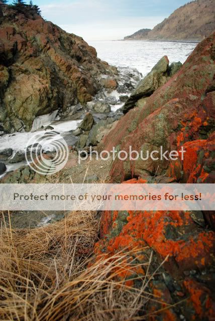
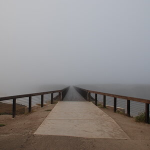
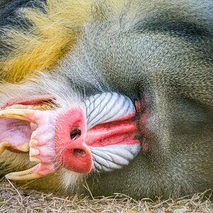
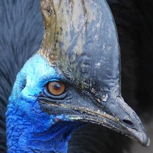
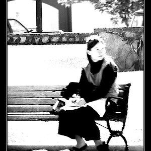
These pictures below are my most recent and I'm really trying to learn both landscape composition as well as editing. I could use some helpful advice on what to work on and how I might edit these pictures further.

1.
Ancedit.jpg


2.
Ancedit2.jpg


3.
Ancedit4.jpg


4.
Ancedit5.jpg


5.
Ancedit8.jpg


6.
Ancedit9.jpg


Thanks!
 
#2 in landscape mode works better for the bridge than #1 in portrait. Your subject fills the frame better and you don't have as much empty space sitting around doing nothing. I'd consider upping the exposure on both a little, though. They both seem awfully dark.

#3, people are going to tell you to fix the horizon, you're tilting down to the right. They'll also probably tell you to crop some of the sky out to get more of a "rule of thirds" layout.

#4 has the same kind of horizon tilt, only much more severe.

#5 has a slight tile, and there appears to be a halo just above the water over the right 75% of the picture (it could be low-lying fog, though, for all I can tell). There's also something going on that's going to be hard to describe - but I'll try. Look at the smoother water close to the near-shore on the left. Something's happening that's splitting this into two regions, the darker triangle on the left and the brighter stuff to the right. The fairly sharp line that separates them continues up into the mountains, and the 'brightness' seems to extend to the right edge of the picture. I don't know if this is an artifact or real, but I am finding it very distracting.

#6 I like best.
 
Thanks for the feed back! And I didn't notice the horizon tilts in 3 and 4 because the horizon is so tiny! I'll fix that for sure. 1 and 2 being dark... I agree! Once I put the pictures up on this white background the suddenly looked really dark. When I'm looking at these in lightroom, they are on a darker background and I thought they looked too bright and I actually darkened them on purpose so this is an easy fix.

#5--I can tell you exactly what the "tile effect" is! It took me a minute to figure out what you were talking about because the phenomenon is completely 100% natural. You're looking at a body of water that is completely frozen over except for that glossy section in the left. The chunkyness of the frozen part is because this body of water is effected by extreme tidal shifts. So the water underneath is constantly moving and breaking up the ice on top. You can see in the closer pictures what it looks like up close. As for the "halo effect" Im not sure where you mean. I don't know if knowing what it is makes it a better picture or not though. Is it less distracting when you know what it is and that it's supposed to look that way? If not....how would I fix this?
 
Firstly, for better critique, stick to one or two images per post. It's too convoluted to really get in-depth when there are so many images.

#1 & #2. I think that the horizontal composition works much better here. Your subject is the bridge and it's a long horizontal object, so it just works better in landscape orientation. The bridge is quite dark, and if that was on purpose, then you would probably be trying to use the shape of it as the 'subject' of your photo. It does have an interesting shape, with all the structural members...but I don't think that you perspective really takes full advantage of that. If you wanted to emphasize the texture of the bridge, then you would have had to expose for that. But the bigger problem in these shots, is the poor light. It does look to be near dusk, but the overcast sky gives a very flat light...and also looks bland in the photo. The bland light makes the landscape look bland...so when we put it all together, most of the image is bland sky and bland land, with a very dark bridge in the middle. The sky does have a bit of color near the horizon...but I don't think that it's enough to save the image.
Suggestions for improvement: Choose your subject and what you want to say about it...then expose for it and adjust your composition for it....and since you are working with natural light, shoot when that light is good...not when it's bad. The most interesting subjects can look bad when in terrible light...and the most boring of things can look interesting in great light.

#3. As mentioned, it's tilted. When water is on the horizon, you usually (always) want to level that horizon. It just looks unnatural when it looks like the ocean should be spilling out the side of your photo. I do agree that a crop would make it look better, but rather than crop the sky, I'd crop from the bottom. The most interesting parts of this image (to me) are the silhouetted branches and the clouds in the sky. So by cropping off the bottom, it would focal the viewer's attention on the best parts. I would like to see a bit more contrast between the sky and the clouds here though.

#4. Again, the horizon is tilted. If you have Photoshop, the easy way to fix this is to use the ruler (measure tool). Drag a line along the horizon, then go up to the menu and click on Image, then Rotate Canvas and choose arbitrary. The box will already be filled with the angle you need to rotate the image.
I'm not too excited by this one. It does have a somewhat interesting foreground, so maybe you could emphasize that by getting lower, or maybe including more of it in the frame. The foreground (especially the rocks) look underexposed. This does give more color to the sky, but hurts the fore & mid ground. This is a perfect case for a graduated filter, which would allow you to keep the sky from blowing out while exposing for the shadows on the land.

#5 & #6 are much, much better. In these shots you have a foreground, mid-ground and background. That allows the viewer to 'walk into the scene', so to speak.
#5 would have benefited from a grad filter as well, because you could have darkened the sky, really bringing out the drama in the clouds.
The red moss in #6 is fantastic and the diagonal line of the waterway leads the viewer past the rocks and out into the background. That's the type of thing that really makes a good landscape.

As for editing, I'd suggest trying to emulate what a grad filter can do. In other words, darken the sky and/or lighten the shadows in the foreground. Don't be afraid to boost the contrast and saturation when you think it will help. I don't think that a landscape photographer has to faithfully recreate the scene as they saw it....rather they are free to edit the photo in order to let the viewer see it how they want them to see it. You can help to guide the viewer's eye into a photo by darkening some parts and lightening others. (burning & dodging). This is a technique that has been used by photographers for a lot longer than any of us has been alive.
 
Thanks Mike! Wow tons of stuff to work on. I've tried the graduated filter thing but I didn't go very dramatic with it. I'm always so hesitant to go dramatic or be "untruthful" with my subject. I'll play with these photos a bit more and see what I can do with them.
 
... I'm always so hesitant to go dramatic or be "untruthful" with my subject. ....

We weren't there, so we have no way to know what the "truth" is. Go for the drama, unless you're a police photographer trying to document the crime scene. Give us the drama that your eye sees, even if the camera's a little lazy. Can't add much more than Big Mike already said, except that perhaps for the bridge getting closer would be better (ie, less bridge to see in the picture, but closer means that what we see is more dramatic...).
 
I will keep that in mind and try not to be so "timid" with my pictures. Thanks for all the advice!
 

Most reactions

Back
Top