Another Garden Engagement Session (11 images!)

AprilRamone

TPF Noob!
Joined
Nov 3, 2005
Messages
1,280
Reaction score
2
Location
Denver
Website
www.apriloharephotography.com
Can others edit my Photos
Photos OK to edit
I bet you guys feel like you've been to this location yourselves since I shoot there so much! :)
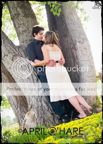
I'm working on getting more romantic shots during engagements and bringing out the love and emotion more. I feel I did better on this one than in the past, but cc is totally welcome!

1.)
Nick--Dani-C-BW.jpg


2.)
Nick--Dani-D-BW.jpg


3.) I don't know what my problem is, but tilted shots do not come naturally for me. So I am forcing myself to experiment more with it. Does this look weird?
Nick--Dani-A.jpg


4.)
NickDaniU.jpg


5.)
NickDaniS.jpg


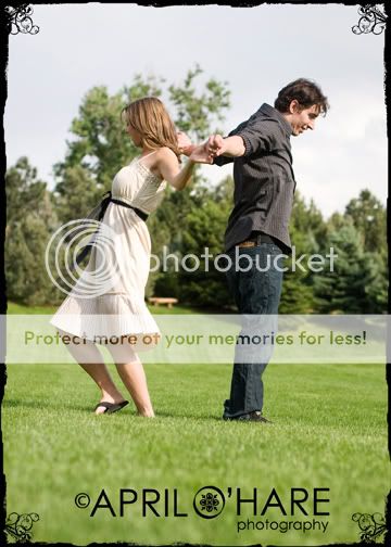
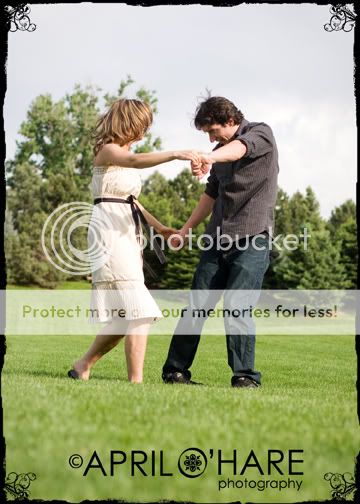
Told them I wanted them to dance in the field and have fun. They were game:)

6.)
NickDaniEE.jpg


7.)
NickDaniFF.jpg


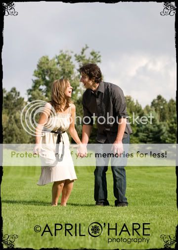
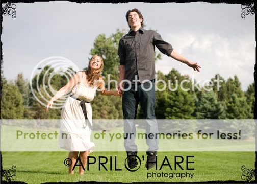
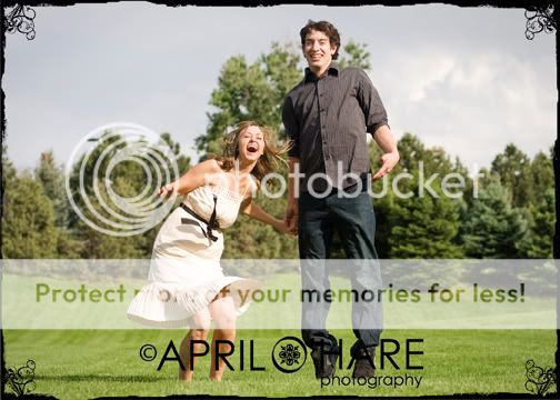
Threw in some jumping shots too since those are cute. (Note to self, next time switch settings to take more frames per second!)
8.)
NickDaniGG.jpg


9.)
NickDaniHH.jpg


10.)
NickDaniII.jpg


Last shot of the session:
11.)
NickDaniJJ.jpg
 
Looks like they had a lot of fun.

On number three, the blown background grabs the eyes attention (natural draw from bottom left to top right) so try mirroring the image:

Nick--Dani_mirror.jpg


The hot spot is top left and the natural leading lines of the trees and female subjects legs draw your eyes right into them. To me it also gives a more dramatic sense of her leaning into him.
 
My fave is 2!! I like some of the d ancing ones too, so fun. There are some minor technical stuff, like the above mentioned, that you could tweak in PS.. but overall a great series :)
 
Jim thank you for the edit.
I'm not sure I like the tilt either way to tell you the truth;)

Kelly thank you. If you have time will you point out the minor technical things that grabbed your attention?
 
1 9 and 10 do it for me... great!!

maybe tilt a lil less and the mirroring it was a neat idea :D
 
Sorry for hijack, but Jim, where can I read up on these techniques?
Educated long, long ago on the "rules" so I don't really have a resource to direct you towards. Search keywords such as "rule of thirds", "diagonal composition" "framing" and "leading lines".

The image I edited (if you can really call it that LOL) uses several of these intertwined. First off, in the original the blown sky is top right. As the eye enters the image from bottom left it is drawn up past the subjects - the sky is brighter then they are - can't be helped. By flipping the image we put the sky up out of the way in the top left. By using the legs and trees we frame the image by using leading lines in a diagonal comp as such to lead the eye into to our subject.

A diagonal composition running bottom left up to top right is more "restful" than a diagonal composition running from bottom right up to top left which is more "dynamic".

So by that simple edit, we tone down a distraction (rather than having to PP it) and change the feel of the image.
 
Composition in #2 is great. Way to branch out.
 
Awww number two is so cute. I love that one.
 
These are so freaking cute and fun, they brought a huge grin to my face going through them. They are very sweet.

As mentioned, the sky is blown, but I am struggling with this too. I have another shot at it tonight where I am doing some friends engagement pics, so I will try metering for the sky and using a flash fill. Wish me luck. LOL
 
I think you did a fantastic job.

#4 is the only one I'm not crazy about because he looks sorely uncomfortable and also because of the composition...

#2 is just breath taking. I love everything about it.

(I also always enjoy your work :)
 
Thank you for the replies everyone:)
RowmyF, What would you do with the comp. in #4? I'm asking because that's the second time I've heard that about that image and I'm failing to see how I should do it differently. I know it's one of those images where it's perfectly broken up into 3rds and they are right in the middle, but other crops I've tried look very strange to me.

It's funny that you say he looks uncomfy in that one because I think they really could have gone to sleep in that one. They were really uncomfortable in #2 as they both were having a hard time fitting on that tiny bench, but they were so nice to indulge me:)
 

Most reactions

Back
Top