What's new

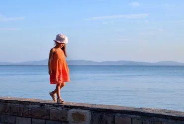
Another girl. This time with both legs.

sashbar

Been spending a lot of time on here!
Joined
Dec 13, 2012
Messages
3,044
Reaction score
1,183
Location
Behind the Irony Curtain
Can others edit my Photos
Photos NOT OK to edit
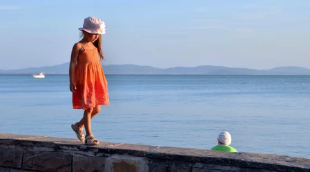
$Girl in Red web.webp
 
Very nice! But for the two extra elements, it might be perfect.
 
I don’t know how you feel about editing, but I hear the photo Gods shouting from the mountaintops that the disembodied head hovering in the lower right needs to be cloned out.

Really nice photo, by the way.


$Girl in Red web.webp
 
I think the picture would be strengthened, slightly, by flipping the boat end for end. Mayyyybe remove it.

Without the boat it's a subtly different picture, more graphical.

Without the green shirted person, it becomes a completely different picture.

I like it with the elements of the world in it, it anchors it and makes it feel more realistic and unposed.
 
There are so few elements that it's possible to clone or flip and make several subtly different pictures out of this. The original shot, with the boat, and the woman in the green with white hat looking toward the boat is "one way of seeing it"...removing both the boat and the woman somehow seems less satisfying, even though it is a simpler composition. I do agree though that flipping the boat so it "points inward" might be a positive change. Looking at what's been done so far, I actually prefer the original...the girl walking along the wall is a simple concept, but the woman and the boat together sort of give me a "framework" against which to see the foreground girl and wall-walking. Anyways, neat post.

 
I don’t know how you feel about editing, but I hear the photo Gods shouting from the mountaintops that the disembodied head hovering in the lower right needs to be cloned out.

Really nice photo, by the way.


View attachment 54749

Thank you Matt. I heard the Gods here but just wanted to leave it as it was: sort of "less beautifull but more real". Probably most would prefer your version, even though it looks more like a staged one. In reality I just walked and saw the girl, took 3 shots and she was gone, jumped off the wall.
 
There are so few elements that it's possible to clone or flip and make several subtly different pictures out of this. The original shot, with the boat, and the woman in the green with white hat looking toward the boat is "one way of seeing it"...removing both the boat and the woman somehow seems less satisfying, even though it is a simpler composition. I do agree though that flipping the boat so it "points inward" might be a positive change. Looking at what's been done so far, I actually prefer the original...the girl walking along the wall is a simple concept, but the woman and the boat together sort of give me a "framework" against which to see the foreground girl and wall-walking. Anyways, neat post.

Again, you said it better than I Derrel, thanks. If we are going into details though, I would not flip the boat, because the woman in green and the boat both look /move to the left and the girl looks/moves to the right, "against the flow", so it is balancing the compo a bit.
 
Last edited:
I think the picture would be strengthened, slightly, by flipping the boat end for end. Mayyyybe remove it.

Without the boat it's a subtly different picture, more graphical.

Without the green shirted person, it becomes a completely different picture.

I like it with the elements of the world in it, it anchors it and makes it feel more realistic and unposed.

Exactly. Thanks. I do see the boat differently though.
 
I don’t know how you feel about editing, but I hear the photo Gods shouting from the mountaintops that the disembodied head hovering in the lower right needs to be cloned out.

Really nice photo, by the way.


View attachment 54749

Thank you Matt. I heard the Gods here but just wanted to leave it as it was: sort of "less beautifull but more real". Probably most would prefer your version, even though it looks more like a staged one. In reality I just walked and saw the girl, took 3 shots and she was gone, jumped off the wall.

Yeah, I can totally understand where you’re coming from.

In general, I’m all for the “less-staged-the-better” philosophy as well. That is, right up until the point where a superfluous element falls victim to an unfortunate forced perspective. In this case, I see what looks like a hat mannequin from JC Penney sitting incongruously on a ledge by the sea, with a young girl gazing down at and walking toward it. Once I see something like that in a photo, it’s all I see.

Anyway, that’s not to impugn your photo; as Derrel mentioned, there are all kinds of possibilities with this, depending on which way you want to take it.
 
This may be nitpicking but I think this is the kind of image where thirds don't necessarily work the best.
There are such strong lines and slants and balancing items that moving her out to the side and making her bigger in the frame is much more satisfying for me. (and so that the end of the wall exits at the corner (not easy to see.)

Quite lovely, no matter what

GirlinRedwebcopylll.jpg~original
 
Nice, Lew. I might push a little more local contrast into the clouds upper right, just to give that negative space a little something more to contain. A light touch, I think.
 
I liked Lew's crop idea above, but I thought it still looked too square-ish...too blocky, and thought a wider, more panoramic aspect ratio might echo the wall better:

$Girl in Red web_wide-aspect.webp

Then I thought it might look better in a much more vivid, highly-saturated look. The JPEG file doesn't have enough latitude to do it right, but I had envisioned this with the highlights on the girl's face, the woman's hat, and the boat, all being shown "bright", against a palette of much darker tones...all three subjects, the girl, the woman, and the boat are broad-lighted, and so I was wondering how it might look seen with bright highlights, and much darker shadows on the wall and girl, to sort of highlight the "bright" aspect of her, the woman, and the boat, with that sunlight sweeping across...

$Girl in Red web_vivid.webp

My apologies--this rendering does look a bit heavy-handed, but it was a way I was envisioning representing "the light" as an element of the scene.
 

Create an account or login to comment

You must be a member in order to leave a comment

Create account

Create an account on our community. It's easy!

Log in

Already have an account? Log in here.

Back
Top Bottom