Derrel
Mr. Rain Cloud
- Joined
- Jul 23, 2009
- Messages
- 48,211
- Reaction score
- 18,936
- Location
- USA
- Can others edit my Photos
- Photos OK to edit
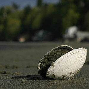
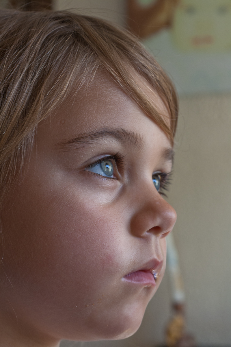
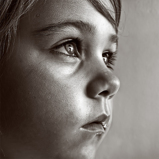
Ruby is a clear second-place finisher in this four-picture race. What do I not like about it? Well, for starters, her chin is cut off at the bottom of the frame, and that makes it feel to me like it was a hastily-shot (a grab-shot type of candid) horizontal composition originally, and not a proper vertical. Second, the light coming in from low and behind her, is giving a slight bit of horror lighting, where the shadows project upwardly and the lower corner of her far lip has a highlight on it--that is just unnatural and weird. Her nose also looks odd to me; the tip of her nose appears very dark, and the bridge of her nose appears quite light, AND the bridge appears blurry....is it out of focus? Why does the bridge of her nose appear blurry but the very tip of the nose appears sharp? Something seems to suggest "fakery" in my mind, for right or wrong, and the image with its strong side-lighting sort of falls into the realm of honest,gritty reporting, of documenting the realities of being a small child. It might be a very small thing, but the depth of field just looks "faked" to me. The gritty reportage look is also at odds with the mythical beauty and innocence of childhood. So the treatment does not appear ideally suited to the subject matter in Ruby, but the treatment appears FANTASTICALLY well-suited to the duck!
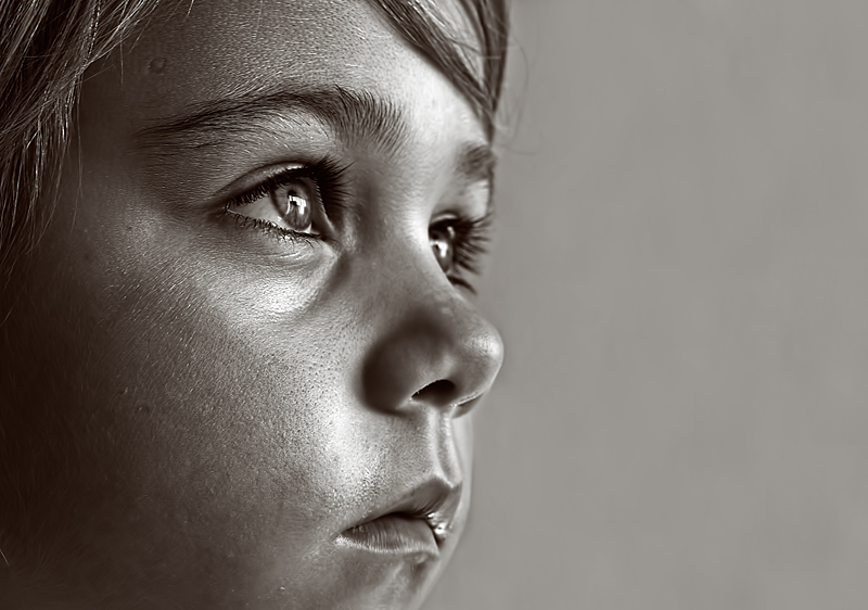
Schwettylen's suggestion of adding some dead space on the right....meh....does not really improve the shot much. The cinema-style ultra-closeup framing used, that is defined as composing with the chin amputated and the top of the head amputated, shows to me a failure to adhere to basic compositional guidelines for fine, formal-style portraiture, which is the genre I would place the "Ruby" photo in. The composition of Ruby is nowhere near as good, nowhere near as strong, as the duck is. The duck is symmetrical, and shown in a square aspect ratio. B&W lends itself well to abstraction, and the processing of the duck image aids in giving it a very abstract, artistic feeling. The original Ruby was framed too tightly to include her chin, and that alone kills the shot as a profile shot...just immediately disqualifies it as a contest entry where there is judging by design- and art-educated judges...people who might have an Master of Fine Arts degree, for example.
Has the bridge of her nose been artificially smoothed in post? Something about that area, the light nose bridge, apparently OOF, and the in-focus nose tip, bugs me about Ruby. Anyway, there's where I am coming from.
Schwettylen's suggestion of adding some dead space on the right....meh....does not really improve the shot much. The cinema-style ultra-closeup framing used, that is defined as composing with the chin amputated and the top of the head amputated, shows to me a failure to adhere to basic compositional guidelines for fine, formal-style portraiture, which is the genre I would place the "Ruby" photo in. The composition of Ruby is nowhere near as good, nowhere near as strong, as the duck is. The duck is symmetrical, and shown in a square aspect ratio. B&W lends itself well to abstraction, and the processing of the duck image aids in giving it a very abstract, artistic feeling. The original Ruby was framed too tightly to include her chin, and that alone kills the shot as a profile shot...just immediately disqualifies it as a contest entry where there is judging by design- and art-educated judges...people who might have an Master of Fine Arts degree, for example.
Has the bridge of her nose been artificially smoothed in post? Something about that area, the light nose bridge, apparently OOF, and the in-focus nose tip, bugs me about Ruby. Anyway, there's where I am coming from.






![[No title]](/data/xfmg/thumbnail/33/33906-2f9b24e4b1e1be07f68257916df0f2b3.jpg?1734164328)
![[No title]](/data/xfmg/thumbnail/41/41763-0bab4b330c52691d3fe616ed090ace09.jpg?1734176068)
![[No title]](/data/xfmg/thumbnail/41/41764-1385c153e9fea917b7efea0bbde7eefe.jpg?1734176069)