Are the colors working for this?

spiralout

TPF Noob!
Joined
Nov 11, 2004
Messages
679
Reaction score
5
Location
University of Houston
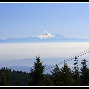
I've been spending a while on this trying to get the flag colors right. They seem a little bit dark, and I've tried lightening them and saturating them, but they still don't look quite right. What do you think.

P.S. Forgive the gratuitous Photoshop n00bity

GraveJohnVossBW2.jpg
 
i might be temped to make the colours darker a little (either with the burn tool, desaturate a little or copy the flag and try a different layer setting like darken or multiply) but also to change the white in the flag... it's just too 'white' to fit in with the rest of the image if you know what i mean? I feel a flag wich is quite desaturated in colour would fit in white well with the mood perhaps.

also the edge of the flag (against the root) looks a little too sharp? try blurring the edge a touch to reflect the not-100% sharpness of the edge of the stone...

but nice image, i like the contrast of the tree stump's texture against the stone... :)
 

Most reactions

Back
Top