What's new

Arizona Road Trip: Grand Canyon, Antelope Canyon, Horseshoe Bend

SuperNewbie

TPF Noob!
Joined
Jun 24, 2016
Messages
6
Reaction score
2
Can others edit my Photos
Photos NOT OK to edit
It was a 1200 mile road trip to arizona. It was a long drive, but well worth it.
Any advice about how to improve my skill will be appreciated.

DSC01279 Panorama1 by Jerry Gao, on Flickr

DSC01743 by Jerry Gao, on Flickr

DSC01769 by Jerry Gao, on Flickr

DSC01345 by Jerry Gao, on Flickr

DSC01336 by Jerry Gao, on Flickr

DSC01326 by Jerry Gao, on Flickr

DSC02317 by Jerry Gao, on Flickr

DSC01224And8more by Jerry Gao, on Flickr

DSC01437And8more by Jerry Gao, on Flickr

DSC025091 by Jerry Gao, on Flickr

DSC02509 by Jerry Gao, on Flickr

DSC01879 by Jerry Gao, on Flickr

20160322_151800-2 by Jerry Gao, on Flickr

The last one was shot by a camera phone
 
I really like the 3 shots towards the end that show the details of the rocks, but they seem a bit over processed I think. But of course that's a personal preference sort of thing. Looks like a fun trip!
 
I really like the 3 shots towards the end that show the details of the rocks, but they seem a bit over processed I think. But of course that's a personal preference sort of thing. Looks like a fun trip!
Thank you. The 3 shots of antelope canyon were almost straight out of the camera. I only added about 10% contrast and 10% sharpening. It's really the best place to see all the detail of the rocks in an interesting lighting.
 
Pwetty
 
[/QUOTE]Thank you. The 3 shots of antelope canyon were almost straight out of the camera. I only added about 10% contrast and 10% sharpening. It's really the best place to see all the detail of the rocks in an interesting lighting.[/QUOTE]

The contrast was not a good idea as you can see where your highlights are completely blown. I would have done multiple exposures and blended so I could get the detail of the sunlight shaft in the sand as well as the detail in the rocks and sky. I agree as to the saturation seemingly a bit too strong..that's personal preference
 
Very nice set of shots.
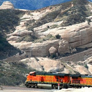
The clouds seem a bit dark on the train shots.
I like the colors in the Antelope Canyon shots. The last of that set I sort of like when I cut off that closer light where it hits the ground as that was just a bit distracting in the overall image. You go there for those colors so you have to show them.
 
Nice work. I particularly like the Antelope Creek Canyon shots (in part b/c i"m jealous--haven't been there yet).
 
I really like the 3 shots towards the end that show the details of the rocks, but they seem a bit over processed I think. But of course that's a personal preference sort of thing. Looks like a fun trip!
Thank you. The 3 shots of antelope canyon were almost straight out of the camera. I only added about 10% contrast and 10% sharpening. It's really the best place to see all the detail of the rocks in an interesting lighting.


Well, and I'm not passing any judgement, photography is a visual art and as such only really requires observation. So here are my observations of the first two canyon shots, again with absolutely no judgement. The orange of the upper rocks is so close to the brightness of the open blue sky that it almost vibrates. The sky is un-naturally blue and the upper rocks look way over-saturated with the loss of variation of colour that they are almost luminous. The clouds have a blue cast which is generally due to bringing slight colour casts forward with heavy saturation. The highlights of the lower rocks are as bright as the clouds lit directly from the sun, (not the heavy highlights but the lower highlights). Considering that you're at the bottom of a canyon where light diminishes with depth and that you're talking to a lot of photographers with experience... You can be as surreal with your editing as you wish, but if you want to understand the effects of what you do then you really need to observe the results. Tone-mapping deadens colour, contrast boosts work on both luminosity and colour (it saturates colour), these are more than SOOC with 10% sharpening and contrast. That it's your visualisation is fine and cool, but these are highly processed and saturated shots, if you don't see it then you don't realise how you've altered them through the processes you've used.

That's my advice, if you want to learn then understand what you've done, see it for what it is.
 
Last edited:

Create an account or login to comment

You must be a member in order to leave a comment

Create account

Create an account on our community. It's easy!

Log in

Already have an account? Log in here.

Back
Top Bottom