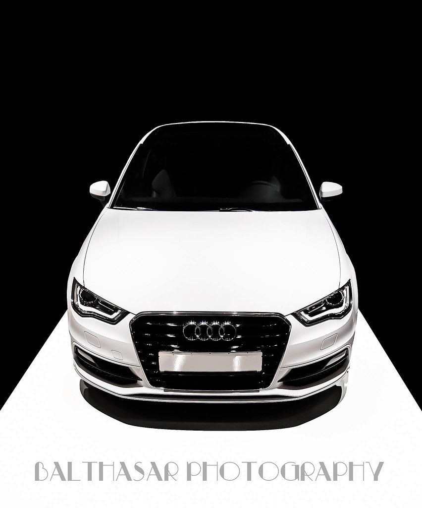
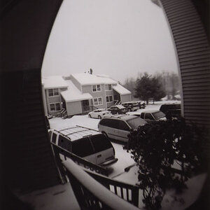
The visual impression of the image (to me at least) is of an automobile sitting level, and being viewed from above. I agree that there's too much black above; if that were counter-balanced with some white text, or cropped a little lower, it would work much better. I'm on the fence about the interior detail; I think I'd like to see either a lot more, or none at all, but I'm not sure.