Austin Skyline

DrumsOfGrohl

No longer a newbie, moving up!
Joined
Sep 26, 2014
Messages
149
Reaction score
44
Location
Austin, TX
Can others edit my Photos
Photos NOT OK to edit
Hey guys, this is the first time I'm posting a photo on the forum. You don't have to go too easy on me, because I'm willing to learn and practice. This is also the first time I ever went anywhere with the express purpose of taking photos, so that was a big step for me.

50mm f/1.8 lens

#1
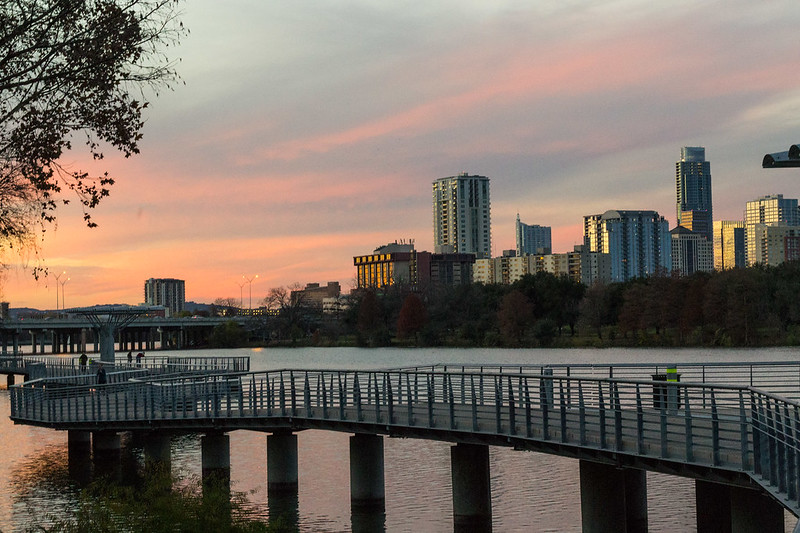
Austin Skyline and Boardwalk by Mike Rothschild, on Flickr

#2
Austin Skyline by Mike Rothschild, on Flickr
 
Thanks for sharing your photos! I think they're an excellent first post.
In the first photo, you captured a lot of nice colors in the evening sky.
The city composition of the 2nd photo is much better, but both have their positives and negatives.

1st photo:
I really like that you got the lead-in-lines of the boardwalk leading into the sunset. The position you were standing probably could have been better, though. I think you tried to capture too much in this photo, because the skyline seems like it's missing half the city. I would have attempted standing further to the right and looking more down the boardwalk toward the sunset!
Also, watch your surroundings. There is a small piece of roof on the right edge that could easily be cropped out or cloned out. The fluorescent yellow marker on the dock could be desaturated so it doesn't stand out as much. Also, the tree on the left edge is a little degrading. Not so easily cropped without significantly affecting the picture.
All-in-all, a nice photo for you to look back on!

2nd photo:
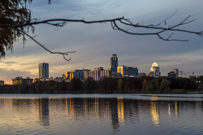
I think this is an excellent shot of the city in prime lighting. I really like how you captured the city reflection in the water (either intentionally or unintentionally doesn't matter). I also like your water:sky ratio.
What I don't care much for is that massive branch ruining the sky. You could try removing it in photoshop, but it may not be as easy as If you took this shot from squatting or some lower position, this branch wouldn't even be a factor.
I also think the power lines on the right side of the frame could afford to be cropped out.

Just a creative thought, next time you could mess around with longer shutter speeds to smooth out the water ripples. You could see then see which shot you like best.

Keep up the good work!

Thanks!
1. The sunset was beautiful, but I was having a hard time deciding whether I wanted a photo of the city or the sunset. I think I tried meeting it halfway, but missed the mark on both accounts. Also the leading lines were aimed at the sunset, so I think you're right, and that I probably should have made the sunset my subject, and stood to the right. The piece of roof on the right was also part of the reason I didn't shoot more of downtown: That roof is part of a larger structure that was directly in my line of site to the rest of the buildings. I honestly hadn't even noticed the flourescent marker, so thanks for pointing that out. I'll get that updated.

2. The reflection was a bit of an afterthought. I thought it would be nice to have the branch to show some depth to the photo, but its ugly and dead, so I see your point. I was also a little worried at having too much sky in the photo.
I haven't picked up a tripod yet, so I haven't had a chance to mess with longer shutter speeds. Maybe that will be my next purchase.

I really appreciate your thoughts. Thanks
 
Last edited:

Most reactions

Back
Top