What's new

Avert Your Eyes - Selective Coloring in Effect

AgentDrex

No longer a newbie, moving up!
Joined
Jan 27, 2008
Messages
2,837
Reaction score
405
Location
Bemidji, Minnesota, USA
Can others edit my Photos
Photos OK to edit
Hopping on the abandoned bandwagon. Flame away!

7394354960_2d411ee793_c.jpg
 
This is just evidence that many new 35 year old men suddenly hit advanced senility! :) (and often buy a sports car, and get an 18 year old mistress too!)

I like that one better than most...
 
"This must be what going mad feels like."
 
So...Yes I'm a photography newbie, yes I've experimented with selective color/color splash. After spending some time on TPF, I realize it's a huge "newbie red flag" and is generally HATED by the majority of experienced photographers. At the risk of sounding too fresh...why is it disliked so much by experienced photographers? I'm looking for legitimate responses...not looking to get bashed for asking the question.

Thanks!

Besides being a technique that is worn out and tired from it's boom in popularity about a decade ago, it almost never enhances a photo. 99% of the time it is distracting or unnecessary.
 
As Rotanimod said! Very few photos are actually improved by selective color... it is mostly a gimmick used by some in an attempt to improve the unimproveable!
 
Yeah, most times its done wrong. Like a red bow on a young girl's head in a b&w portrait. It detracts from the subject. A good photo (in my opinion) should cause the viewer to look at the whole photo, not just one area. When you do selective coloring, you generate more visual interest in a small portion of the photo. Kind of defeats the purpose of the photo. Then again, a lot of people like it as well. Que sera sera me thinks. My photo here uses it well enough. But its still gimmicky and unnecessary.

Go outside, find a piece of dog poo. Now take that brown monstrosity and put a nice, shiny, red ribbon on it. Now smell it. Does it smell better with the pretty ribbon? No? Same thing with a photo. If it doesn't come out of the camera looking good, no amount of "pretty ribbons" is going to save it.

 
I've seen very few examples that work (or rather, that work for me) and most were in advertising.
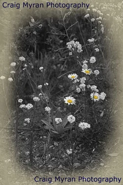
You could have added some white vignetting to make it extra special.
;)
 
Yeah, most times its done wrong. Like a red bow on a young girl's head in a b&w portrait. It detracts from the subject. A good photo (in my opinion) should cause the viewer to look at the whole photo, not just one area. When you do selective coloring, you generate more visual interest in a small portion of the photo. Kind of defeats the purpose of the photo. Then again, a lot of people like it as well. Que sera sera me thinks. My photo here uses it well enough. But its still gimmicky and unnecessary.

Go outside, find a piece of dog poo. Now take that brown monstrosity and put a nice, shiny, red ribbon on it. Now smell it. Does it smell better with the pretty ribbon? No? Same thing with a photo. If it doesn't come out of the camera looking good, no amount of "pretty ribbons" is going to save it.

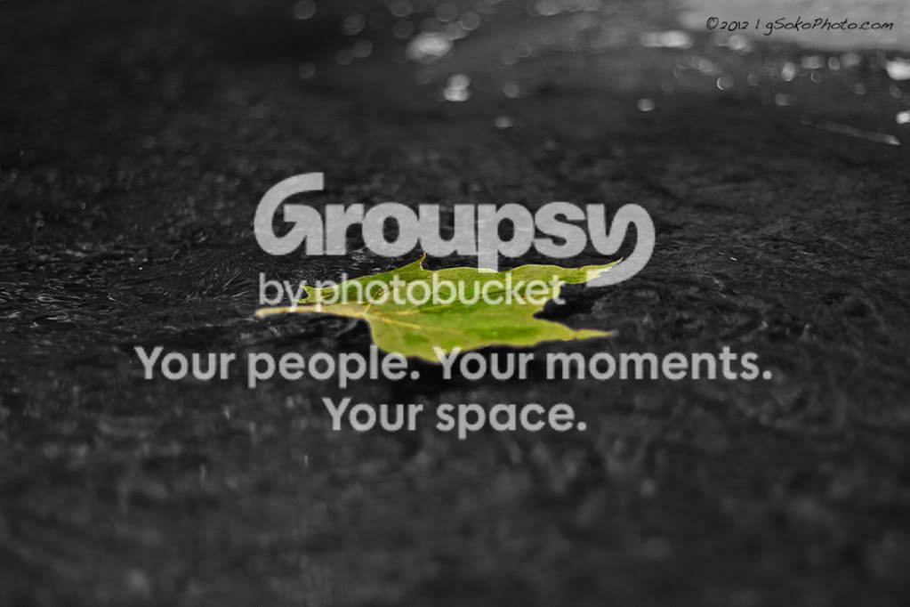
Thanks for the response. Rotanimod was nice enough to check out some of the selective color shots I've done and give me feedback. He happened to give decent feedback on my favorite of the bunch. I realize that you say the majority of time it's done wrong...but in this case, I feel it added to the final photo. I'd really appreciate your feedback on this shot as well if you don't mind...if I'm wrong, it's good to know for the future. (please ignore the watermark...I don't have the chance to take it off right now.)

LeafFloatingonBWwatermarked.jpg

I think this one works. The background is simple, the subject is obvious (with or without the color) so there is no confusion; it helps that it is a strong photo to begin with, though uncentering the leaf may improve it a bit.
 
So...Yes I'm a photography newbie, yes I've experimented with selective color/color splash. After spending some time on TPF, I realize it's a huge "newbie red flag" and is generally HATED by the majority of experienced photographers. At the risk of sounding too fresh...why is it disliked so much by experienced photographers? I'm looking for legitimate responses...not looking to get bashed for asking the question.

Thanks!

Pretty much entirely agree with many of the previous responses. Certain techniques, like selective color, just don't hold too much all-around usefulness in terms of creating a photograph with more emotional appeal, more striking visuals or stronger communicative qualities as compared to the same photograph without selective color applied. It honestly doesn't get more technical or complicated than that, because the degree to which selective color is frowned upon is the degree to which it tends to be used indiscriminately without any apparent thought as to whether or not it was actually improving the photograph it was applied to. Selective color simply tends not to be very impactful in most photographs, but rather to be somewhat distracting and strange.

I think the important question to ask yourself when considering selective coloring is:

"Is there a clear purpose for using this technique which will genuinely enhance the photograph?"

If you can't really think of a clear purpose, then it's probably just the novelty value that got you thinking about it in the first place.

There are undoubtedly those individuals that will think that my criteria for using selective color is "too purposeful", "too stuffy" or "too self-conscious" for the realm of art. But as much as art is about expressing one's self, that expression is degraded if we forget that the choices we make in creating our art need to communicate in some way with our viewers. The use of editing techniques that don't really communicate any enhanced emotional/introspective response just tend to detract from whatever it is that we're communicating. So, I think that there's more that ought to go into it besides "hey, this looks neato!"... and, quite frankly, I feel like most examples of selective color editing emerge from that very thought.
 
You could have added some white vignetting to make it extra special.

I will do that in a future edit. Thank you for the tip. I may also add a watermark using the Verdana font!
:drool:
 

Create an account or login to comment

You must be a member in order to leave a comment

Create account

Create an account on our community. It's easy!

Log in

Already have an account? Log in here.

Back
Top Bottom