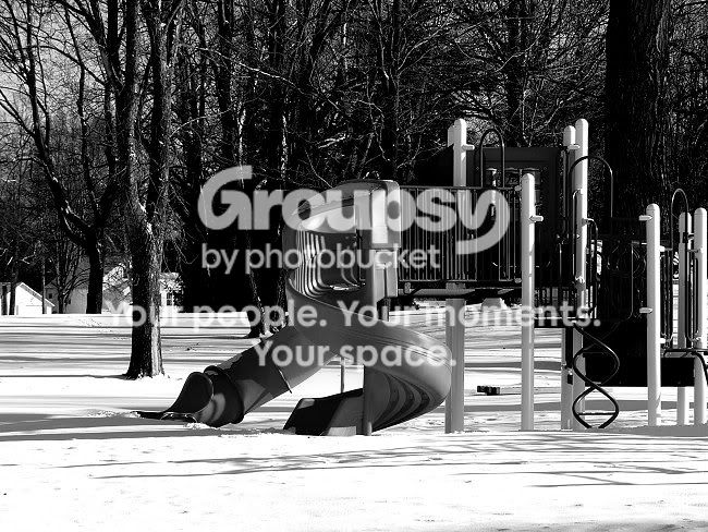
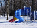
Thanks for putting up the little original photo, now I know how to appreciate your very crisp, very well contrasted b+w version even better. I am quite fond of the harsh contrasts in this one, as fond as I am of the motif as such, and I find the spirals come out even better (as opposed to the vertical lines of the trees in the background, the props and the banisters [do I make use of the correct English words here?]) in the b+w version.
This one works very well for me and I am sure you are on the right path towards b+w (wish I were....).






![[No title]](/data/xfmg/thumbnail/37/37632-06d8ff7f84d84f6ac01249ce8885d896.jpg?1734170756)
![[No title]](/data/xfmg/thumbnail/41/41891-e5bba75ac5ce57c6892ade4cfc3f7d4c.jpg?1734176244)