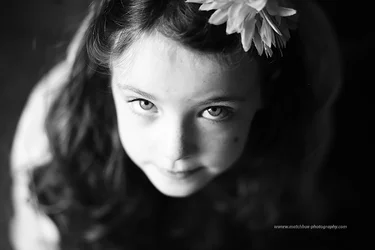
Here are the things "I" think about when I see your portrait of this young girl. I think, "This could have made a nice "tall" shot, done at about f/8, with a slowish shutter speed and tripod or stabilized lens." And, for me at least, I think the horizontal camera orientation has hurt the shot in multiple ways (lopped off head, empty blackness on the right side of the frame, flower head ornament right on the edge of the frame, causing visual tension and thus competing with her eyes and face). When seen large, the lack of depth of field hurts the image. It does look fine seem small, like on the back of the camera, or on a smartphone screen, but at 3,000 pixels wide or so, the lack of focus is distressing.
The thing is this: she is seated or kneeing and is looking upward. She is taller than she is wide. Her expression is directed "upwards". But the 3:2 aspect ratio of the frame is "slicing across her". She is looking "upward", but the camera is showing us "across". That's the fundamental compositional weakness here; the subject and pose do not match the camera orientation, and vice-versa as well.
The camera frame is very wide, but not very tall when the camera is held horizontally, so the obvious thing to do is to re-orient the camera for this, specific pose and subject. That is so fundamental, that even withy the shallow depth of field, **if** the camera had been oriented as a tall, the big black space off to the right would have been eliminated, and we would have been shown more of her "seated-ness", and the image, even OOF as it is, would have made much,much more visual sense!




![[No title]](/data/xfmg/thumbnail/39/39472-acea19526f2c08f92fd1e95a92191bc2.jpg?1734173564)