I love it. And I know why I love it.
I don't think Trevor was beating you up over those issues. Every so often there is a photo that actually *should* be vignetted... or grainy, etc. The "problem" is that a lot of people just indiscriminately apply some processing effect with no particular reason why.
Apply this to cooking: Cheese goes well on my pasta... broccoli... and hot dogs. Therefore, cheese most go well on everything... so the next thing you know I'm using it as a ice-cream topping. There's a point where a good thing is just applied at the wrong time. Some of these effects take such a beating for being so overused that you'd get the idea that they just don't belong anywhere... ever.
Usually when I see a B&W I ask people "why" they decided to convert the image to B&W. Usually they don't know. Applying effects indiscriminately is like throwing notes into a song for no particularly reason. Some of those notes will sound really sour if they're out of place in the key or chord.
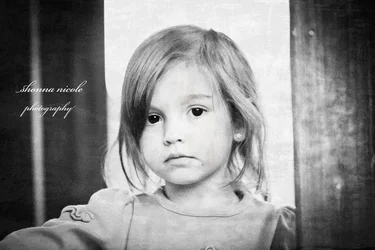
But look at the mood in this photo: She's got HUGE SAD EYES and her lips are curved down. Her hair is just a little unkept. Essentially you have a mood or emotion happening here and certain lighting and treatments will help drive that emotion. Your B&W treatment (which I normally reserve for images with structure, texture, pattern, etc.) actually helps the emotion. The same for the grain. Usually we'd offset her out of the middle, but in this shot it works. All of this feeds the emotion & mood of the image.
Nicely done.




 Do settings need to be adjusted when using an adapted lens?