What's new

Baby Pics C&C

Berter

TPF Noob!
Joined
Oct 11, 2011
Messages
61
Reaction score
3
Location
The Mitten
Can others edit my Photos
Photos OK to edit
Some photos from the shoot i did for my cousins and their new son. they were very happy with how they turned out. i like them but i do see some things that couldve been done differently. what do you guys think? Thanks
1. $A_Hazlewood-5773.webp
2.$A_Hazlewood-5814.webp
3.$A_Hazlewood-5833.webp
4.$A_Hazlewood-5911.webp
 
joel28 said:
can someone please tell me what "C & C" means?

Comments and critique - I believe.
 
joel28 said:
can someone please tell me what "C & C" means?

Comments and critique - I believe.
Or Critique and Criticism. Or maybe Constructive Criticism/Critique...? Critique is the important part. :lol:


I like #2. And I like the PP in #3, but I wish the baby's expression was different.
 
Overall, these photos are wonderful!!! I can only make a few critiques, based solely on my own humble opinion...

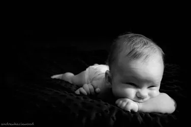
1. So much personality... Brilliant... But perhaps maybe just a little bit too much 'dead space' on the left of the image...

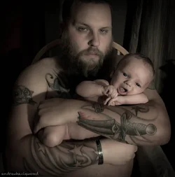
2. A stunning juxtaposition (woohoo! big word!) between the big burly tattooed daddy and the pristine baby... Breathtaking... But I wish you hadn't cut dad's head off at just above the hairline... A truly minor detail and just my humble opinion...

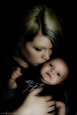
3. Perfect... Just perfect...

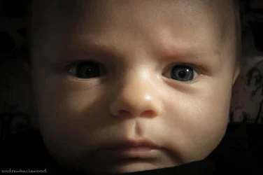
4. Great focus... Perhaps just a little bit too dark and shadowy for a newborn... But that's just my humble opinion...

I love these photos individually and as a set... Thanks for sharing!
 
1 & 3 are nice but all are a little dark for my taste though I think you were going for a moody vibe so that makes sense. I have such a hard time cutting off heads and limbs too!!
 
number two almost feels like a candid snapshot because of where he is sitting. the background feels a little busy with the different colors and the shadow of an object on the right.
there is already his chair in view, maybe you could've used a plain backdrop? or even just the loss of that shadow on the right could've improved the picture.
(and like someone said the head being cut off is unflattering, which is why I wish baby's chin wasn't cut off in number 4)
but that's just one opinion :) there's no reason they won't love these, but you're right, its better to get opinions on what might work next time! :)
 
Just my personal opinion: I'd like to see more brightness in #2, a lot more contrast...they're all a little dark to me but tattoos look amazing in a higher contrast. Also, I would've hung a black sheet behind him, I can't stand the chair and curtain...they distract from the subject. Maybe if it was just the chair, I could like it. In the first, I think I would have angled in a way where the diaper doesn't show or taken it off. For me, diapers are very unattractive to show, but I like the position and the baby's face. In 3, I just would like a different expression for baby. In 4, I would've done a plain black sheet behind, it's a little distracting to me and I would've liked a different lighting angle; it's a little harsh for a baby. I also love the moodiness...but if 1 didn't have the diaper, I'd be head over heels for that shot! So cute!

 
Thank you everyone! this is the first actual newborn shoot ive done. having kids of my own i knew what i was getting into but at least with my own kids i can set my camera down and pick it back up later. dont have that luxury when shooting someone else's.

#1 is my personal fav- and to be completely honest, Eveamlizya, it didnt even occur to me to take the diaper off. i wish i would have now though

I agree with all of you in regards to the background on #2, i was thinking about darkening it in ps but wanted your guys' opinion on it before hand

They loved #3. the position of the babies head really bugs me. i also dont like how her hand looks. not sure what i could do with it though

#4 I do wish the light below his right eye was just a little bit higher. something to think about next time i guess.

Thanks again for all the great comments, this is what helps us become better at what we do.


Am I the only one who is not a fan of these photos? I think poor lighting is what kills it for me. A somewhat good start but it looks like snapshots that went through Photoshop to give it a bad professional finish.

#1 - I think this is the best of the bunch but that's not saying much. The lack of light on both sides of the baby is distracting. The baby has it's face buried in it's arm and they look super uncomfortable. Also, because of the way the baby is positioned, it's head looks super big and the body looks super small.

#2 - I like the idea. Again, lighting would have made this much better but the shadows are not good. Dad looks stoned, have him open his eyes a bit more to avoid this.

#3 - Nice interaction with the Mom and baby but I do not like the PP on this. Since it is so dark everything blends together. If it weren't for the shirt design it would look like a baby head floating in space. Better lighting will help.

#4 - Lighting, did I mention that before? The harsh light coming from the right of the photo is making the opposite side of the baby's face really dark. You are losing key aspects of the right eye. I am not able to connect with the subject in the picture because of losing the eye contact. The shadow it casts of the nose is also really bad.

Keep working on it. Try taking some shots outside with the natural light to help play with shadows and such. It will really help. You can do low key lighting (which is what this looks like an attempt at) but you REALLY have to make sure you have the basics down before you attempt to get creative.

Hope this helps.
 

Create an account or login to comment

You must be a member in order to leave a comment

Create account

Create an account on our community. It's easy!

Log in

Already have an account? Log in here.

New Topics

Back
Top Bottom