Back to school C&C

okayhop

TPF Noob!
Joined
Jul 11, 2010
Messages
7
Reaction score
0
Can others edit my Photos
Photos OK to edit
T'was the night before classes and the camera comes out. looking for comments on composition (content and framing). No post process.

Image__02.jpg


Image__01.jpg


Image__03.jpg
 
That was my first thought as well... oh look, half a bike! and then you also cut off the top of the building.

the second one look soft...long exposure hand held? framing is ok for the subject you shot, i just dont find the image all that interesting. would of been fun with those blurry people right in front of the camera.

third one is alright, i find there is too much pole for some reason, not sure why. seems like a more random snapshot taken that a thought out photo.
 
1. As someone said earlier you missed the top of the building and half the bike. Decide on whole bike or no bike, but you should keep the top of the building in no matter what.

2. It's a nice shot, I can tell you were using the tripod so :thumbup: for that. Other than that, I'd crop a bit off the bottom, OOC thought it's fairly good. Too bad the building in the distance's lights are blown out.

3. I like the shot but the pole is crooked; I'd watch to keep that straight in the camera so that you don't have to PP a rotation on the image to straighten it out.
 
Been said but, here's my 2 cents to give you additional consideration for the unnumbered photographs:

1. If the focal is the building, it's missing. If it's the bike, wheels are extremely important.
2. blurred, and second the question for handheld?
3. I don't know of anybody interested in bikes who cares to see a large object spearing the headpiece. Ex. Beheading somebody at the gates of town. It doesn't really produce a desired affect.

Sorry, just my 2 cents. Keep shootin.
 
I like the pole and helmet photo the best. I like the the personification of the pole wearing the helmet. What an awesome idea and you pulled it off quite nicely....

SageMark: My dad was a biker and I love the photo. The helmet isn't being speared by the pole though. Because of the vertical stance it seems more like an abstract human wearing it. I would agree with the spearing comment however if the pole had been coming out the face area or it had been at an angle...
 
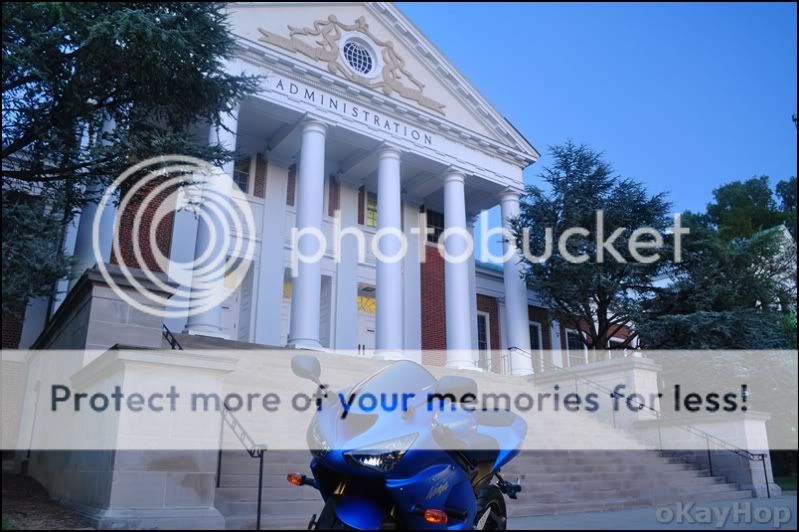
Nr 1 ... The blue cast bothers me a bit, and I agree with the half-bike comments. The building roof going outside the picture doesn't bother me, it in fact creates a feeling of grandeur (The building is TOO BIG for the frame, thus it implies that School is bigger than life). It is a very good photo regardless.

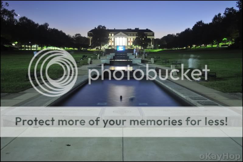
Nr 2 ... Is that a TV screen below the building? This and the highlights spoil the picture more than the soft focus! In fact I think the focus is fine, at least at this resolution, and clearly based on the time people had to move this was not hand held. The picture however doesn't appear to relate to the subject. This too is a very well executed photo.

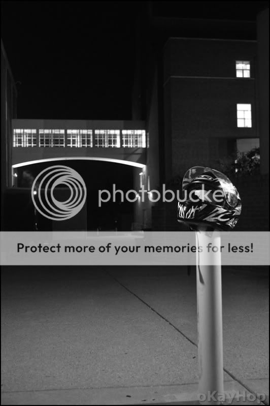
Nr 3 ... I also at first glance got the impression that the helmet was speared / dead. And the building doesn't look like a school to me, at least schools doesn't look like that over here, so again it seems to mis the subject, but ignoring the subject this not a bad photo!
 
Thanks for the comments. More details for everything...

nr 1: tripod, UV filter, 30 second exposure.

nr 2: tripod, UV filter, 30 second exposure. There was a freshmen event, thus all the people and the projector screen out there

nr 3: hand held and cranked the ISO. I liked this one a lot, just wish I could have gotten it to come out sharper. I tried to keep the vertical in the bridge instead of the pole. btw, our engineering and science buildings are pretty nice :)
 
Always watch your white balance. Especially in low light. A quick check before you shoot can save you a lot of time later in post when you have to correct multiple shots. And I agree- more of the bike would be better. Just a step or 2 back would get the bike and the top of the building.

Image__02.jpg
 
On #1 I agree with the half a bike comments. The building being cut off is ok. the blue cast bothered me too.

#2 If you crop it so that the photo starts in the water it would lead the eye into the photo a bit better and cut out a lot of distracting concrete in the front.

#3 I like this one. but I would crop it off right at the bottom of the strap's shadow on the pole.
 

Most reactions

New Topics

Back
Top