Ernicus
TPF Noob!
- Joined
- May 18, 2012
- Messages
- 2,689
- Reaction score
- 337
- Location
- Old Town, ME
- Can others edit my Photos
- Photos OK to edit
- Banned
- #1
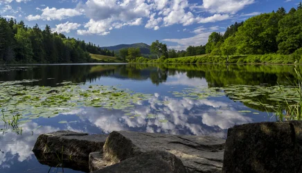
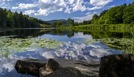
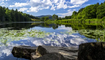
Ok, so for those who were looking/helping on my other thread. It seems locally some folks liked my cropped version. Not so much that one was better than the other, but it made 2 separate images really.
So I went back to the raw file and re did it, using same crop size.
This time I used the profile correction, and to my surprise, it actually got rid of all of the CA. So that was really cool.
I have 4 different versions I need opinions on from those of you who have calibrated monitors. My craptop sucks so my stuff is generally dark. The first is what I thought was good, knowing my chit is darker generally, I adjusted. I saved each adjustment rather than do 2 or 3 at once.
So if you can tell me if it is too dark, too bright, etc, that would help me assess my output until I can get a better monitor.
The last edit you may not even notice unless you're a pixel peeper as I used imagenomic to reduce noise and unless you zoom way in, I don't think it's even noticeable.
but anyway, please take a look and tell me which is best in terms of not being too dark and that you think will print the best.
Thanks.
*rather than clog this post, I'll put each image in a separate post.
So I went back to the raw file and re did it, using same crop size.
This time I used the profile correction, and to my surprise, it actually got rid of all of the CA. So that was really cool.
I have 4 different versions I need opinions on from those of you who have calibrated monitors. My craptop sucks so my stuff is generally dark. The first is what I thought was good, knowing my chit is darker generally, I adjusted. I saved each adjustment rather than do 2 or 3 at once.
So if you can tell me if it is too dark, too bright, etc, that would help me assess my output until I can get a better monitor.
The last edit you may not even notice unless you're a pixel peeper as I used imagenomic to reduce noise and unless you zoom way in, I don't think it's even noticeable.
but anyway, please take a look and tell me which is best in terms of not being too dark and that you think will print the best.
Thanks.
*rather than clog this post, I'll put each image in a separate post.


![[No title]](/data/xfmg/thumbnail/36/36643-92fe0dd9e247722bfefe299cd8a549f5.jpg?1734169157)
![[No title]](/data/xfmg/thumbnail/39/39446-903cfeac143cee6330a51546ecfdda92.jpg?1734173536)