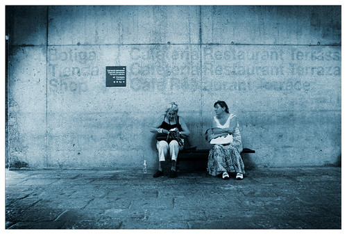
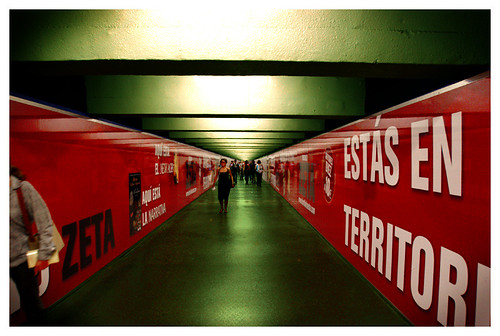
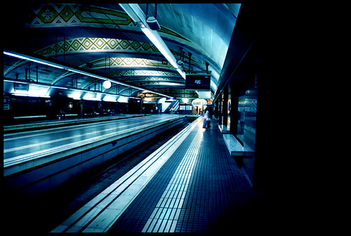
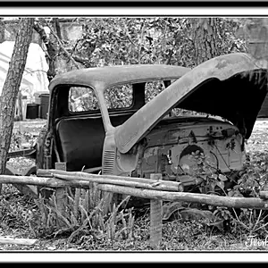
I dont mind the duotone one but the other 3 I prefer the originals IMO.
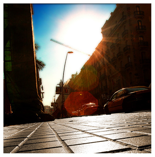
The first one I feel that the crop has taken away the dynamic of the angle and the PS work in the sky is too obvious, the other two (the Metro shots) I'm not convinced the colour correction has improved the images.
But thats the beauty of any kind of art - its subjective!
Maybe some other people would like to give their (probably different) opinions.
Ahh I love Spain. And especially Barcelona. I've only been to Barcelona once, but I did stay in Granada for a month this summer. What a nice place. Those are great photos of the city.
As for Force of Nature's edits, I really like what he did with the 2nd metro shot. The blue effect gives it a more sleek urban feel I think. The other edits aren't bad either, but they're not a whole lot better than the originals IMO.
yeh, dont get me wrong, I adore the original shots, I just wanted to practisea few new skills I had learnt. Anyway, I enjoyed doing it, just thought I'd share them!





![[No title]](/data/xfmg/thumbnail/37/37120-1d477daab99b292a0c740b50f1c96d53.jpg?1734169832)