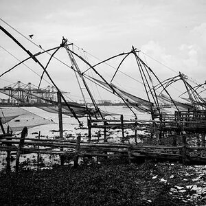
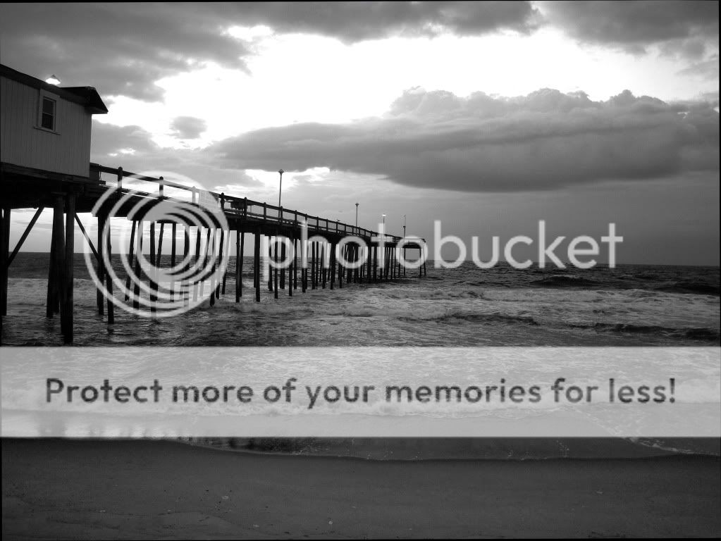
When I look at this my eye enters at the end of the pier, where the building is, and then quickly moves to the bright sky area and stays there due to the strength of that part of the image. Ideally, I think that I would like to be able to linger more on the structure, and perhaps take in the entire setting a bit more than my eye does as it is presented here.
I would suggest that you consider a couple of things, but these are just my opinions and should be taken only for what you think they are worth.
1) The right side of the image offers nothing, leaving the composition out of balance left to right, with the pier anchoring the left and nothing but negative space on the right. If there is nothing to balance (look up 'steelyard' in a design or art book) the right side it might be stronger if it were cropped out. It is often important to include background areas to provide a sense of place, but in this case I think that there should be more (think panoramic) or less (tighter on the pier). The cloud does provide some balance, but I'm just not sure if it's enough, again, in my opinion.
Another idea might be to burn down the beach, allowing the weight of that part of the image to build and balance out the sky. This would add top to bottom balance and might keep the same feel that you have here. Something to consider...
2) The brightest areas will pull the eye strongly, as will very dark areas, so I would have tried to control that sky contrast if I had made this exposure. I think that if the building were the brightest part of the image it would pull the eye there and then the leading line of the pier would give a good sense of both depth and place. Dodging the building and burning down the sky might change this positively, but only you can say for sure.
3) The horizon is mid-frame, which may weaken an image, but in this case I think that it's fine (although you should try to make it level - it's low on the right side). You might consider what this would have looked like if you had either a) more water, or b) more sky. Depending on what you were going for altering the placement of the bisecting horizon line would have put more emphasis on what you showed more of. If the sky was the subject that you wanted to present I would suggest imagining what this would be like with more sky than water, and vice versa.
I like the image in general - it's pictorial, but pleasingly so, and although it is low in contrast (except for that one part of the sky) this effect imparts a certain feel that works well with the subject. I hope that these comments can provide you with some insight into alternative ways to see your image...

![[No title]](/data/xfmg/thumbnail/39/39438-1eb8b5f82b59d9d0c72ae9025778ed4c.jpg?1619739032)