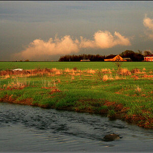
#2: Weakly applied DOF. Distracting treeline and structures. Dull sky. I like the overgrown vegetation and sense of loneliness.
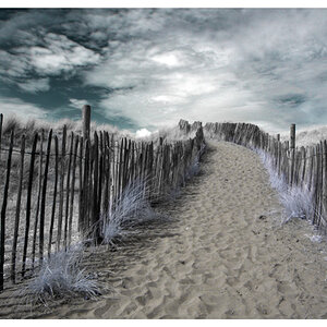
#3: Somewhat interesting patterns, shadows. Lacks sharpness where I want sharpness. Low contrast. Dull sky. Major sensor debris - ya, those aren't seagulls!
Tilted horizons are generally distracting, yes. Trying to get the post vertical was an error, in that sense. Also, having the light at the horizon line draws attention to the horizon, and feels a little weird besides.
I quite like number 2. I'd like to see the shadows opened up a little, and maybe try some slightly different angles. Decide where the visual center is (I think it's where all the lines lead the eye) and move that around in the frame a bit to see what works and what does not. I think there are stronger images to be had here, with small changes in point of view.
#3 has a tilted horizon again, and am not really feeling the composition all that much.


![[No title]](/data/xfmg/thumbnail/33/33351-cd8e1d901d113ee8f9312e19478885a7.jpg?1619735918)

![[No title]](/data/xfmg/thumbnail/42/42066-badd1780980376f04f261f985a608adf.jpg?1619739998)


![[No title]](/data/xfmg/thumbnail/42/42064-76de02ee1a248037351c52c414af9bab.jpg?1619739997)