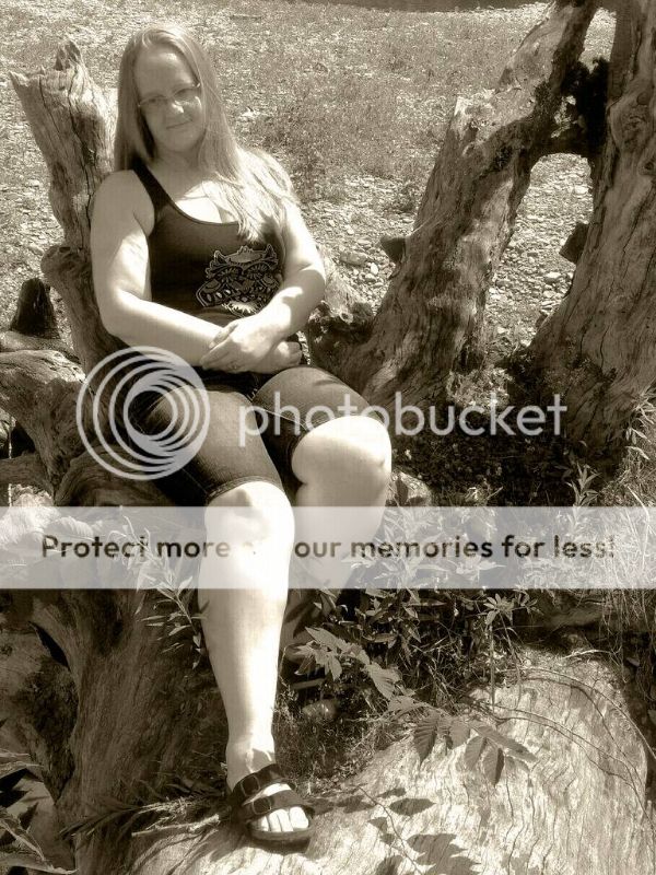
Honestly? I think this is a swing and a miss. The first issue is that the model's face is in deep shadow, probably 3 full stops below the highlights on her bust, arms and legs which means that the viewer's eye is pulled to those spots, vice resting on her face. Next is her pose: Leaning away from the camera makes her thigh/knee area much larger in relation to her body than her face, and lastly (and this is purely a personal taste thing) IMO, sepia-esque tones just never make people look good. Black & white mono, or colour would have made this stronger I think.





![[No title]](/data/xfmg/thumbnail/40/40296-1e3931509698e96fed6a0e43f5cb4adc.jpg?1734174707)
![[No title]](/data/xfmg/thumbnail/40/40299-41bf1ccac2889096fb5f4fcffdd56721.jpg?1734174709)
![[No title]](/data/xfmg/thumbnail/40/40298-08fb67b2f2c98625b8ff8dcb00ed42a8.jpg?1734174708)

![[No title]](/data/xfmg/thumbnail/42/42278-22ed940cbdc5888a28d9be36006594dc.jpg?1734176689)