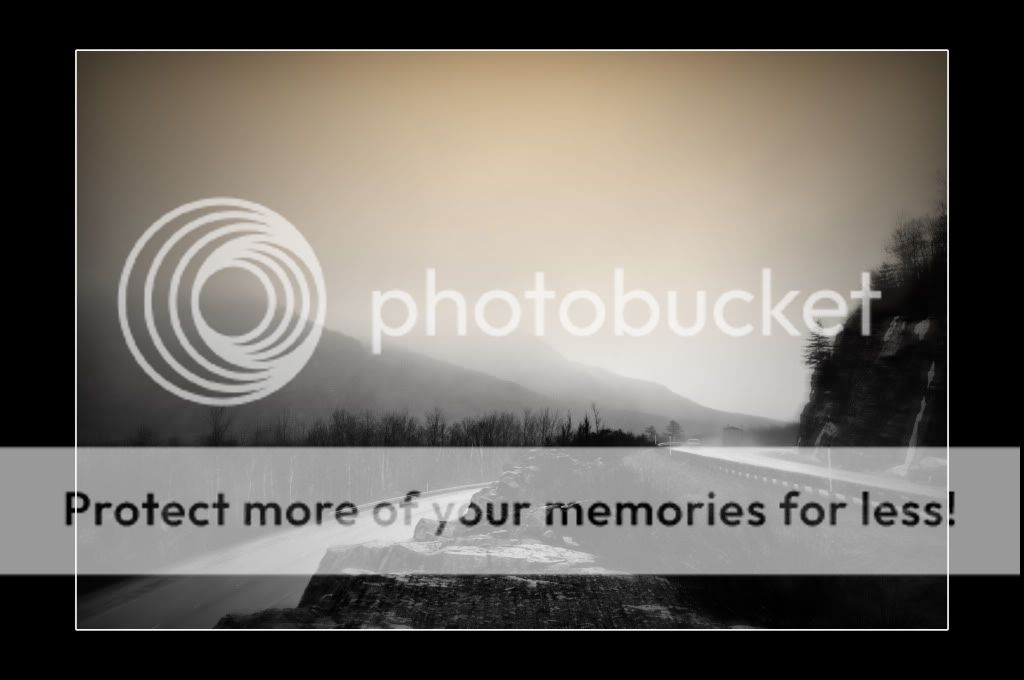
#1 I like the feel that you have presented here - the softness works well with the slight warm tone and the subject to create a very compelling image with a great sense of depth. The vignetting in the upper corners works well to bound the sky while the triangular form created by the roads keeps my eye inside the frame. For an otherwise bland setting (roadside), you've added a lot of impact the way you presented it to the viewer.
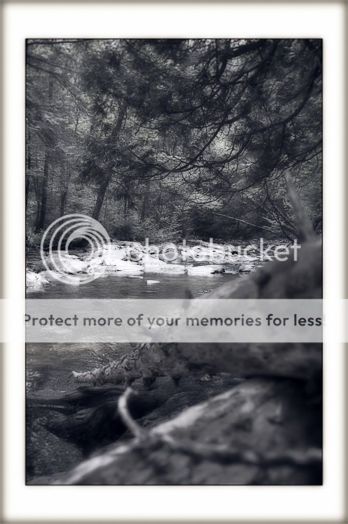
#2 The two-tone effect and vignetting at the top do not work as well in this one as in the first, at least for me - the warm upper portion seems in contention with the colder lower portion of the image. I do like the depth created by the leading line of the bridge and the line of the river though, and the rocks and bridge work fairly well as presented (although my eye is pulled more toward the bottom than the top). I think that the lower tonal values in the top of the frame detract from the impact of this one more than help - if the sky were higher in value it might improve the top to bottom balance, but that's just me.
If I could make a suggestion, I would say that you might consider keeping the borders equal on all sides, much as a physical mat would have. The different width sides alter the viewers perception (wider imparting more emphasis, thinner imparting less), which stretchs the aspect ratio too much, introducing a little visual tension that should not be there, again, in my opinion.
Nice work just the same...
- Randy
