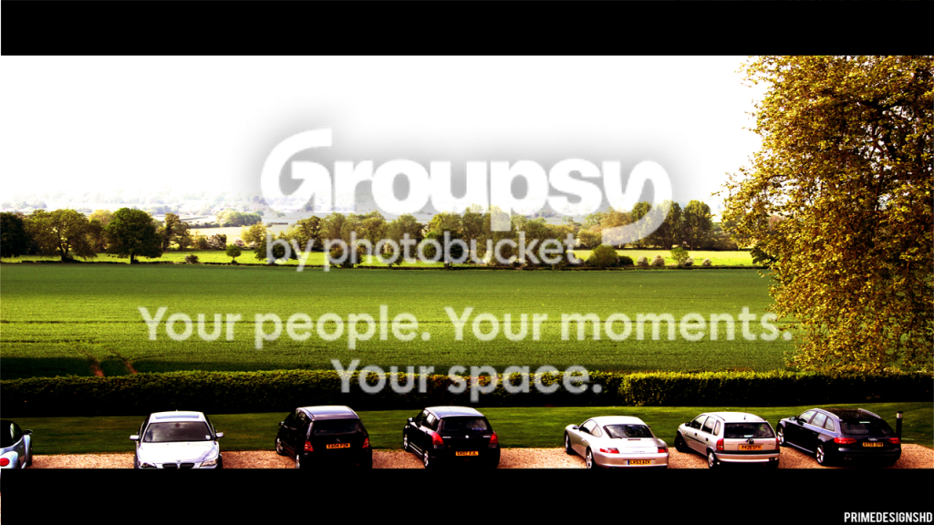
Along with everyone, I quite like the first one. The deeply saturated colors and the white deep background.
Excellent composition, the various cars, seeming to sit and look over the fields, almost implying the cars are alive with no people.
really quite nice.
Where this falls short is the clipping of the car wheels; it feels like a mistake particularly where there is so much room in the background. These cars are entities and their parts should be respected.
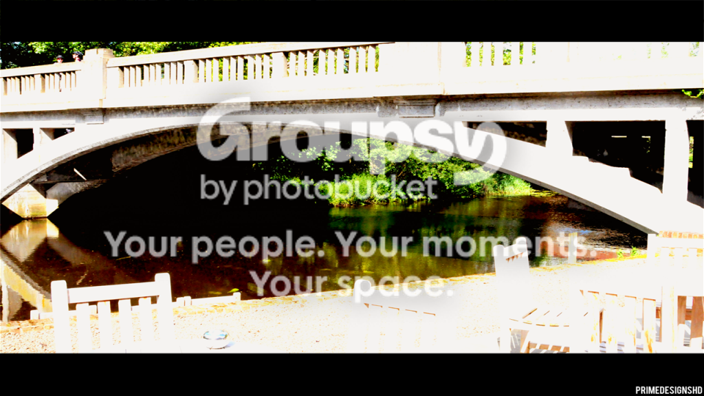
IMO, the second one is a mistake.
While the overexposure might be intentional to allude to very bright sun, it doesn't fall like the sun, with brightness on top and some more detail in the shadows. It just seems too contrast.
Here is where the mannered black bars top and bottom start to look like an affect. Why are they obliterating the chairs? What do you mean by it?
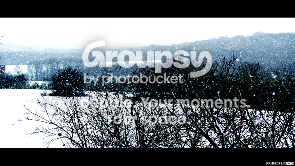
Between 3 & 4 I like 3 the most. The blue hills in the distance, exactly the way it feels to be in the cold, snowy day. The completely obliterated by white ground. The indistinctness of everything but that up close. Because there is often glare through the clouds on a snowy day, we see few colors and this really looks right.
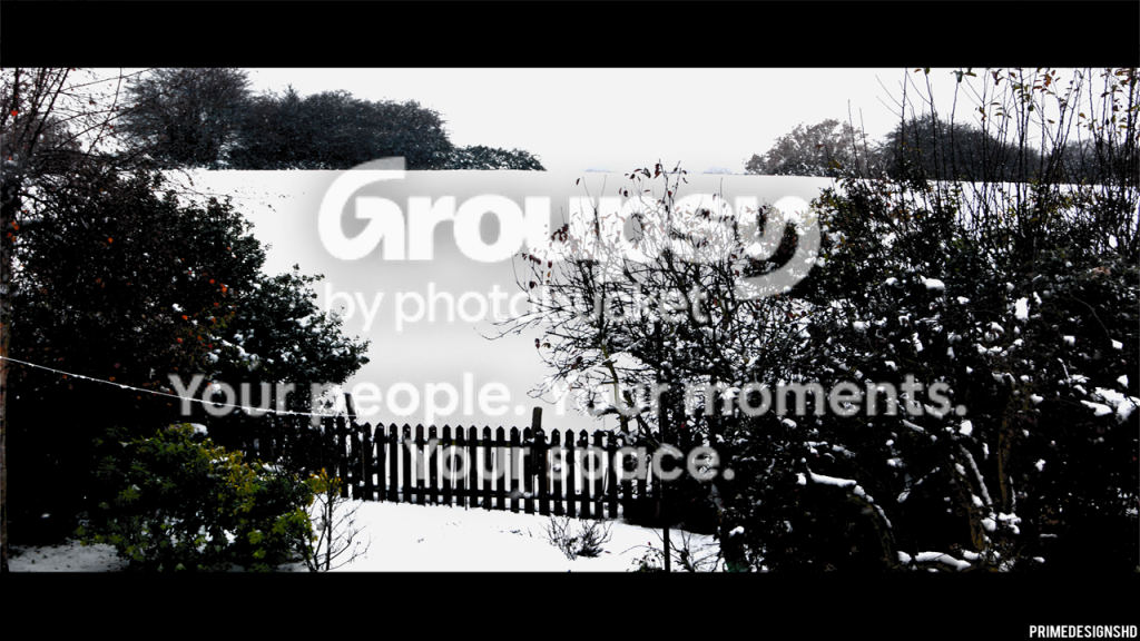
IMO, #4 doesn't have the spare simplicity of the first. The stuff on the right is both very close and further away and the blocking up of the shadows hides the dimensionality.
And then the green on the left gives the wrong impression. This one is a miss, especially compared to #3.
All in all a great start at at a style and a vision.
I see you use a Sony A90.
These shots are a great example that one doesn't need top tier, expensive equipment to produce good pictures.
Talent, skill and effort mean 99%.