Mtalicarox
TPF Noob!
- Joined
- May 7, 2009
- Messages
- 188
- Reaction score
- 0
- Can others edit my Photos
- Photos NOT OK to edit
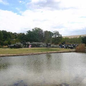
Just some fun pics from the farm the past weekend


Follow along with the video below to see how to install our site as a web app on your home screen.

Note: This feature currently requires accessing the site using the built-in Safari browser.
")
I'm bored today and have lots of time so I'll try to go through them all.
1. The background [brick] is distracting. even though the ground istself appears to be level, the angle of the building corner throws the shot off enough that it looks tilted. A bit of fill flash would have helped on the chicken and --- you cut its feet off.
2 & 3 - appear to be the same and neither seems very interesting. I'm assuming the main subject was the dark cloud?
4. could have been a nice landscape, but it appears to be underexposed, a bit out of focus and your horizon line is tilted.
5. Not too bad, but the sky is blown out. You could use a polarizer to darken the sky in future shots of this type. I do like the contrasting color of the field and surrounding green though.
6. is very out of focus and I'm not going to criticize further because, I have yet to get a shot like this to turn out well for me either.
7.The composition is not very appealing. That square thing behind the one chair is distracting and i think it would have been better shot from a slightly lower angle. Not sure its a great candidate for a B&W shot either....to much white. Perhaps had the table and chair been solid it might have worked better, or even just a patterened table cloth on the table.
8.A cute snapshot, but whatever is in the left of the shot needs to be cropped off and the cat is a bit obscured by the hammock, rather than being "framed" by the hammock and its frame. Again its out of focus -also watch your DOF.
9. Best of the lot - even though the focus seems a bit soft, its acceptable in this case. Your color could pop a bit more, it seems a bit flat right now. I would not increase the saturation however....maybe a tad more contrast.
10. A bit out of focus, and the blue whatever is a huge distraction.
11. Interesting, but the composition is off. I'd have included a bit more foreground rather than chopping the fire off at the bottom and I think a shorter[faster] shutter speed might have helped to kind of freeze the flames. Just my opnion as I've never photographed fire before.
i cant really pose a cat in action, so had to take it form where i was/where he was not much i could do about it as it was about to pounce something i like the #4 answer. the earth is tilted!. need to add that one to my list. awesome
i do like the last one though. no idea why but to me it just looks cool
the chicken one... well had KFC earlier and after seeing that i felt a little guilty... 2.3 seconds later i was over it and start typing this
cheers
bitter.. got any more popcorn dude.. have a feeling this is gonna be a long one !

 :lmao:
![[No title]](/data/xfmg/thumbnail/41/41492-467958db3420bceb7ab410a12dcc681f.jpg?1619739819)
![[No title]](/data/xfmg/thumbnail/41/41490-6af71315284539e04ae1878cda0d613f.jpg?1619739818)