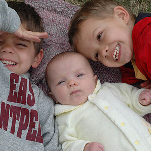
in 1 the light and background are working really well, i also like her expression. the back of her head is cut off, always unfortunate.
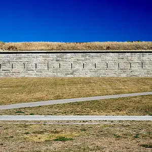
2, the light is flat, the left arm partly in the frame doesn't work composition wise.
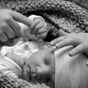
3 is an excellent subject but framed too tight on the left. the background here is dull and there's no context.
in 4 the tilt does not work as it seldom does unless the picture is of an abstract nature and then still it should be used with care.



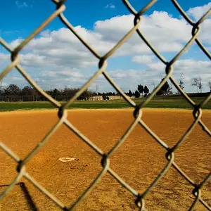
 I think I'd like it even more if you couldn't see the chain link fence in the background. But I really like the geometry and the shadow in that one. snazzy!


![[No title]](/data/xfmg/thumbnail/36/36666-189f65b1addbb68da2a43dc6f7206a01.jpg?1734169172)


![[No title]](/data/xfmg/thumbnail/33/33024-f9a0cb6482030fec791845de1a21c82a.jpg?1734163016)