What's new

Beginner Shots

I am sorry, that one picture is too good to have powerlines in it.

Try this:

z.jpg
 
HA! I don't remember what exactly I did.
I know I added a burn layer and...I think...I color layer.
Then I messed with color balance some, adding blues, yellow, and a little magenta, I think.
I'll post it in a bit.:mrgreen:
 
On mine (I use Capture NX with Control Points for PP), I boosted the saturation of the most orange part of the orange JUST a bit, and the contrast quite a bit... I also boosted the contrast of the darker area quite a bit and actually desaturated it some... and, obviously, cropped out the lines. The contrast boosts give the clouds some definition. I also would have unsharp masked the clouds if I had been working on the original, but the small file size here made it look horrible so I undid that revision.

It started to pixelate a bit because I was working on a small for-the-web file, but you get the point.
 
Now I don't know if you'll like this, I think it's kind of neat. But it's a little too red/yellow/orange for my own personal liking, but I'm a cooler color person, myself.
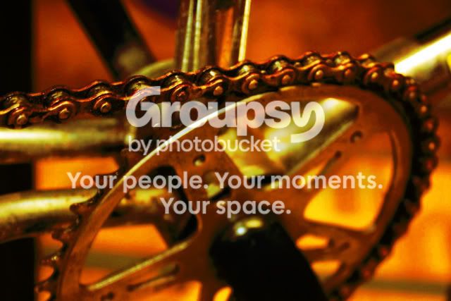
I duplicated the background layer, turned it into a burn layer and messed with opacity, then I duplicated the background layer again and I believe I turned that layer into a color layer. Then I went under color balance and added more magenta, more yellow, and a little bit of cyan, I think.
I messed with the contrast, oh! And I saturated the colors in the original layer.
zzzzzzzzz1.jpg


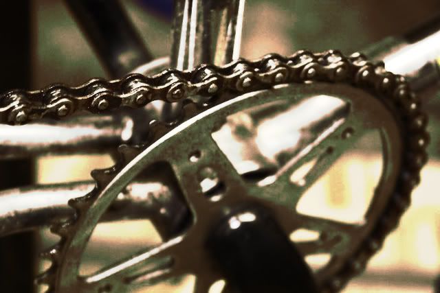
I also did this one last night, but my second duplication of the background layer was a dissolve layer, and I think i actually desaturated one or two of the layers a bit and then in my color balance I definitely added more blue.
Like I said, I cannot remember exactly what I did with these.
The only thing I do know that I did was I duplicated the background layer and made it a burn layer.
I use GIMP, and I'm still learning it. I'm not that great at it.:lmao:

zzzzzzzzz-3.jpg
 
Mary Beth you are a *****. This is why it is a beginners thread, so we can give advice, and so unexperienced people can get better.

It's a pity you are so biased that you can't see the trees for the forest, dark. FYI, the implicit advice I gave a noob here is: posting unedited photos is unusual, to put it mildly.
You seem to have missed that the OP did ask "what you think"...

Oh, and thanks for the compliment!
 
such anger.... haha

I like the first one alot!! I like the lines leading up to the center... it's what I like to look at.

Personally, I think it's good for a beginner to post their unedited stuff. With all of the pros on here, it's a great way to see what all can be done with it, and people that can give advice can look at it and see it as is... then have fun with it (with permission of course :))


sometimes the unedited stuff can be better than if you go overboard (like I ALWAYS do) in photoshop.
 
i like them, and i think the point of posting unprocessed photos is so people then say:

"well how about you do this and that..."

a while ago I submitted an unprocessed one as I was not sure if a vignette would work, so got opinion on overall shot and then asked if a vignette would work
 
It's a pity you are so biased that you can't see the trees for the forest, dark. FYI, the implicit advice I gave a noob here is: posting unedited photos is unusual, to put it mildly.
Again I ask, have you ever seen a newspaper?

Regardless, learning the camera and how to photograph well is much more important to the OP right now than learning photoshop.
 
Nice work FDSA, you defiantly have an artistic eye to make photos interesting, Keep at it!:D
 
such anger.... haha

I like the first one alot!! I like the lines leading up to the center... it's what I like to look at.

Personally, I think it's .

leading lines was one of the first assignments I had in photo class, I took the same kind of shot in B&W film and I was hoping it would cone out much greener.

I like Both of the bike chain edits but I feel like its to obviously edited, just not my style I guess.
 
leading lines was one of the first assignments I had in photo class, I took the same kind of shot in B&W film and I was hoping it would cone out much greener.

I like Both of the bike chain edits but I feel like its to obviously edited, just not my style I guess.


And that's perfectly ok:mrgreen:
I don't normally do that to pictures anyway. I've only done it to one other picture and that was only because I was messing around with it.:mrgreen:
 

Create an account or login to comment

You must be a member in order to leave a comment

Create account

Create an account on our community. It's easy!

Log in

Already have an account? Log in here.

New Topics

Back
Top Bottom