Beginner's Critique - Pass it on

Village Idiot

No longer a newbie, moving up!
Joined
Mar 20, 2008
Messages
7,269
Reaction score
406
Location
Shepherdsturd, WV / Almost, MD
Can others edit my Photos
Photos NOT OK to edit
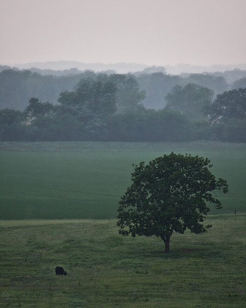
Another fun thread. This may work in this section of the forum it may not. Post a photo, just one, that you like and the next person to post will critique the photo to the best of their ability and post another photo for the next person to critique.

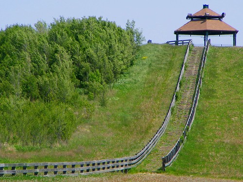
Since it's in the beginner section, I don't expect a ton of super detailed critiques, but if you got them, put them out there. Remember, beginner's forum. Keep it clean and don't post anything too harsh. Also remember to not take it personally if some one doesn't like your photo.

I'm not exactly a beginner, but I'll post up one of my older shots to get things moving and see if this works.


Edit: Keep in mind basics like exposure, rule of thirds, etc... and see what you can do.
 
knowing you're not a beginner I'll make the following recommendations to this shot.

Have you considered using a flash to balance out the lighting? Possibly change white balance to tungsten?

Sorry about forgetting pic. here it is. I had about 2 minutes to quickly get everyone in the shot and i had a chair as a tripod...I put the camera on tripod(about 10 feet away from everyone) set the timer ran in (me in front with black shirt)and took the shot.

Very hot lights above I think I did ok. only lights on were the round ones.


2540217016_fcaaf7e706.jpg
 
knowing you're not a beginner I'll make the following recommendations to this shot.

Have you considered using a flash to balance out the lighting? Possibly change white balance to tungsten?

With the exception of you squatting down you may have very well been able to crop the photo and get rid of the chair. The problem with you being posed how you are though would leave you with no hands and it would look more ackward than it does now. The lighting is not bad. It's just a tiny bit yellow and the only real flaw I can see is the white haired guy on the right's forehead. Some one said asking them to wipe their forehead off helps with the glare. I don't know that I would have done it here, but for a more professional shoot I would have. That or he's got one mean unibrow.
 
I'm not much of an expert on critique-ing but I understand the rules, so will have a go.

Nice overall shot, but perhaps a little too dark in areas (eg. behind the girl's head).

I find the purple light and the background (green curtain and whatever is beyond there) a little distracting.

Interesting tilt to the shot which I think strangely kind of works.

I'll have to admit to being a little confused as to what I'm looking at. Is this some kind of bar?

Was that OK? Sorry, as I said, I'm not that good at critiques.

Anyway, here goes with a shot from me...

butterfly.jpg
 
First thing that draws into the image is the blown highlight in the top left corner. I believe the centered crop actually works OK... but I do feel that moving the butterfly to the right a little would have improved this shot. You did a great job of exposing the butterfly. Could use a little (not much) sharpening.

Here's mine:
2595861710_be137a33d1_o.jpg
 
I like it. You've got three different horizons going on, beautiful muted blue/greens, and a nice point of interest in the lower left (buffalo? sheep? large porcupine?). The trees in the back seem a bit over-processed, sorta water-color-y, which is not necessarily a bad thing. The tree appears wind-blown; whether it is or not, still a cool effect. Maybe just a slightly tighter crop would be better, but, overall, still an A.

Mine:

2601221522_423e276bb0.jpg
 
Your exposure looks pretty good, it's pretty sharp (though difficult to tell for sure at that size) and the shot has a nice leading line up to the top of the hill. Overall though it feels like a shot without a real subject - perhaps the composition would be stronger if you cropped that trees/bushes on the left out and retained the r/h side in portrait format.

498298147_bd1c2df34e_o.jpg
 
Here's an issue I have. Your bunny is not as cute as my pug.

Bunny is very centered(so is my pug). Not that you can do a lot without the bunny running away. Grass appears sharper than bunny too...
Actually I am not seeing a lot wrong other than what I think I see...I just wanted to rub in my pug being cuter than your bunny.
2366489352_9b9fab5667.jpg
 
LOL I think the little bugger moved and I'm sure it was before I knew anything about unsharp masks, but you're probably right.
 
Nice pug asfixate. Composition is good, despite being centered and is very cute. Not much to criticize but I want to see a bit more of your pug's face. Still, very nice. It gives a warm and fuzzy feeling.

My Pic:
imgp1973je5.jpg

A bit noisy and not enough DOF but thats because I had the wrong lens on and didn't have much light. Still, it's fairly decent in my mind.

Also, I think I'm now beyond the beginner stage.
 
The leaf looks kind of pixelated like it may be oversharpened (although that may just be my computer). I would also like to see, if the fly is supposed to be a focal point (which I wouldn't think it would be in this case) I would like to see it sharper. Although if you had the wrong lens on you may not have had any other choice.

 
God, I don't know if anything is wrong with your picture of your pug, because I quite like it as well. Maybe a little more light by the right eye (not that it's saying much because that happens to me in pics all the time)? I don't know...


And, fine. I'll post one. Even though I'm pretty sure I know already what is wrong (or could be viewed as "wrong") with this shot, I want to hear what you all have to say.
This was taken with my 50mm f1.8 which I have to manually focus on my D60. YES. Another action shot with the rope.
2591883483_40fe8167fd.jpg
 

Most reactions

New Topics

Back
Top