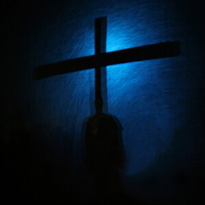
I really like your shots, except i don't like the edit to the first one. Looking at this from my cell phone but looks good in quality also (I do have VGA screen afterall lol).
The first one I like the normal version better, the glowing edges don't do it for me. However, I would like to see a bit more depth of field, since the entire photo is the point of interest. It's a nice image.
The second one, I'm not a fan of either versions. The gradiants in the sky on the colourful version just throw me off (though, the building is nice in it) and in the other one.. just not my taste at all.
the original pics look good by themselves. maybe just bump up the saturation on the first one. looks like you spooged photoshop filters all over your pics. not my cup o tea.
Although I know you didn't install them, and could do nothing about it, those modern light poles in front of the ancient-looking building totally ruin the shot.
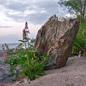
Love the first shot of the flowers. Bursting with color.
I dont like the edits, they really take away from the images. The first flower shot is good, I would just bump up the saturation and play with levels a bit, to me it looks a little underexposed.
As for the church pics, these both look like bad edits. I would rather see the original shot. The modern light post is a bit distracting, but you can easily clone or crop that out.


")