What's new

Bonnie- 2013 Senior

DanOstergren30 5

"We're all mad here" ... At me?
Joined
Jun 2, 2013
Messages
5,279
Reaction score
5,171
Location
Oregon
Can others edit my Photos
Photos NOT OK to edit
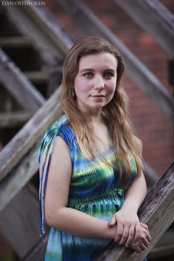
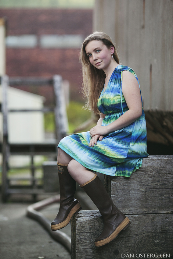
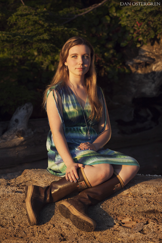
I've only ever done two senior photo sessions, this being the second one which I did a day ago. I wanted to keep my individual style while still presenting the senior in a somewhat traditional way. Bonnie will be graduating ahead of her class this year rather than in 2014.
These were all shot using natural ambient light and a reflector.
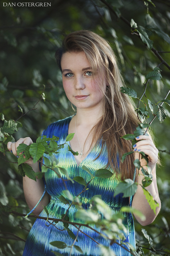
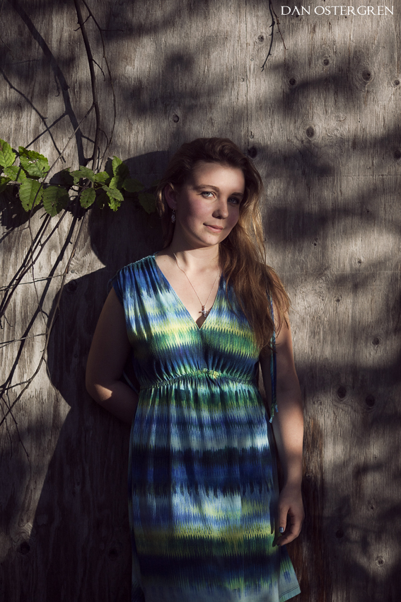
mg_1624_by_danostergren-d6kagme.jpg


mg_1613_by_danostergren-d6kaglq.jpg


mg_1649_by_danostergren-d6kagmh.jpg


mg_1638_by_danostergren-d6kanom.jpg


Also, the boots are called XtraTufs, also know as the Alaskan sneaker.
mg_1650_by_danostergren-d6kagmm.jpg


mg_1685_by_danostergren-d6kanow.jpg
 
Last edited:
+1 for including the Alaskan sneakers! I like these especially #2 but the only thing that bugs me about it is the right side of her face isn't lit.
 
+1 for including the Alaskan sneakers! I like these especially #2 but the only thing that bugs me about it is the right side of her face isn't lit.
It bugs me just a little bit as well, but I also feel that it adds a bit of an unplanned feel to it. I like the idea of making a posed photo look sort of like a snapshot, and to me this adds to this feeling.
 
Only one I didn't like was the dabbled light image in #2. It's a big rule and I know you're a rule breaker but just didn't pull that one off this time like I've noticed you to do.

only other gripe is her facial expression, it's pretty much the same in every image. I know that some people are like this, but gotta try something during the shoot to break that monotony. From past shoots, you've been blessed with some amazing models (term used lightly Bc I know they're not professional models) who have great expressions. I just didn't feel this shot had that..at least from a facial expression aspect.
 
I think we need a little funk to the composition. The dead center spot is a little repetitive.
 
#1 - Lovely lighting. Nice catch lights.
#2 - Dappled lighting.. meh.. However, perhaps if the right side of her face was lit the wall behind her would make a cool background with the shadows on it. Or maybe even do a super close head/shoulders crop to make the dramatic contrast work better.
#3 - Pose looks forced. However, I love the lighting here.
#4 - More fill on the right side of her face would have been nice...
#5 - The lighting is really pretty, but I think she needs more fill for her eyes, they are looking a little dark. The pose is awkward. Her hands on her lap are very formal and the slouching just doesn't fit. She either needs to straighten up (just a bit, doesn't have to be stick-straight) or relax her hands.
#6 - meh - this one throws me off completely because all the others in this set are cool. This is super ultra warmed up, so its sticks out like a sore thumb. I'm not a fan of the pose. There are other ways to have a young girl sit that would be more flattering, but still be casual/day at the beach. Also, she needs a lot of fill light on the right side of her body/face. The speck of light on the right cheek is totally distracting.

There is my 2 cents. :)
 
I thought shots #1 and #5 were very solid photographs, very enjoyable to look at. The others, for various reasons were not to my liking, either due to lighting, or posing, and the way those two factors interacted to show her. a minor quibble in #5 might be the way her dress is bunched up under her, but that's minor. The old, faded wood and the step effect, the boots, the leg placement, and her "perched" there make that shot a real winner. The background has some things going on, but they're out of focus enough that they have very little "pull", and are actually kind of interesting things going on...call it "controlled clutter"--whatever it's called, it worked out great Dan!

What's so nice about #5 is that it has four distinct background planes, and each one adds up to a really strong feeling of space, of three-dimensional space,m which makes her, being rendered in the DOF zone, very much the center of attention. The way the lens renders the OOF areas and the different distances is really lovely. And there's a bit of the same thing in shot #1 as well, but unlike #5, #1 also has some foreground bokeh effects, which frame her really in a wonderful way!
 
1 and 5 were my favorites as well. Nicely done! Great name too! ;) lol
 
I think we need a little funk to the composition. The dead center spot is a little repetitive.
I was shooting with the intention that any shot could be used for her yearbook photo and felt that an off-center shot wouldn't look right in the yearbook. Is this not how a senior shoot should be done? Like I said I've only done senior photos twice now. There are also a few that do have off-center positions, but you can't expect me to post the 50 good images from the shoot.
 
Last edited:
I've only ever done two senior photo sessions, this being the second one which I did a day ago. I wanted to keep my individual style while still presenting the senior in a somewhat traditional way. Bonnie will be graduating ahead of her class this year rather than in 2014.
These were all shot using natural ambient light and a reflector.
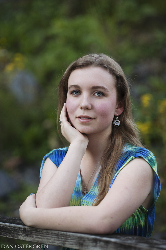
I'm no expert, but i think you did exactly what you set out to do. I view photography exactly like any other art form. What separates the "men from the boys" so to speak, just a term ladies ;), is the ability to see it in your mind's eye and recreate it in physical form. You can never please everyone. if you can bring a plan to fruition in a way that makes you happy, as i've seen in your work on numerous occasions, then what else matters. plus, i'm sure she was in love with her photos. thumbs up buddy.
 

Create an account or login to comment

You must be a member in order to leave a comment

Create account

Create an account on our community. It's easy!

Log in

Already have an account? Log in here.

Back
Top Bottom