Botanical Garden Pictures-- C&C please

shortpballer

TPF Noob!
Joined
Aug 1, 2009
Messages
664
Reaction score
12
Location
San Diego
Website
www.dossantoslemone.com
Can others edit my Photos
Photos NOT OK to edit
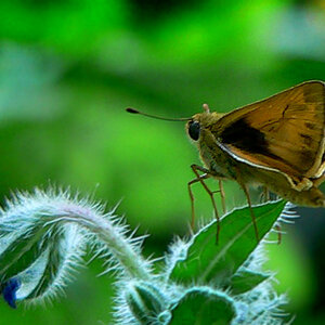
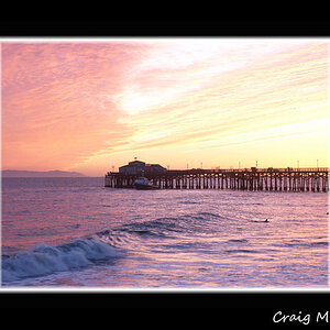
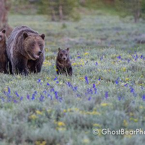
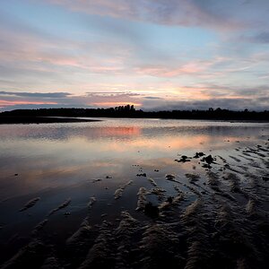
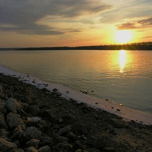
We went on a nature walk through a botanical garden today. Let me know what you guys think of the pictures. Sorry there is 5. They were all taken with my nifty fifty except for the fisheye one.

1
cactus1.jpg


2
cactus2.jpg


3
cactus3.jpg


4
cactus4.jpg


5
cactus5.jpg
 
3&4 are my favs.

good shots!
 
#1 I'm actually like the look of this...like the prickly tentacles from space look. Nice choice of subject. I'd like a closer in crop though, so its looks all tentacly. I also find the top of the image is darker than the bottom? Probably some shadows me thinks.

#2 Interesting. Nice use of DOF. The overall exposure is better than in 1, but the subject is just alright

#3 The bottom is way too dark for me. Did you apply a gradient in pp?? Its distracting to the image as it draws my eye morethan the light part of the flower.

#4 Much better composition here than in #3. Nice job using the flowers as a leading line in the image. Good DOF, nice exposure, good saturation. Probably the best of the bunch IMO.

#5 its a fun pic, but not much else. Did you happen to catch an image with the two of these guys in the frame, the lower / eating on on the bottom left of the frame and the other dude in the back looknig at you in the upper right?

My eye wasn't drawn into the image much, I'm thinking its because of the other guy in the back. Its a nice capture though, although the focus seems to be on the top of his head and not his eye
 
1. I really like this one, but as mentioned before, I think it should be cropped in a bit.

2. Nice detail, DOF, and exposure.

3. The dark area in the bottom kinda ruins it for me.

4. Nice composition, but I would have moved slightly to the right, but thats just me.

5. This picture just looks like a snapshot, and it seems you missed the focus. I also don't like the perspective; the way that you are looking down on them.

I like your enthusiasm, keep working on it.
 
I thought about cropping it before I put it up. Because I know a lot of you guys aren't really fans of the fisheye look. However, I felt that it took away from the look that I was inside the cactus. Which I was by the way, My arm was a about a foot and a half inside the plant when I took the picture.

Here is a cropped version:

cactus6.jpg


Let me know what you think
 
And the cool part about the last one is that it wasn't cropped, and it was taken with my 50mm so the lens was about a foot away from their faces. :)
 
Its not that I don't like the fish eye look, its just that I thought the subject would look better isolated.
 
Try to find different angles than you would see every day. Don't shoot down, especially on flowers. Try shooting them from their level, or even getting below them and shooting up on them.

I think the DOF in #2 may be a little too small because part of the cactus is OOF.

I like the plumeria shots, take more of those while you are there. :thumbup:

Never thought about shooting them upward. That would look good at provide a blue background with the sky instead of green. Thanks!:thumbup:
 
The crop of #1 puts the cactus into a very interesting perspective. I'm not a big fan of the fisheye lens, but I do like this photo.
 
I like the last three shots -- nice detail on the flowers and the two beautiful birds.
 
Thanks everyone. I appreciate all the help. You guys like the cropped version of the first one better? or the original?

Definitely like the cropped version. Very cool perspective.
 
1) It bothers me that the top "shoot" of cactus is cut off. either pull out wider, or crop it out entirely IMO.

2) Good picture but maybe a little deeper depth of field would look better here.

3) Doesn't due much for me. The white looks a little blown out to me.

4) Great shot!! Wouldn't change a thing. Love it.

5) The bird in the background is distracting to me. Would have been an awesome shot if it was just the front bird, otherwise doesn't due much for me. Great color though.
 

Most reactions

New Topics

Back
Top