What's new

Breakfast At Tiffany's

agompert

TPF Noob!
Joined
Oct 15, 2009
Messages
131
Reaction score
16
Location
Sierra Vista, AZ
Can others edit my Photos
Photos NOT OK to edit
1 $DSC_2864.webp
2$DSC_3263.webp
3$DSC_3754.webp
4$Shanin.webp


To see the full set click on the link below.I couldnt post the full set due to its Mature content NSFW

Breakfast At Tiffany?s (Mature Content Warning)
 
She would be an attractive woman if she were not marked up with all of the tattoos. Instead she looks like an idiot.
 
She would be an attractive woman if she were not marked up with all of the tattoos. Instead she looks like an idiot.

I think you'll find that negative personal comments about the model are against the site policy. Comments are usually welcome on the artistic and technical merits of the photographs being displayed. :)
 
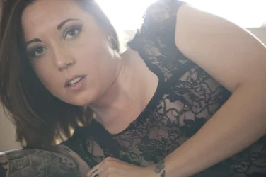
I have no place in critiquing portraiture type photography. All I can say is her eyes in number three are great! There is something so captivating to me about her eyes and face. Really sensual, attractive, innocent.... bottom line for me is it has a je ne sais quio feel too it. Beautiful!
 
Ashley, you seem to post the same pictures in multiple threads, in various combinations. Not sure what you're getting at with that.
 
Tattoos or no tattoos, that is a nice butt.
 
Nice set (well, these four anyway, shouldn't check out the full set from work). Thanks for sharing.

Not sure if you're looking for C&C, so feel free to disregard the following comments.
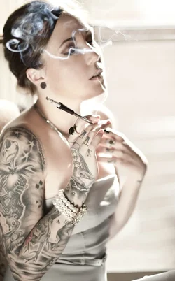
Shot 1) Question - when you shoot smoke (I never have) do you shoot in burst mode or single shot? There's a lot I like about this shot (her expression, the processing), it's just unfortunate that the wisp of smoke drifted up right across her eye.

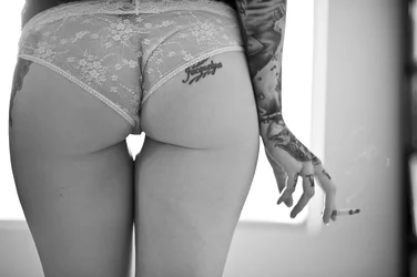
Shot 2) I like this one as well - I like that in a shot largely comprised of a practically naked woman's tush my eye is drawn to the shapely pose of her hand and the lit cigarette. My nitpicks on this one are that I wish her underwear had been evened out (the engineer in me likes symmetry in details like that) and it looks like the background (as defined by the window frame) wants to be rotated CCW a smidge. Her lines look pretty darn vertical to me though, so I suspect rotating the frame to get the window level might actually detract from the result. I go back and forth on whether I like the bit of bookcase on the right, whether I'd like it better with that dark area defining the right border of the frame or if I'd like it open ended, cropping to leave the light gray trailing off the right.

Shot 3) Very nice use of lighting and depth of focus to show her lower body without having her ink draw attention away from her face. It's also a great pose for an implied shot, it shows without showing too much in a manner which looks completely natural for the setting. I do wish you had been able to avoid the spout in the bottom right corner (that's probably a bit difficult to clone out with her ink right behind it, eh?). Again, I like the pose and the composition overall, and I'm not sure how better to do it while keeping the natural feel, but I wish her right arm hadn't been disconnected (and that the tip of the cigar had been seen - tells so much more of a story IMO if it's lit).

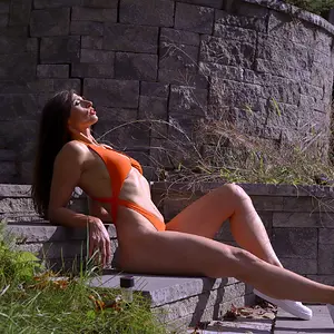
Shot 4) Nothing wrong with it, per se, it just doesn't move me as much as the other three do.

Again, nice job and thanks for sharing!

 
Ashley, you seem to post the same pictures in multiple threads, in various combinations. Not sure what you're getting at with that.


I posted the butt shot in a black and white thread with other photos. It is the same set yes, but I posted the B&W one first and wanted these up as an afterthought.

Not "getting at" anything.
 
Nice set (well, these four anyway, shouldn't check out the full set from work). Thanks for sharing.

Not sure if you're looking for C&C, so feel free to disregard the following comments.
Shot 1) Question - when you shoot smoke (I never have) do you shoot in burst mode or single shot? There's a lot I like about this shot (her expression, the processing), it's just unfortunate that the wisp of smoke drifted up right across her eye.

Shot 2) I like this one as well - I like that in a shot largely comprised of a practically naked woman's tush my eye is drawn to the shapely pose of her hand and the lit cigarette. My nitpicks on this one are that I wish her underwear had been evened out (the engineer in me likes symmetry in details like that) and it looks like the background (as defined by the window frame) wants to be rotated CCW a smidge. Her lines look pretty darn vertical to me though, so I suspect rotating the frame to get the window level might actually detract from the result. I go back and forth on whether I like the bit of bookcase on the right, whether I'd like it better with that dark area defining the right border of the frame or if I'd like it open ended, cropping to leave the light gray trailing off the right.

Shot 3) Very nice use of lighting and depth of focus to show her lower body without having her ink draw attention away from her face. It's also a great pose for an implied shot, it shows without showing too much in a manner which looks completely natural for the setting. I do wish you had been able to avoid the spout in the bottom right corner (that's probably a bit difficult to clone out with her ink right behind it, eh?). Again, I like the pose and the composition overall, and I'm not sure how better to do it while keeping the natural feel, but I wish her right arm hadn't been disconnected (and that the tip of the cigar had been seen - tells so much more of a story IMO if it's lit).

Shot 4) Nothing wrong with it, per se, it just doesn't move me as much as the other three do.

Again, nice job and thanks for sharing!


Yes with the smoke I took a BUNCH of shots to try to get it just right. Hopefully I didn't fail miserably :)

Thank you for the nice crit. :) It was constructive without being the least bit harmful which I appreciate. As for the tub faucet, there was very little room to move around in the bathroom so it was kind of a tight squeeze. I could try to clone it tho if you think it's distracting :)

Did any of you look at the full set on my blog? They're nude but I don't think the story is complete without them.
 
The asymmetrical panties in the butt shot are absolutely necessary. With the panties lined up, it's yet another boring cheesecake shot, oo, with a cigarette. There's only 10,000,000 of THOSE.

With the sloppy panties it's vastly more naturalistic, it has a documentary flavor while still being sexy. It's much more meaningful and affecting.
 
She would be an attractive woman if she were not marked up with all of the tattoos. Instead she looks like an idiot.

I can't seem to remember anyone asking how you feel about tattoos? So how this it feel when making a fool out of yourself?

Over to the photos.. I love them, the poses, the compositions and the lighting is in my mind very good!
If there is one negative thing, I would say that the pose in the last photo is really doing no justice to the model, it just looks awkward.
 
The tattoo comment didn't bother me really. I have 6 and Ive been called a bad mom for it, a delinquent, blah blah blah. Some just don't have the appreciation for them. I personally think they can look really beautiful. especially in photos. There are entire books and magazines devoted fully to women with tattoos. It's sexy.
 
to each their own. i find tats on chicks to be hot. suicide girls? mmmmmmm....
 

Create an account or login to comment

You must be a member in order to leave a comment

Create account

Create an account on our community. It's easy!

Log in

Already have an account? Log in here.

New Topics

Back
Top Bottom