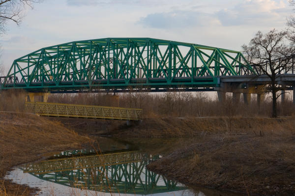
I like #1 and #2. #1 would have been better with a slightly higher or lower composition though. Right now the top 1/2 is light and the bottom1/2 is dark. Maybe experiment with some creative cropping. The bottom 1/3 doesn't have any detail, so you could either try to lighten or crop off.
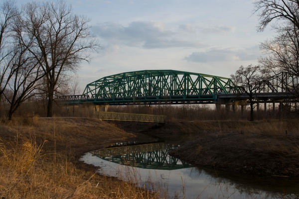
I like the reflection and lines of #2. It would have been a better composition if you tilted your camera down a bit, putting more space underneath the reflection and less in the sky for balance. Also, you should have centered it more, left to right. The left side is cropped, but you had room on the right to capture the entire thing.
And finally, if you have a photo editing software, you could increase saturation and sharpness.
You last added shot is perfect to experiment with cropping and color! Nice!
Play around with B&W and Sepia on these too!


![[No title]](/data/xfmg/thumbnail/36/36667-b3265abf8272f21d759a0abd6a0995c3.jpg?1734169172)