What's new

Bumpity bump!

sarah_19_nz

No longer a newbie, moving up!
Joined
Apr 1, 2013
Messages
411
Reaction score
148
Location
New Zealand
Can others edit my Photos
Photos OK to edit
Not sure i'm following the rules with this 'image size' or whatever but remove if need be.

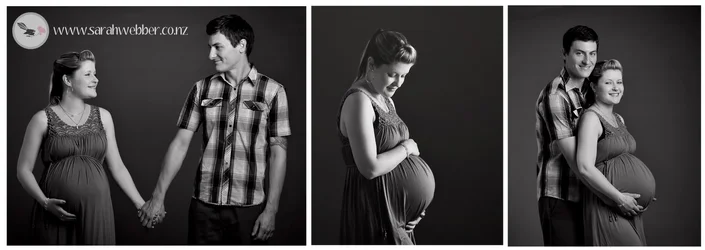
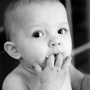
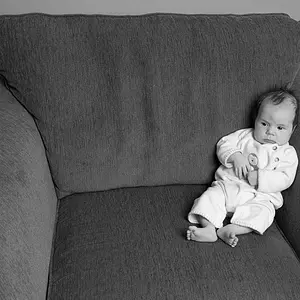
A maternity shoot I did in the weekend, Only had one large softbox plus a large reflector at my disposal... what do you think? Hows the black 'n' white conversion? Needs a few tweeks huh? Any tips on how to make these look better is appreciated. :) Thanks in advance.
$alyshasneakpeek.webp
 
someone weigh in...
 
I have always enjoyed delicate, lovely grays in B&W photos. These have a good, broad tonal range, with a LOT of delicate, beautiful grays. A lot of people would probably say the local contrast is a bit lower than they might like to see, but that's a matter of personal taste. Seen against a medium-gray matte, this collage would look excellent; seen here on TPF with all of the white surround, these look a bit too grayish...I can almost name the person who will mention the grays are a bit too dominant...hint: he lives north of me by a few hundred miles! I used to do personal B&W images very much in this style, and while others preferred to mount their prints in white mattes, I always preferred medium-gray mattes.

You could bump the contrast a bit if you'd like, but I do not think you need more blacks; these have a good amount of detail in the shadowed parts, meaning there's plenty of "fill", and I like that. You kept the FACES about the same exact tonal value in all three panels,and I do like that. I think that shows a good degree of consistency and attention to detail. These three images look good together. I loike the very quiet, peaceful vibe this collection has; it's calm, not cutesy, not silly, very dignified, without being utterly boring.
 
Thanks Derrel, as always a detailed response/critique which is very much appreciated. I might have a play around with the contrast a bit more just to see what happens. Thanks for the tip about mounting n a medium grey matte! I would never have thought of that. I'm still learning about what makes a black 'n' white conversion awesome.... whether it is low contrast or high... you are right it's about personal taste I guess... lets hear what the crew have to say then :)...

Cheers
 
I have always enjoyed delicate, lovely grays in B&W photos. These have a good, broad tonal range, with a LOT of delicate, beautiful grays. A lot of people would probably say the local contrast is a bit lower than they might like to see, but that's a matter of personal taste. Seen against a medium-gray matte, this collage would look excellent; seen here on TPF with all of the white surround, these look a bit too grayish...I can almost name the person who will mention the grays are a bit too dominant...hint: he lives north of me by a few hundred miles! I used to do personal B&W images very much in this style, and while others preferred to mount their prints in white mattes, I always preferred medium-gray mattes.

You could bump the contrast a bit if you'd like, but I do not think you need more blacks; these have a good amount of detail in the shadowed parts, meaning there's plenty of "fill", and I like that. You kept the FACES about the same exact tonal value in all three panels,and I do like that. I think that shows a good degree of consistency and attention to detail. These three images look good together. I loike the very quiet, peaceful vibe this collection has; it's calm, not cutesy, not silly, very dignified, without being utterly boring.

Exactly what Mr. D said!

All I know is they are really pleasant to look at. #2 IMO could be in a magazine, and looks like something I have seen in magazines.
 
I like the consistent tones of 1 and 3. I agree with JacaRada, #2 does have a print feel to it. How much differently did you adjust the lighting for that one in comparison to 1 & 3?
 
number 2's lighting was completely different, I had the soft box low and pointing directly at her belly. The others it was up high, pointing down at them and just to the side of them (haha sorry I have no professional lingo as I am self taught!)

Thanks everyone :)
 
Sarah,

I don't know if you really did it intentionally but you NAILED SHORT LIGHTING on the middle image. That lighting pattern on her face is the single most useful pattern in professional photography--it slims the face and creates the third dimension at the same time.

It's the first lighting pattern I show MY students when I seen them making the usual mistake of flat-lighting everyone in the studio.

Short lighting is so important that photographers testing for their Certification (CPP Degree) with PPA (Professional Photographers of America) MUST Demonstrate the use of this lighting pattern.

The fact that you are only using ONE main light and a reflector had a lot to do with your results--it's the best way to learn proper studio lighting.
Most photographers with mutiple lights usually over-fill the studio set creating the usual dull, flat, pattern.

Good job! And keep MOVING your light--that's how you learn. Jerry V.
 
I did research 'short lighting' for a week before this shoot and used it on purpose :) Glad it is obvious to a professional in my images! :) Thank you.

Sarah,

I don't know if you really did it intentionally but you NAILED SHORT LIGHTING on the middle image. That lighting pattern on her face is the single most useful pattern in professional photography--it slims the face and creates the third dimension at the same time.

It's the first lighting pattern I show MY students when I seen them making the usual mistake of flat-lighting everyone in the studio.

Short lighting is so important that photographers testing for their Certification (CPP Degree) with PPA (Professional Photographers of America) MUST Demonstrate the use of this lighting pattern.

The fact that you are only using ONE main light and a reflector had a lot to do with your results--it's the best way to learn proper studio lighting.
Most photographers with mutiple lights usually over-fill the studio set creating the usual dull, flat, pattern.

Good job! And keep MOVING your light--that's how you learn. Jerry V.
 
Mehh... got here too late; all the good comments have been used. I'll simply echo the others. Excellent work, and some of the nicest and most tasteful maternity images I have seen in a LONG time. I expect the customer will be well pleased, and hopefully this leads to a hockey-sock of referrals!
 
Sorry that I am about to stray from the post, but I noticed that you're from NZ. It's been eons since I have been there. Do you take any nature shots out there?
 
Sorry that I am about to stray from the post, but I noticed that you're from NZ. It's been eons since I have been there. Do you take any nature shots out there?


Heya! I've not really dabbled in scenic photography but I will when my kids are older I think. :) It would be a shame NOT to wouldn't it! ;)
 
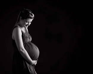
Hows this conversion? A bit 'punchier'? (I know some will roll eyes at the negative space and landscape crop :) )

$alysha15forum.webp
 
I personally like it, and if the client likes it, it's perfect. Right?
 
I feel the same as tirediron... Very nice.
 

Create an account or login to comment

You must be a member in order to leave a comment

Create account

Create an account on our community. It's easy!

Log in

Already have an account? Log in here.

Back
Top Bottom